I mean, I’m all down for the Linux mascot and all, but it feels out of place in the bottom right.
Oh on the default ‘material’ theme its still there.
I find it reminds me of clippy…
2 Likes
Indeed
Eh, just deal with it when y’all can, probably already doing a lot of things right now anyway.
I think only the team and admins can do that, if they so wish.
You will have to wait for one of them to respond.
The footer is where less important stuff goes, it works well there.
1 Like
It just wasn’t on the previous forum, and it just feels out of place.
If you can, make it to where we can remove it? Probably with something similar to the theme picker in the previous forum.
1 Like
Hello @anon17725764 and thank you for your feedback so far.
I’m sorry, but … it was created in 15.08.2020
It couldn’t be anywhere else before that.
I have to ask if is considered so, just a visual noise based on personal preferences, or is due to a design flaw, visual frame composition, color, size, etc.flaw? Before i get a reply, i would like to justify it.
It follows the 1:3 composition framing that is used in movies, paintings and some illustrations. Example:
Of course is an “adapted” compositional frame. All this visual irritation could be a style issue, same as in music, some can’t hear progressive metal when they prefer classic music. We are quite open to criticism as long as is not a short affirmation that can’t be correlated with anything from “conceptual/design/art guidelines”. Is quite easy to trow: “This comment is out of place” and be done with it.
For those that use bigger screens, that visual space was quite empty, and mind you, that Hello text was also out of visual context and disconnected visually.
I actually asked the team and Vitor to remove it, so ve can move on and avoid short replies based on personal feelings or moods or flashy past memories. Is true, there are mornings when the Sun bothers me … ![]()
As always, we welcome all the constructive feedback we get from community members!
Regards
Is it really that important? Is only a drawing in the footer, do you really spend that much time staring at the footer, we have some content above, not much yet, but is getting shape.
1 Like
I mean … if someone finds something unpleasing or distasteful it doesnt much matter where it is.
“Oh, you dont enjoy our [insert offensive item here]? Why? Its only at the back/corner/edge/etc”
If I am being honest … it looks weird to me too.
3 Likes
Yeah, it’s not the position itself, it’s really the drawing of the penguin, if I was on reddit I will probably find it on /r/cursed_images.
I won’t say that I made an account just to say this (there are lots of reasons actually), but I can guarantee you that this is one of the reasons, and this should tell you how negatively impacting is that penguin.
Basically:
- The penguin itself looks like it came out of a landfill
- Has the eyes of a maniac
- Does not follow the latest trends about simplicity and overall flatness (as an example, the profile pic of @cscs is way way better, the actual penguin on the footer was acceptable probably in 2012)
- At a first glance this is what a visitor brain perceives: dirtiness, age, clumsiness and disquietude.
I submitted a screenshot to a Telegram group asking “What are the first impressions this penguin is giving you?” and the replies were: *“creepy”
I’m not joking and I’m completely serious, I love the new forum overall (even if I disagree with the “city skyline” overall graphics, but that is probably personal) but that penguin isn’t really the best first impression a new user may perceive.
I get that there are more urgent problems right now and I totally respect the guy/lady that made that drawing (I wouldn’t even know where to start to make one, sincerely) but we should definitely ditch the ol’ “functionality over usability/embellishment” creed.
3 Likes
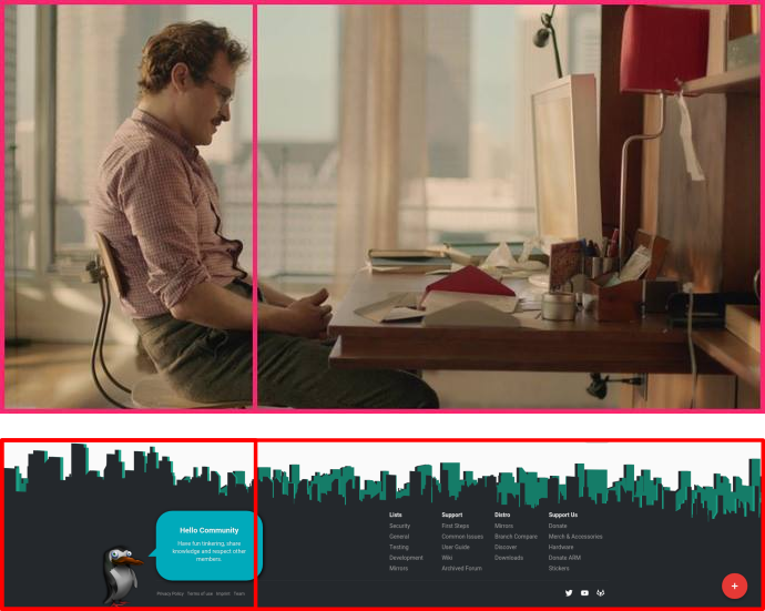
What Penguin??? I see no Penguin.
Yeah it’s not visible in the dark theme of the forum. Switch to the material theme to take a look at it.
1 Like
Thanks, but I perfer the Dark Theme.
2 Likes
Is definitely not offensive and comes to personal taste, it can be disabled by switching to default dark theme or by simply applying a CSS override at browser level for the domain.
The penguin is a cliche, it’s not really creative.
On top of that, that’s probably the dumbest looking penguin, to be honest.
I mean, I’m all down for the Linux mascot and all, but it feels out of place in the bottom right.
The way the OP put it is interesting because a couple of days ago I expressed it almost the same way:
And IMO penguin and his blue box feel like they don’t really belong to the environment.
Manjaro text and logo look a bit weird [Most likely my PC]
I think it looks unpro.
For example the main website is well made, almost all pro websites look like that nowadays, i’m not really familiar with php but i can easily tell that’s above average design. The manjaro logo loading is a really nice touch as well.
Now imagine this silly cartoonish penguin on the bottom of that index page. I think you get what I mean.
Also, IMO Manjaro logo on top should always stay on the dark green part regardless of dpi.
Looks don’t really matter all that much, that’s just my 2 cents.
Well, yes. But once the personal taste becomes no more so personal (more of a hive taste) the issue should be addressed properly.
From my experience and the feedbacks obtained on my Telegram group (not a single positive feedback came) that icon/drawing is terrible (also the sole existence of this thread confirms the trend).
A simple poll should be sufficient to determine what the majority of users think.
With all due respect, I think this is not the right mentality to approach such a problem.
I actually don’t even know how to reply to the proposed solution, which seems completely summary and disinterested: are you really thinking a new user coming to this site is going to apply a CSS patch?
Users don’t care, or even better: they do care enough to tell that that drawing is creepy but do not care enough to actively change it by their selves. Users will simply jump to the conclusion: “The manjaro community is weird”
I just joined the forum and if it wasn’t for this thread I didn’t even know the existence of a dark theme, which is selectable on the settings and it’s not even the default choice.
Most of the people reading the forum has not an account, they just look for a quick solution.
Therefore, most of the users will see that drawing and certainly “the welcome” could be way better (I’d actually say the actual drawing is plain terrible).
If you care and want to settle it down simply do a poll and we’ll see the results coming from the community.
If you ask me even the classical Tux copy-pasted from the first GNU website we can find is way better.
I second this. I’m not writing a thesis on why either.
Y’all did a good job explaining, I don’t think anything else needs said(all of it was covered pretty much).
Some people act weird for me too, yet seems the penguin is more dangerous than that.
The story behind is that it did …
He must be a maniac too then. Good call !
https://www.instagram.com/p/BO4dYAEg3MO/
The trend we follow is about the simplicity of installing and using a distribution based on arch. Graphics can follow any style, not a trendy one.
They have no sense of humor and probably they like different styles of graphics.
Aside the fact the the rest of that statement was edited (for good reasons), i’m sorry you had to encounter so many, that you now recognize them even in a drawing. Really sorry for that experience in your life!
Probably that’s the problem. Have more fun …
Do you? Just few words above you used a word that needed editing, how is that going to show “respect” ?
Everything is in that regard.
Unprofessional is to not assume any responsibility for something you do for others …
So, argumentum ad populum is the way you go and should we all?
No need to waste forum resources and time from others to spend 1 second more on this.
@codesardine - take it down now!
Nobody asked you, so … why offering a compromised help?
According to whom?
Explanation is not justification nor objective qualification, so yeah, merely a deep subjective ramble …
Case closed!