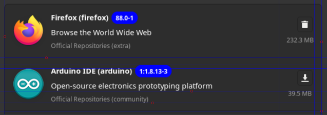
I totally disagree, the UI as gotten better with each iteration, if clicking the button on the image bellow is hard you can always use the shell or install pamac-classic from the AUR.
1 Like
Seems like we had the same reaction.
1 Like
The why getting rid of colors? Before we got a big button, colored with word, it was self-explanatory, intuitive and clear within a fraction of seconds. Now I look on the UI and have to really try to recognize the difference between similar, black-white icons… Before buttons were huge, now they are tiny and unfriendly by mobile and desktop standards. This has nothing to do with being mobile friendly. This is simply a bad UI decision and clearly a utility regression.
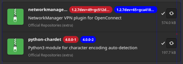
The incredibly strong, aggressive color is put on versions, while action icons are white-black. So non-actionable element is stressed while actionable is undifferentiated. The fact that this version color is so strong within basically colorless UI makes it unbalances and unpleasant to look. It really looks as if I could click on the versions.
Don’t get me wrong. There are improvements, but we are not talking about them because there is no need to. New UI has numerous issues that need to be changed.
What is disappointing is that when a new app version comes, it comes with many regressions and those cover the overall improvements. So it’s like: fix this, but break things that are good… WHY? This leads to constant lack of optimization and unnecessary work.
Some pamac features were sub-optimal, but now they got just worse. It’s hard to see the good things and all the hard work behind it. It’s not a good development direction and shows that the developer doesn’t understand fully its target group and how we use its app…
Many bad features of pamac weren’t resolved so it is intensely disappointing when the developer focuses its time and effort to… break things, instead fixing things that really matter, like:
- adding packages to ignore list is just ridiculous, and now it got even worse
- illogical tools placement in preferences didn’t change, they are still in place where a normal person wouldn’t look, so at first glance, pamac may look as if those tools didn’t exist.
- lack of reinstall button
- UI following Gnome design, which is bad choice, because pamac is not Gnome app and is used in Qt and other environments, which creates alien look outside Gnome
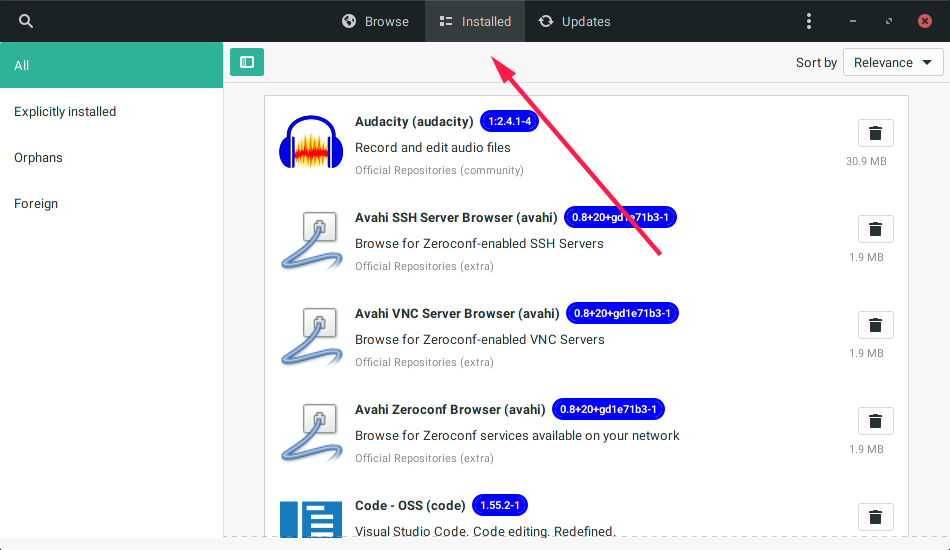
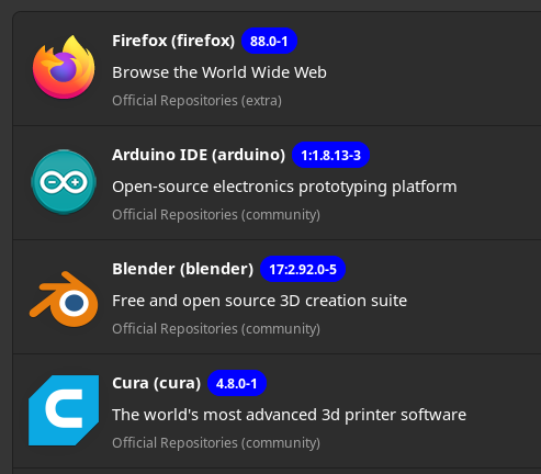
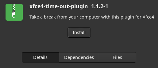
See this package page. Do you really thing that Install button should be so small and un-colored?
From most standing out positive changes:
- better menu structures and lack of confusing, multi-leveld drop down menus
- snappy UI
8 Likes
Also, after every few updates (being performed) there’s now a pop-up with a restart button. The highlight color is on “restart” instead of “close”. By reflex, you’d think of clicking on restart. It has me every single time before I eventually realize I’m on the verge of a big mistake (uptime is important).
Since when do we as Linux users should restart after every couple of updates? This is not Windows. The stress should be on “Close”.
Well, on rolling releases reboot is often needed, especially on Manjaro, when on stable you get almost always updates with kernels. Without reboot virtual machines, certain GPU drivers and other won’t work. Also, you test if everything went fine.
I think that pamac has built in check that recognizes kernel updates and prompts for reboot which is a good practice. LTS systems are a different story.
1 Like
I have rebooted maybe 6 times in a year, one of them was unintended (due to that change).
If you don’t use Nvidia drivers, virtual machines and few other elements that are broken after update then you will be fine. However, most users do need them.
It’s also common that the system won’t boot after update. You won’t even know that something is wrong if you won’t restart the system.
If you wish to reboot 6 times a year, and it’s working for you - fine, but as a good practice on rolling system, reboots must be done after major updates to ensure stability and functionality of the system. It’s simply safer that way.
If you reboot after a few months and then the system won’t boot - how will you know which update is at fault? What to fix, where to look? It’s a risky behavior.
My system was installed ca. 5 years ago, and I can say, usually once a year or once a 1,5 year there is an update which breaks the system. Quick reaction and backups can save you a lot of stress. If you stumble upon such update and do another updates, it’s possible you will never fix the system. So for sake of stability, frequent reboots are a must.
Uptime is only important if you run publicly used servers.
3 Likes
A word is always self explanatory, but you have to read it first, then becomes explanatory. Then, in same context you no longer read that text for the second and third time, so it remains the color and the size of the button. Same function can be achieved by smaller button, icon instead of text, and is not visually competing with the application icon and their description. Or is that important that the button of install and unistall has more decorations than anything else?
Yes, are a bit aggressive, but also depends of the theme used. For instance in Arc Dark that strong blue is nt so strong anymore.
Probably is a static color choice, and in Adwaita dark theme is bearable, even tho can be better
We only talk, and i’m quite into it, not trying to deceive myself or anybody else … even tho there is a better place for it. maybe a moderator can move all the discussion here
Since i renounced to be a moderator, not sure, even if in the team, if i can move things around in the forum. Not much time to test right now.
I had a decently working engine on my car, the service took it apart and put it back together, was not so good, i took it apart, put it back together and is working fine for 12 years now. Get my point? But i doubt @guinux is sabotaging his own project … so, i really don’t quite understand why someone could come up with such thing to mention.
Wasn’t that discouraged as could lead to partial updates? If a newbie (even if i don’t like that description) adds packages that should not be ignored to the ignore list and breaks their system after update, who will be to blame? Manjaro again?
Pamac GTK is GTK and GTK seems to go towards GTK4 following libadwaita that is a Gnome thing … Qt version is on works by @LordTermor and will follow the Qt guidelines …
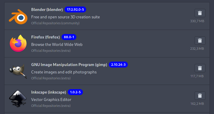
With your theme, it might be so, but look at this beauty
And looks the same on pinephone

Sure, needs more tweaking and arrangement, and will always be improved.
Reflex you say? So nobody reads what is on buttons anymore, so is not required to have text on them ![]()
Sorry, but there seems to be a huge gap in communication. Are you color-blind? Word or not, the lack of color and black-white, indistinguishable icons are the problem. Many people in this thread agreed. You have to stare at them quite a while. It is HUGELY inconvenient, especially if before this wasn’t the issue. This is a usability downgrade. Besides, having word+color was the best usability choice. Icons are good if you need to pack a lot of various options in a tight space. However, I understand than on mobile when space is sparse, this may work better, but even on Android when you do to apps, you get word (Uninstall, Turn Off), so I’m saying that using icons still not the best UI decision in this case.
This wasn’t what I meant. It only shows that if a developer has a time to tinker with non-essential things and yet ignores painful, more important issues, he lacks the overview of user priorities, at least this is how it looks on my - user end. I get that he merely tried to make the app mobile friendly, but when I see things that piss me off for many years straight, and they are still not fixed where I don’t benefit from mobile friendliness, it’s irritating. I know, I know, he is sparring his own free time to develop this app and kudos for him. I feel that probably test users are not the best representative group and thus not the best advisers when it comes to usability for average Joe.
Am I at fault that I didn’t submit any complaint about usability problems? Yes. Frankly, if there are too many issues, it’s demotivating to be involved in a project and this is how I feel with pamac or wayland or… you get my point, hopefully.
This is off the point. It’s for more advanced users who know what they are doing and yet want to have the convenience of using UI instead pacman.conf. Yet the convenience is completely lost here. This is so obvious that I can’t understand why this wasn’t quickly fixed. Maybe because advanced users will go to conf seeing this abomination and don’t waste time complaining aloud. That is what I was doing most of the time but it doesn’t mean I was oblivious to the issue here. I do prefer UIs instead editing configs, so it pains me and since it’s related to the topic we discuss, I’m mentioning it now.
Isn’t it a waste of time and effort to offer app suitable only to one environment where Manjaro users use many? GTK is used in Gnome but is not Gnome exclusive. There are many GTK apps that have normal, useful UI and don’t look out of place outside Gnome, for example Filezilla. My point is, universal apps should have universal UI. Developing UI for Gnome and then doing the same for QT is a bad choice. It’s been two years or so and pamac-qt is nowhere near to be usable. It was better on the beginning but with all the changes, the project slowed down and is not visible anymore. I doubt it will be finished, especially that the UI constantly changes, so it’s like chasing a wind. This is usually the problem with all GTK apps, the break easily with GTK updates, especially those Gnome based ones. Those independent of Adwaita UI, seems to be more resistant.
Looks better but still not ideal. For me the standard of program managers is to have distinctive install/remove buttons (green-install, red-remove, a good standard IMO). This feels lacking here. This is even a pattern in the present UI, the most important buttons are almost merging with background and other functional elements. This is again, bad UI design.
This wasn’t a response to my text, but I add my reflection. Words in buttons (if possible) increase highly discoverability and usability on the beginning making UI more beginner-friendly or friendly for infrequent users. Icons only buttons are for more expert use and that has sense for programs like GIMP, LIBRE OFFICE - you need to learn those anyway, no other way around. Apps like pamac are a different category.
Again, test developers are often IT inclined users who lack of feel for average user needs, and it looks like this problem happened here. although pamac is or should be aimed for average users.
5 Likes
I prefer tilling with no gaps …
And even if i’m … what are you going to do about it? How does affect you exactly? Is not contagious via forum, you know?
No, i don’t. Is not a painting, and i’m not blind either …
You made it even worse. Now you are in charge with the developers mind and time too. Good for you …
What does wayland have to do in any way with Manjaro or Pamac? Why you bring it up? Are we going to discuss that too? Are you directly involved in those projects and now you are demotivated? Sorry about that …
Is ON the point because Pamac makes no distinction between advanced users and newbies.
![]()
Was never my business how other spend their time and effort for their projects, nor been disappointed, unless i was directly involved … Maybe you are …
Like Adobe is doing Photoshop for Mac and Windows is a bad choice ? OK then … If there was Gimp written in Qt i would use that instead in KDE Plasma. If there was Krita in GTK+ i would use that in Gnome or XFCE install …
Nobody forces you to use it. And, is either important to be done quickly or is it a waste of time? Can you make up your mind and not hold two opposite positions about Pamac-Qt ?
Oh, but i recall all the same discussion a while back, and before that … same story, and seems to always be people upset about decisions taken.
There was no refection before yours, it was about reflexes … decisions either made as a habit, or actions performed without conscious thought as a response to a stimulus, and the stimulus was the color of the buttons, or the lack of …
Ans as was mentioned already:
Let me explain something to you. This signs are known even among those that do not know to read and write

This signs/symbols are known among anyone that pressed a button in a OS at least once in their life:

How big they need to be before we call each other blind ?
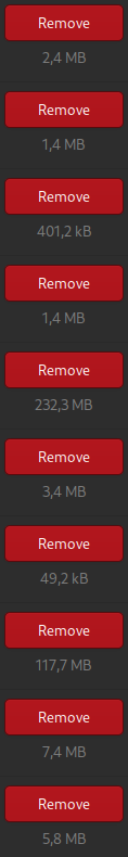
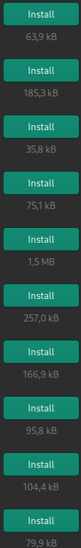
On the other hand, to see Remove, Remove, Remove, Remove, Remove, Remove, Remove, Remove ad nauseam one right under each other … is … quite
same with Install
By all means, i’m not into flat visual hypnosis …
1 Like
I take the Remove/Install buttons as showed above over what it is now. It’s a vast improvement and if you can’t see that, I assume you really don’t know the comfort and easiness of such a solution because of the visual color deficiency. It’s clearly, you don’t perceive it the same as me or many other users here. You don’t believe it if you won’t see it yourself but since you can’t see it, you will never believe it. No point of discussing it further. I can only assure you, color/old solution is instinctive, natural, easy, instant. The present icons are… empty, similar at glance and require uncomfortable effort to realize what is it what I’m looking at. People relaying on colors will understand how much value colors brought, those who can’t see colors the same way, developed other means to assess the visuals. However, I doubt that the goal of pamac was to develop app only for people with color deficiency, but it looks that way now. I can’t appreciate app’s progress when visually it’s just as pleasing to use as a trunk of muddy wood. This is a disaster and I can’t perceive it other way - this is how important color for me is.
Let’s move on, I won’t answer here anymore, because we are clearly spamming this thread and nothing good is coming out of it.
8 Likes
You are in a rumble with suppositions out of your reach. You make suppositions about me, that are quite far from reality, and you do the same with the rest of your arguments.
Apples and oranges are natural. Everything man made is synthetic, so please don’t list random apparent coherent words just for “likes”.
You can always make better ones and showcase here. Text, on the other hand, is not icons, text has to be read, so you can’t pretend is intuitive …
Above you said you relied on text …
Now, is either the current design that helps more those with color deficiency, or those with color deficiency will not see it, because they can’t? How is it? For the second time, in our “discussion” you hold two contradictory stances simultaneously, and you lecture me about consistency?
I’m happy for you that you never run into an actual, real disaster … and now you feel justified to call pamac a disaster.
But you also complain about them, as you did already
So, your expectations are that, in this instant, pamac should have been perfect visually, and comply with all the random operations done by users, load faster than your internet speed, and have all the colors of the rainbow, because that is important for all of you … Such “product” already exists
Yeah, i already knew you feel superior … especially since i’m not advocating strictly for your so called arguments that would not pass even in the first hour of online design classes.
1 Like
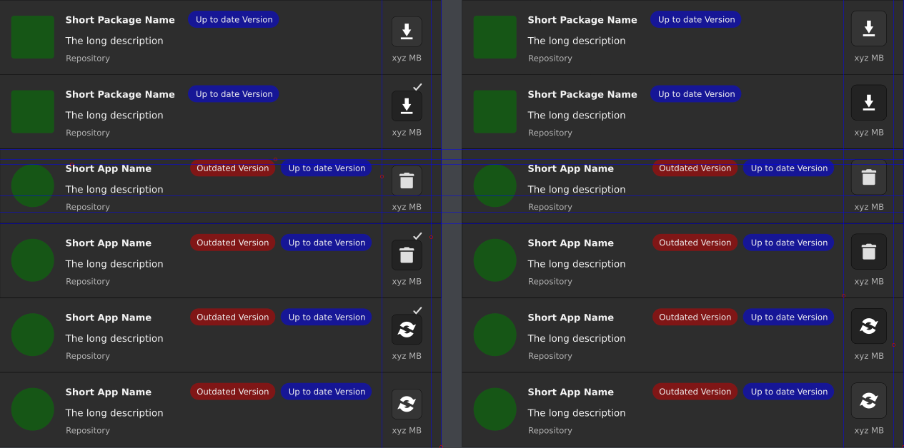
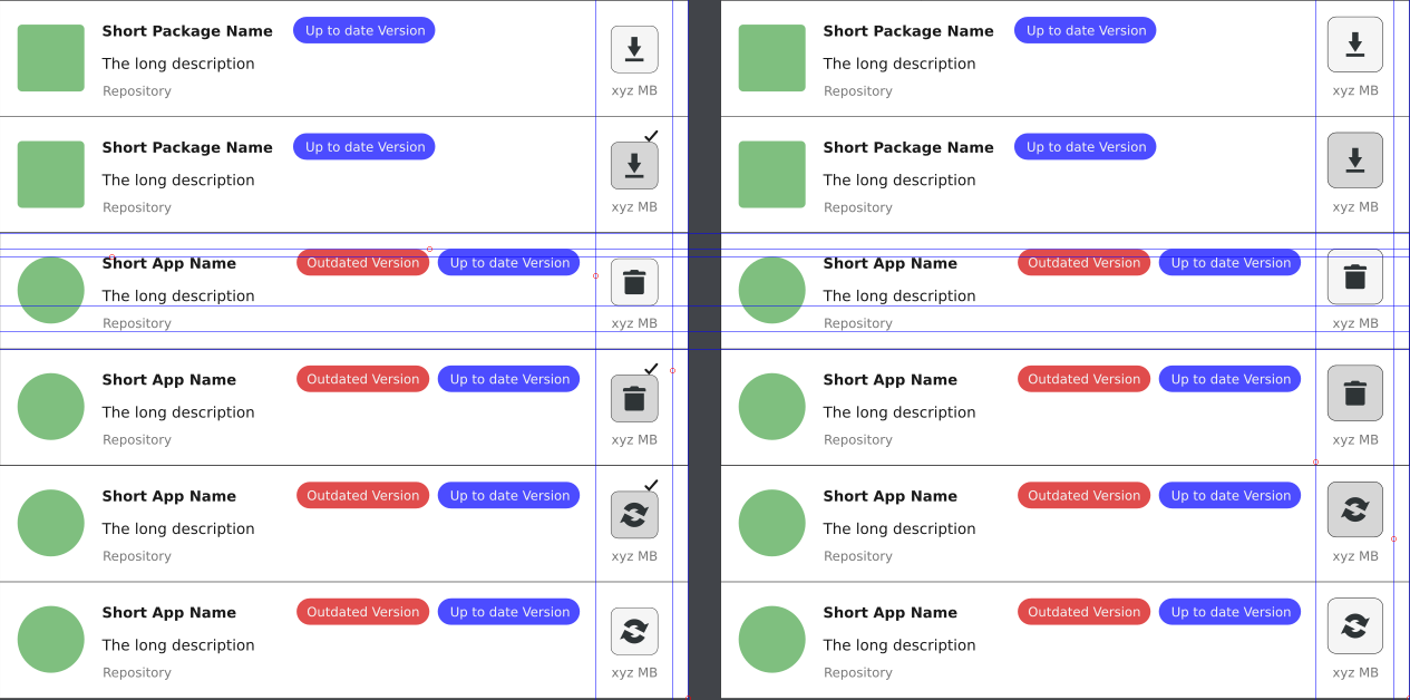
This is what Pamac UI offers at this point, in regard with install/remove/update icons/buttons:
What could be improved, and i’m not talking about themes yet, as we should start with Color Codes signification (that we can use in this context) if that is the most important:
- RED - danger, stop, emergency, highly important, severe
- ORANGE - warning - medium important, can lead to broken functionality, ignorance
- YELLOW - caution - about to proceed, ready to perform an action
- GREEN - safety, clean, ready, recommended
- BLUE - information, guidance, additional, low importance
- MAGENTA (purple) - probably the favorite color of Prince, royalty, magic
States and Pending Operations (as i see them):
- Available for install > Install = Pending for Install
- Installed > Remove/Uninstall = Pending Removal
- Available Update = Pending Update
- Available Update > Removed from Pending Updates
- Available Update > Remove/Uninstall = Pending Removal
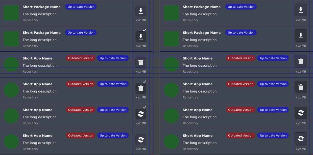
Here some alternatives, without color codes:
-
default Adwaita dark theme:
-
default Adwaita theme:
There will be needed at least two of each red and blue for versions to not fall into an visual issue between dark and light themes, and when comes to nuances of a color, good luck to please everyone …
- this is how should look like on Arc Dark theme, just as a side note:
Now colors for the buttons to match the install/remove/update and pending + the usual colors significations…
-
Adwaita dark:
-
Adwaita and probably most light themes:
-
Arc Dark as side example:
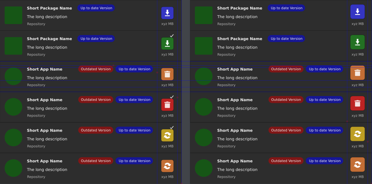
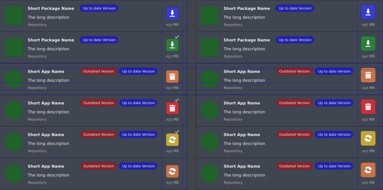
To me it looks way too colorful, and i excluded applications and packages icons on purpose. Once they are also there, the entire UI will look crowded like a Christmas tree …
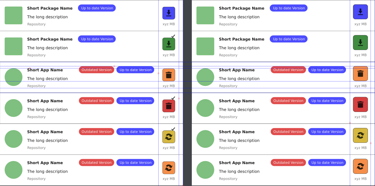
Based on all this, the state buttons and pending operations should have this nomenclature:
-
 Available install
 -
 Pending install
 -
 Uninstall option
 -
 Pending uninstall/remove
 -
 Available and pending update
 -
 Update excluded from trnasaction
And of course, you can picture the dark icons variant …
Hope this helps, and makes it more clear for everyone, or give you the start to make your own coherent proposal draft, directly to the point, without personal snarky remarks to devs and other forum members.
If my estimations are correct, this would not have a negative impact on the mobile functionality of Pamac, and visually should work too, regardless the monochromatic or colored version adopted (or not).
Cheers!
10 Likes
Oh now this makes sense. One question though: is it really necessary to have a colorful highlight of a package versions? Maybe in package details page, but when they are in a list - why bother with highlighting?
3 Likes
So nobody complains they do not exist … ![]() As i see it so far, people will complain about everything.
As i see it so far, people will complain about everything.
1 Like
Ah, someone asked for that? Hm… I am maybe wrong, but I believe that relatively small colorful elements should rather indicate an “actionable” bit of interface, not something unclickable. By looking at those versions labels I get a wrong perception that I can interact with them somehow…
5 Likes
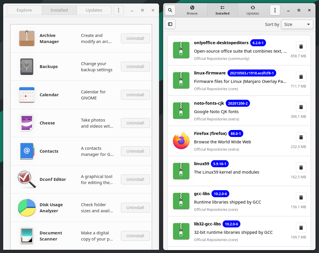
Don’t know exactly the story behind it. On Discover is like this for example:
If i recall some comments about it outside of this forum, someone pointed out of being dry, and lacking visuals … So, maybe that got taken as a good point and considered to be “improved” ![]()
With color or not, layout looks unclear when all operations are displayed on screen (with color looks “happy”). From what I’ve understood:
- icons are fetched from theme, so adding dedicated ones will end with incompatibility with theme, not all icon themes have a proper label which can be fetched and recognize as dark or light theme.
- GTK color scheme (in Pamac) depend on theme, so it can look good or bad, depends on theme. Adding transparency (for colors), in theory should blend with background at least for most themes. Which should be less “Skittles” I guess. But we can’t be sure what someone has installed. So, this can end with “We don’t support other themes than X,Y, Z” which will be bad.
I believe this was discussed in M-team already, and a less colorful layout was chosen. Which one is better is very subjective.
For example: I don’t mind flat icons, but with them desktop looks childish. Even game consoles menu looks more mature.
If the theming part is not enough, there is a mobile part as well. Which means everything needs to look good when it’s squeezed.
I doubt, we figure out a better solution in a few days which will be pleasant at least for the majority of users, especially when emotions are involved. For now, it’s Camp A vs Camp B.
For me the bigger issue at the moment is check mark for pending operations. Bottom, top, left right it looks almost like error in code. If I figure out how to make it better I will not hesitate idea to let you know. For now, my brain lagging when I see it 
3 Likes
Just pointing that is was the initial and discussed concern since the beginning.
I don’t recall anyone asking for Pamac Skittles edition.
1 Like
It simply needs testing on the real thing, because in many cases those colors and transparencies over something else (again depending of themes) can look washed, or change completely the tint of it …
Exactly. At this point, Gnome Software vs Pamac
To me, Pamac still offers better info, arrangement, and once the base layout will be improved, then next steps should follow to make it even better.
That is why on my second proposals are removed. For me have no actual use, nor visual information pertinence. What remains is to rely in better icons and or colors … The advantage of icons do not require translations, and is not that words can’t be translated, but each translation can have longer or shorter words, and that will change the layout considerably regardless if is mobile or desktop.