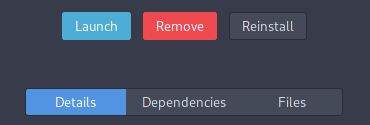
Yeah, but how is the distinction between Remove and Marked for Removal made ? Then it begs for the Install and Marked for Install to have the same visual treatment … Correct? 
It already has a system with a tick mark next to icon. So I don’t know if this needs change too.
So you both do not agree 
I missed something probably because I don’t see tick marks bottom top left and right in Pamac currently, I think he’s talking about your skittles edition.
1 Like
Currently is on the bottom of the icon. @mr_glitch was talking about that and the following alternatives i made above, to showcase that is not coherent with the rest of the UI regardless where is placed, and he just pointed that out, as i also did …
This is how I see the tickmarks in Pamac, all at that place, but OK.
I know … have you seen and compared the next images i posted in the same comment ?
I’ve just made a quick check using Google Translate. Install takes up to 14 symbols in different languages, sometimes it takes 3 words (rare case), but usually it is about 8-10 symbols.
Remove takes less.
I honestly cannot consider this as a major obstacle.
I know nothing about coding GTK apps but I assume it should be possible to set dynamic widget’s length and height with maximum possible values and allow some space for it among other elements.
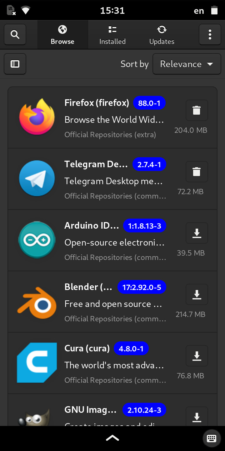
Test it on mobile and you will run in the same situation as this:
Or, you will have buttons that scale, hence make the all UI move around, or you establish the maximum size and will not fit on the screen.
Ouch. But those are not buttons. Those are tabs.
Install button sits happily in the center.
Regarding those tabs, why details and files ones are so wide with a ton of wasted space to the left and right? Shouldn’t that tabs headers be scaled according to their contents? I imagine this could be set only for that row.
Another story is about buttons in app list view (e.g. Installed). If you set a fixed space for action buttons on the right, then some part on the left (description, version) will shrink but why not? In a list view, it is not possible to read full description anyway.
Fine … because on Desktop, if those “tabs” would match the size of the text, with the inside spacing, will look odd in this situation:
I thought i made the point about that …
In Romanian would be Dezinstalați - that is as good as drinking milk with vinegar IMO … (don’t try it, by the way)
Edit:
Let me try to add more info about this with another screenshot from Phosh Pinephone.
Oh no, only milk alone is enough to make me sick so sure thing no.
Yes I remember what you said about colored buttons with text. Sad. I don’t see it like that.
Btw funny enough we’re talking about translations of button text while Gnome shell and settings still has no translation (to Russian I mean) for Restart action and Keyboard settings.
This is just a sidenote.
I can understand over sensible souls … But i see sad to be something else, not software related. Anyway, wish a good day.
So maybe someone of you guys might start an issue on our bug tracker, if that all is so important to you guys. Pamac is not only used by Manjaro. Other Arch-based derivatives use it too. And the only place our developers mostly look at is the issue tracker not the forum. The forum is maintained by the community, and most of us have to follow our real jobs and projects we do for Manjaro.
3 Likes
You too.
But what puzzles me. You said visual hypnosis or something. Especially when presenting those buttons as you did: with a cut of the right area of the app list. But at the same time there are blue-highlighted versions near each and every app’s name. Isn’t it the same? No hypnosis there? 
I’m just trying to understand your concern with it.
2 Likes
Yeah, this is the worst part. In mockup everything can look beautiful. One change in Adwaita and then in other themes can end with a mess, now or future. There is too many variables needs to be considered. I understand that decisions need to be taken carefully.
I don’t have much to say here, I’m following Manjaro profile on Mastodon, and I’m used to it already. Package description under name, is much better idea than putting it in separate column, so thumbs up for it. I can argue a bit about icon buttons borders, are they are necessary. For mobile, probably will be pretty natural, but for desktop not so sure. So I’m leave it be as it is.
I understand that, so I’m not even try to argue with it. I had similar experience in that matter last days (on desktop), so icons instead of text is reasonable for me. If I can be radical for a moment, complex programs shouldn’t be even translated from English. It depends on language, but in English option names are shorter usually plus they can lose general sense while in translation.
Don’t have much knowledge in that area, but if it will be possible to detect theme type, adding custom icons for Pamac would avoid confusion, because everybody will have the same icons in buttons.
There is a much easier way, which would be worth consideration - font icons. They always have the same color as text, so the theming part will no longer be an issue. Don’t know how creating process look like, and how difficult it is. But if there is no icon font suitable, there is always the option to create one, so they will look how we want
There are not two or three apps/packages with the same version text one under another. Is not only the color i mentioned there, but the actual text: Remove/Install, that after a while neither you, nor others will actually read it again, so it becomes just a shape with color, that can be a rectangle (doesn’t fit on mobile) or a square with an icon … round or triangle doesn’t make much sense … And we only talked about primitive shapes (not to be confused with obsolete)
So, based on the above, I can imagine that a happy middle ground solution could be using some in-house Pamac icons like the following?
Install

Install pending

That’s just a quick and dirty mockup.
UPD: what can I say. I’m glad that I’m not using Pamac due to other reasons and I don’t have to fiddle with its design…
1 Like
Either way. Remember, space is a visual element too, and depending on how big the rounded square is, the inside icon will become huge in some circumstances …
You have to see all to scale 1:1, otherwise is giving a different “feel”, that is why in this context, the second example here, shows the UI at 1:1 on a 1920x1080 resolution, but you have to click on the image:
The graphical elements can be broken down/created separately, move to next layout stage, then put them back together, switch colors for what could be most used themes … Sometimes that can take another round of tweaking, mowing things around, etc. Even choosing the right font family sometimes can be tricky …
Just my 2 cents but I like the new look and it hasn’t caused anything to break on my system.Until I read it here I had no idea only one person maintains it so my hats off to them.I can use the terminal and do at times but I like being able to see I have updates click on update and done.It looks ok to me on KDE and the new Gnome.
1 Like