Pamac Pending list and button contrasts

Hello,

I’m currently using Pamac 10.1.1-2 and during the GTK 4 adaptation, there are 2 irritating things that popped up.

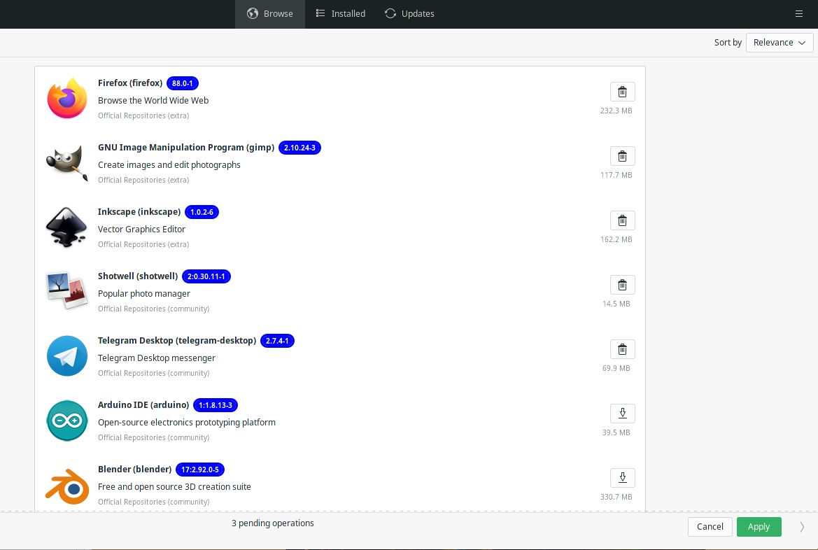
  1. I can’t find the list of pending operations anymore.
    A few weeks or months ago, there was still a dedicated tab for a summary of the pending operations. Now there’s just a line at the bottom to apply or cancel with “2 pending operations” but I can’t find where to see them listed exclusively and deselect some for example. Where is it?

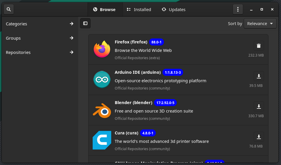
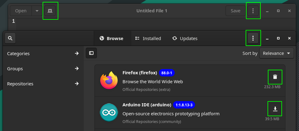
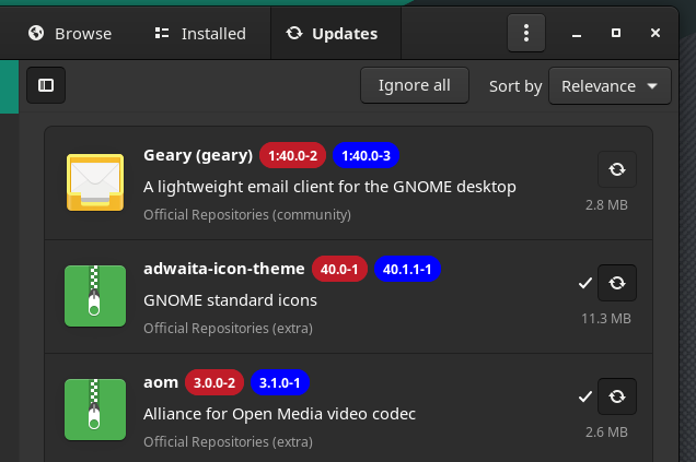
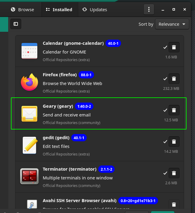
  2. With Matcha-Sea theme (the default for GTK environments I believe), the download button (to install/build) and the thrash button (to remove) have no background contrast between them anymore. It’s now very hard to distinguish what’s installed at first sight (without straining your eyes). Previously, installed packages displayed a green-sea button that made it easy to know if a package was installed or not.
    That background button color is now only applied when you have selected a package to install/build or to remove.

5 Likes

Hello,

Just wanted to say that this is the proper way, in the forum, to address some issues related to Pamac, even tho we might disagree. Kudos for that.

And that showcases the pending operations and those packages are promoted on top of the list when in Browse tab.

image

It seems that could have some little work done tho, as at this point you have to switch tabs then back to Browse to see them on top.

1 Like

Regarding button contrasts, look between installed and non installed:

Now the background color is applied to candidates for operations instead of installed packages, like Pending/selected here:

Which means, you can’t quickly visualize what’s installed or is not.
And you can’t visualize quickly if you’re installing or removing (as both our images show).
All you see is a contrast between what is and what could be. This doesn’t seem like a proper way to me. It felt much better before.

Regarding pending operations:

There’s nowhere I can find what 3 packages I selected for installation or removal, they are not promoted anywhere on top or anything and there is no tab listing them. The only way is to remember which one I have pending and search for them individually. That’s a hassle.
A few weeks ago, I still had the pending tab… Is it supposed to be gone?

PS: I’m on Unstable (with Gnome 40), if these are just bugs, it’s all fine and my bad for bringing it up. If they are design decisions, I’d be really surprised.

4 Likes

Just for the record. v10.1.x series is still on GTK3 and libhandy1. Porting to GTK4 is done in v11.x series of Pamac.

2 Likes

Yes, for many, the power of habit is also a factor, but that interface was not working on mobile at all.

The colloquial design word can be used here, yes, also decision… but, as pointed above:

so, many aspects of the 10.1.x, for many people might look off. I recall that samohow people got unhappy also when Manjaro switched from pamac-classic “design” to the 9 version … :slight_smile:

1 Like

That’s strange because the tabs look like the usual matcha-sea GTK4 porting (see last screenshot above), as in Gnome-system-monitor, etc…

@bogdancovaciu

I could live with the lack of button contrasts, although I really believe it’s bad (you can see in my 1st screenshot how hard it is to distinguish, and it’s even worse on a 4K screen) and my eyes hurt by just trying to distinguish installed/not.
if it’s a design decision, that’s alright. I might just (sadly) switch to a better thought out theme or modify that myself.

But dropping the pending tab or any kind of way to find what are the pending operations, I really don’t get it.
If I have say 15 pending operations and decide to revert 5, there’s no way to do it quickly, I need to remember what I selected previously then perform 5 different searches (and scroll to find the selected ones down the list).
Only solution is to have a good memory or to close the app and start all over again and there again possibly forgetting what you wanted in the meantime.
I mean that is a serious downgrade. This has to be a bug.

To both I have no problem changing my habits if I can do things in an alternative way, never have never will, but here I don’t see how this could be an improvement if I can’t find my pending operations at all anymore.

4 Likes

I prefer Adwaita Dark variants (or Arck Dark on my KDE install). For me there is a clear visual distinction, the install and uninstall buttons do not compete with the icons of the apps or packages. I use Pamac in the most compact mode possible, the window will never be larger than this

Then i guess you have the same issue with Text Editor buttons, especially when in inactive mode, and most GTK+ applications.

Is a close Gnome design guidelines followup …

Yes, i imagine doing this every half hour can get frustrating.

That was never bad to have, in any circumstances, and like any “muscle” - practice is the only way to keep it in a good shape.

But is it entirely missing tho? I just mentioned above how you get in Browse tab the pending operations promoted on top of the list.
Here is an example:

If i want to uninstall some packages/apps from the list of already installed ones, then i switch tab to Installed, and the pending are there, on top

And right now, if i switch to Updates, then are there all the updates available. If i click on an app that has an update, and chose remove, then i see it in the Updates list as available, but with the sign that will not be updated, and in the installed tab will be part of the pending to remove apps, on top of the list …

Example:
Geary available for updates, but marked by me to be removed, will not be updated

image

In the Installed is now part of the top list of apps to be removed, pending operation

Hope this helps to figure out a better workflow … while things will be worked out to improve Pamac, because i’m 100% sure, all the work was done on it so far, had that goal in mind.

1 Like

I think that is all everyone wants. Any time something is changed/updated there’s always things to be tweaked improved. I totally appreciate how rude some of the posts in the testing thread were and they really weren’t constructive at all.

Hopefully there will be some helpful feedback in this thread and pamac can work well on both mobile and pc

Yes exactly, Pending Tab was removed because we view them on the top of the list.
Concerning buttons color, I will consider adding it in a next release.

5 Likes

Adwaita is one of my least favorite theme (to be polite). It looks outdated (2009-like), dull, with a weird inconsistent prominency for buttons, ii my opinion it’s the worst in terms of look, feel and integration. I am not ever going down that path. :slight_smile:

Exactly the weird inconsistent prominency I was explaining. Not all themes are as bad and the text editor or Gnome settings, etc… feels great on any other them without the issue you point at.

Honestly, pragmatism in terms of design is much better. Keeping things easy to manage.

Almost entirely missing yes.


As you can see, that’s only 2 out of 14 mixed pending operations. There are 4 others + Telegram again in the Installed tab. Still 9 missing from the changes I made. I did them randomly before writing to you, and I have absolutely no recollection what they were, nor any way to know (except for browsing every single package in all the tabs and sub-tabs.

OK, I understand what’s going on. In the Browse tab, Pamac is only showing the ones from the last sub-category I visited (it’s just “Featured” if I didn’t visit any). It’s like it never comes back the entire way to a globalization of all packages.

Hence, it doesn’t show me the whole summary on top. As I suspected, this is a bug.

I would be alright to have the 14 of them being listed under “Browse” on top of all packages and no pending tab. I just don’t even get that. Which is my problem.

I will try to downgrade.

2 Likes

Have you told that to Gnome developers that will actually use gtk4 and libadwaita only for developing UI for mobile devices hence the entire Gnome 40 on?

Is either the theme or the app? If themes act differently, then the theme developer has to address them, if is the app, then all apps based on that UI should lack the consistency.

Apple has some design guidelines, IBM slightly different guidelines, Material Design stands for a bit different guidelines, Gnome has their own, the developer has to manage to follow one, not all (because that would be a true visual mess), and the user manages to get used to it … I guess you referred to all? :slight_smile:

True or False can’t be almost …

Why randomly? By this logic, a car should have doors in all directions i want to get out, or in, randomly.

Applications and packages i think are sorted and dealt with differently, so if is a mix of installed applications and packages you want to remove, for example, then only the applications will be shown in Browse, the other will be in Installed. If are not installed, and you want to install them, then will be shown in Browse, but because there is the Category / Groups / Repositories and each has their extra detailed entries submenu, then they get lost, being part from different groups/repository etc
Then there is the sorting part: Relevance / Name / Repository / Date / Size that adds a bit of extra complexity to all …

It probably needs just another ALL entry above the Category / Groups / Repositories (that might increase a lot the load time) but then all the random pending entries would be there.

That’s an idea I’ll keep in mind

2 Likes

If you decide to add button colors in the future, maybe adding yellow or blue (or whatever will be proper) color for pending operation will be a good idea. This will save some space (on mobile) for package title and description because pending icon will not be necessary anymore.

Yellow color would be a slick idea I guess because the color scheme will be similar to traffic lights. Everybody knows how traffic lights work, so it should be easy to catch for everyone.

Just a thought :slight_smile:

2 Likes

Wow! Thank you! That was my biggest concern with 10.1, to me the biggest issue. Colors were important to instantly differentiate installed packages in a list. And that regarding if it is for mobile, or not.

:+1:

//EDIT: added my album back to this thread Pamac new UI difference - Album on Imgur where we can see the color issue better.

Thank you! The lack of contrast between buttons and an overly thick title bar (at least on Breath2 theme) are pretty much my only issues with the layout. :heart_eyes:

Like they have ever listened to the community right…

2 Likes

Are al,l in the community, designers ? :slight_smile:

That’s really all I need to compensate for the Pending tab, indeed!

I don’t mind which one to follow. Visualizing all your pending operations in one screen (on top of others in Browse is “one screen”) seems to me as the basics of all basics. There is no simpler way to deal with your pending changes. :slight_smile:
Pamac did that, Synaptic (for debian/Ubuntu) has always done that. It’s common sense. Centralization of your pending operations.
Reinventing the wheel can have its advantages, I’m not against it. But, if I understand correctly, you’ll now need to browse through 10 different screens (9 sub-categories and the Installed tab) for trivial installation/removal of packages. Versus one before. If that’s not losing quality for no valid reasons…

Randomly, because when we users install or remove packages we pick some here and some there. I’ll install budgie-calendar-applet then think about libinput-gestures and decide that Chrome is a worse Chrome than Edge and needs to be gone, then if I want to build dash-to-dock progress towards Gnome 40 I now need sassc installed, etc… We don’t just go and install firefox, then close pamac and reopen it to remove the disappointing new cursor theme we just tried then repeat to install smplayer-themes. We do everything we think of in one go, and being able to visualize the summary of these operations seems as a logical expectation.

85% (2/14) is closing down on 100% and “almost entirely” is then a good wording. :wink:

Gnome is made by devs for devs. None of them are design specialists. And they do indeed never listen.

Oh boy, you got me started. This is bad. :smiley:
I don’t care about Gnome devs, as they don’t care about anyone else beside themselves in their bunker far from any kind of reality of their users.
To answer you, I trust 3rd party theme creators, who have a history of providing the community with a few hundreds themes more consistent and more integrated than anything adwaita could ever achieve in terms of refinements and professional look. And they did it on their spare time (Vs mostly Red Hat employees).

In general, it’s adwaita theme. This is a non issue for most other themes. The more a non Gnome app follows Gnome guidelines, the worse it usually gets in terms of theme consistency. It’s of course partly subjective, but the specific adwaita prominency inconsistency shown above is a good way to objectify the reasons why it’s bad.
Once again, I trust theme developers to correct Gnome devs mistakes on this. Among many others, Arc did an amazing job at that, becoming the de facto standard GTK theme, and Matcha is building very well on it. But it really shouldn’t try to absolutely follow adwaita (within the “burden of maintenance” trade-off of course) or it’ll lose its added value.

Aka you actually testing things around and you are still in the learning phase of what, how, where and why you might or not need something. Not so experienced then, and that is nothing derogatory, but wouldn’t that defy the very notion of giving advice ?

Hope you never came across a doctor that when will reach 85% of the operation will say: almost cured and leave because you are almost entirely safe :wink:

And where do i see your portfolio in UX/UI design ? You know, i’m still learning myself a couple of things here and there.

I was a boy long time ago, don’t push the friendliness in the wrong direction.

And you know what “antecedent” means?

And those theme creators, if there was no “platform” to begin with, or developers you don’t care, on what would have they been showcase their themes?

I’ll say with confidence, you have no clue what you are talking about. No offense. Apple achieved a “professional” look of their OS interface only not long ago. I would have to write a book to explain, and nobody will read it, because all already know everything, and they are all professionals.

Is mostly common that is GTK+ or is Qt, or is Electron, or is JAVA, and each follow something or in some cases many things. As beautiful, for last example, the Material Design looks like, on their documentation and examples, it fails short in many regards when comes to a complete system …
Colors on themes, as long as they do not compete visually with what i’m doing, then is fine.
If everything was in rainbow colors around us, then the real rainbow will not be visible anymore.

I’m not testing things around. I was reproducing my usual behavior in the fastest possible way for the sake of showing you how impractical the result was. I needed a few operations, which ones did not matter, so I didn’t need to spend 5 minutes on it.
I’m not on the learning phase either. Being contemptuous is not the best way to reply to users.
The lack of button contrast has been pointed out as well in other topics, this is just trivial obvious stuff I’m pointing at.

“Oh boy” is a standard expression in English, it doesn’t mean I consider you as a boy.
Wiktionary: An expression of dismay, resignation, frustration or annoyance (sarcastic).

For the rest, you’ve been rude to me since the beginning, and your reply doesn’t bring much anymore to the topic, so I won’t add fuel to the fire.

1 Like