Pamac's new look

I just noticed pamac’s new look. I hate the change. It’s unintuitive and unreadable. The biggest issue is, in the old UI there was a coloring that quickly was informing about what is installed and what is not. Now we have those black and white icons. They are not so well readable at first glance. I hate it!

Try to recognize which packages are here installed in a fraction of a second! In the old UI it was easy. Now, not anymore.

5 Likes

I can’t say I hate anything in the new layout, but yes, it is a downgrade in seeing what’s installed and what isn’t at a glance. Using a background colour on those tiny install and remove icons would be a great improvement to how they are in this version of the GUI.

As of my own criticism, I find the title bar to be much taller than necessary.

What I am glad is getting rid of all those drop-down menus :100:

7 Likes

I have to agree that the readability is really hard in the new Pamac, I think using the good old RED color on the REMOVE button could be a simple fix to that.

I also noticed issues in the preferences where some items were not having the proper dark theme like the rest of the UI, can you guys explore the Preferences and confirm if it is on me or not (preferably if you use a Dark theme). It could be an issue with the Materia Dark theme I use, but I don’t want to reconfigure everything (it would take less than 5 minutes OK but not in the mood to reset everything in my theming to check for a bug).

And also I couldn’t find a place where I could view the pending operations to remove/deselect packages I had selected to install like before.

That should probably be reported on the Gitlab as pretty sure everything we say here about it will not be read or be ignored.

5 Likes

Yes I’m running Zorin Os-Dark theme (on cinnamon) and the theming on preferences is a bit wonky for me too.

Agree with your comments about the new ui as well. I still prefer the old ui but your suggestion would definitely be an improvement :+1:

1 Like

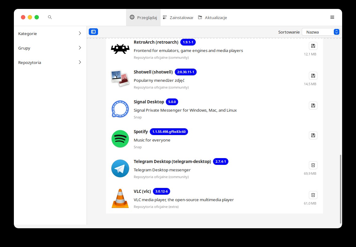
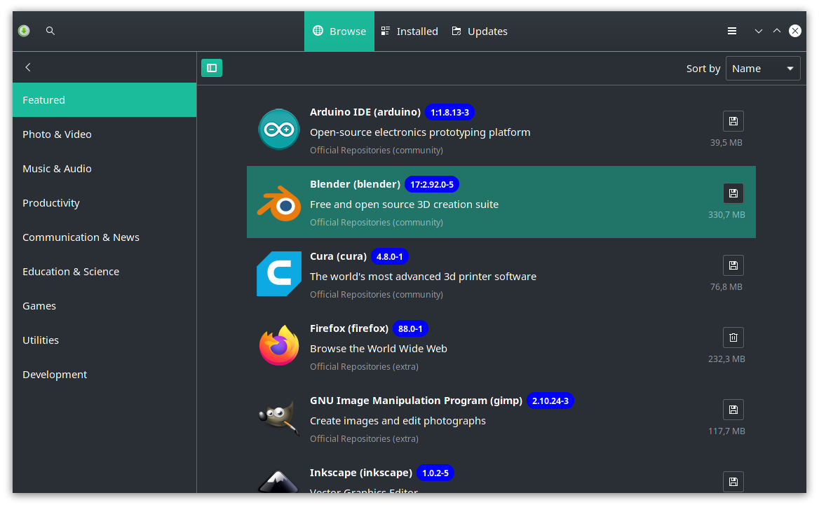
There are more problems with new pamac. Issues that were present in old version got even worse. For example, adding packages to ignore was very, very inconvenient. No search? Why. Now, the UI is even worse, when we click accidentally on ANY package, it will add to the list, whether we want it or not. This is the most stupid and primitive UI possible. Pamac’s UI was broken from the beginning but instead scratching it completely and starting anew, it feels like an experiment without a clear goal, like: let’s try that, doesn’t work, then try that, etc. Instead, designing a functional UI project first, it’s just trial and error, just like Gnome itself…

Pamac as a tool is OK, but the UI is just horrendous. I suspect that most people accept only because they got used to it. But it doesn’t change the fact that it’s UI design is just bad. I’m tiered of its many issues, so I decided to speak up. I can’t believe I am the only one unhappy with the UI. The problems are so numerous, I just don’t have strengths to write about it. I’m just tired with it. It was a crappy design from the beginning, and it got only worse.

Sorry to be so negative, but sometimes things must be spoken. Please, note that I’m not talking about the app and what it can do. It’s a great tool, only the graphical interface is done badly and that is why it’s super inconvenient and anti-intuitive.
For example: pacman cache cleanup or ignore list are in Preferences… WHAT? Where is any logic in this? Preferences should be PAMAC preferences. Cache cleaning, ignore list, history - those are additional tools within Pamac, so they shouldn’t exist within preferences.

If you want more:

  • in new UI: if preferences window is opened and the app minimized, you can’t un-minimize it (clicking on it does nothing), I have to use windows preview to get to the proper window
  • horrible discoverability, additional options are hidden so well, that I was sure that new UI lost them, but then I realized, I have to click the arrow to unwrap the list, this is more of Gnome and Android like nonfunctional and badly designed UI that should be banned from desktops
  • when options stay opened for a longer time and I want to close the window, it asks me for password!!! I can’t close it if I don’t give the password… WTF?

To be fair, some UI elements are improved against the old version. No more those confusing multi-leveled drop down menus, only one remained as it should be. UI is more responsive now. So it’s not all bad.

I may be just irritated, because pamac was downgraded to beta version again. It’s a constant experiment. However, I’m sure the issues of the new UI will be solved eventually.

Sorry for the post in advance, I had to vent some steam.

To be fair I think there is only one guy working on Pamac. I would help if I could code, but knowing that I just ‘deal with it’ and understand things will be slowly moving for Pamac development anyway so only high priority issues may be fixed quickly, and the rest will probably be ‘ignored’ as developing Pamac requires lot of time investment.

But we also have to acknowledge the issues, and even if there was some improvements here and there, I also join you to say this new version is kinda disappointing.

3 Likes

Same to me.

Pamac looks very good to me, modern and slick. Clean and tidy and not anti-intuitive at all. Maybe “Search” would deserve its own button next to “Browse” than the magnifying glass, which newcomers could miss, and the 3,5" diskette icon which people associate more with Saving than Installing is theoretically not the best (nitpicking territory), that’s all.

2 Likes

There is one program installed in your screenshot, we clearly don’t see it without searching hard for it. This is main issue to me here.

4 Likes

Maybe people find a better icon theme for Pamac readability

On my end the difference is clear, and my eyesight is not as good as used to be

What do you mean? Search works fine, even just by starting to type

image

That is probably something on your end, so windows rules as is not happening on my end on any of the installs.

Used the new Pamac UI since the first beta came out, and i had no problems. Maybe we are all deep into subjective personal preferences and expectations and present them as objective opinions …
I’m sure any feedback will be considered to a degree, and improvements will happen, just that any new concept needs to start somewhere.

1 Like

Tell me Pamac UI is clearer now: two screenshots per version, which is clearer to read, this is obviously not a subjective opinion. I’m not talking about the new UI improvement here and there, but the one second it took before to clearly spot every important info, and now the fact you can’t distinguish clearly what is installed and what is not. Click to open the album (//EDIT: added two blurred image to make it even more obvious, this is even clearer, no doubt about what is objectively clearer to see. An exaggeration of reality but I think I made my point here).

He’s actually right, open Pamac, open preferences, click the Pamac icon in Panel, application minimizes, you can’t unminimize it by clicking its icon, before clicking on something else, to then be able to restore Pamac window by clicking the icon in panel again. It is minor annoyance to me, but still the case. Seems like if preferences windows doesn’t lose focus you can’t unminimize Pamac by clicking its icon.

3 Likes

Apparently you made up your mind, hence whatever i say, you will have a counter argument.

The most peculiar workflow.

but not clear objective tho, and the objective (not as an opinion, not part of your argument) was to be able to use Pamac on mobile too, without splitting it in two version for desktop and mobile. Is just one person working on it. Now that is an objective argument :slight_smile:

Come on… Whatever, my album is clearly showing what I consider objective difference to me, and probably to most people I’m sure of that. (//EDIT: I don’t consider Pinephone users that is true, that doesn’t change what I consider a fact for desktop users in readability).

Yes I already mentioned it. This doesn’t change what I consider a fact in my album above.

Anyway we don’t have a say in development so whatever we say it is up to maintainer to do whatever he wants. (//EDIT: <= I mean whatever we say, as there is one man working on Pamac, only high priority bugs are worked on like recently with the AUR issue, see the list of issues opened in Pamac GitLab and see the backlog of issues to work on. Obviously maintainer makes choices on what is worked on due to the reality)

1 Like

Manjaro always took consideration of the feedback from community members, and has consideration for the active members. To deny that shows some disingenuousness. Your album is specific to desktop, because same interface is not working on mobile, hence, whoever comes with an album of screenshots from a pinephone for example, will dismantle in seconds that interface …

2 Likes

We didn’t even have to look at the button before to know whether a package is installed. Maybe it’s just me, but I definetely can’t distinguish small icons with my peripheral vision (and yes, I use the same icon theme). Different colors make a huge difference.

5 Likes

What I find exceptionally wrong is using a diskette icon in 2021 in general and as an install action - in particular.

2 Likes

That’s a first. You see without looking or looking without seeing ?

How about those that have color deficiency? Really glad when someone posts for the first time to give me the summary of color theory.

Not with papirus icon theme, so not something we can chose for people.

Yeah I see already, looks like @michaldybczak was using some let-me-call-it “fancy” icon theme :slight_smile:
But anyway, up there was a rational opinion on colored install/remove actions. I don’t use pamac now (since it messes with mime types and makes Ark behave wrong when opening PKG files but that’s another story), but I remember very well how clear and instantly recognizable were install/remove actions in Pamac when the respective buttons were colored. Now it is necessary to stare at each icon for a while, and that’s the main concern of many people in this thread as far as I understand.

8 Likes

Does that mean i shouldn’t be getting this message when i have an AMD-System? (Asrock Taichi x470, besides Network i couldn’t find any info about intel-chips on there)

What about linux59-rt? Not that I would need it but it still appears as an install option in Manjaro Settings.