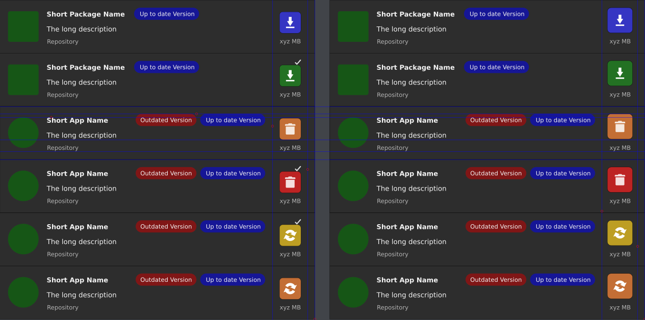
The why getting rid of colors? Before we got a big button, colored with word, it was self-explanatory, intuitive and clear within a fraction of seconds. Now I look on the UI and have to really try to recognize the difference between similar, black-white icons… Before buttons were huge, now they are tiny and unfriendly by mobile and desktop standards. This has nothing to do with being mobile friendly. This is simply a bad UI decision and clearly a utility regression.
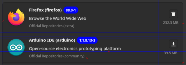
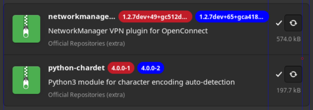
The incredibly strong, aggressive color is put on versions, while action icons are white-black. So non-actionable element is stressed while actionable is undifferentiated. The fact that this version color is so strong within basically colorless UI makes it unbalances and unpleasant to look. It really looks as if I could click on the versions.
Don’t get me wrong. There are improvements, but we are not talking about them because there is no need to. New UI has numerous issues that need to be changed.
What is disappointing is that when a new app version comes, it comes with many regressions and those cover the overall improvements. So it’s like: fix this, but break things that are good… WHY? This leads to constant lack of optimization and unnecessary work.
Some pamac features were sub-optimal, but now they got just worse. It’s hard to see the good things and all the hard work behind it. It’s not a good development direction and shows that the developer doesn’t understand fully its target group and how we use its app…
Many bad features of pamac weren’t resolved so it is intensely disappointing when the developer focuses its time and effort to… break things, instead fixing things that really matter, like:
- adding packages to ignore list is just ridiculous, and now it got even worse
- illogical tools placement in preferences didn’t change, they are still in place where a normal person wouldn’t look, so at first glance, pamac may look as if those tools didn’t exist.
- lack of reinstall button
- UI following Gnome design, which is bad choice, because pamac is not Gnome app and is used in Qt and other environments, which creates alien look outside Gnome
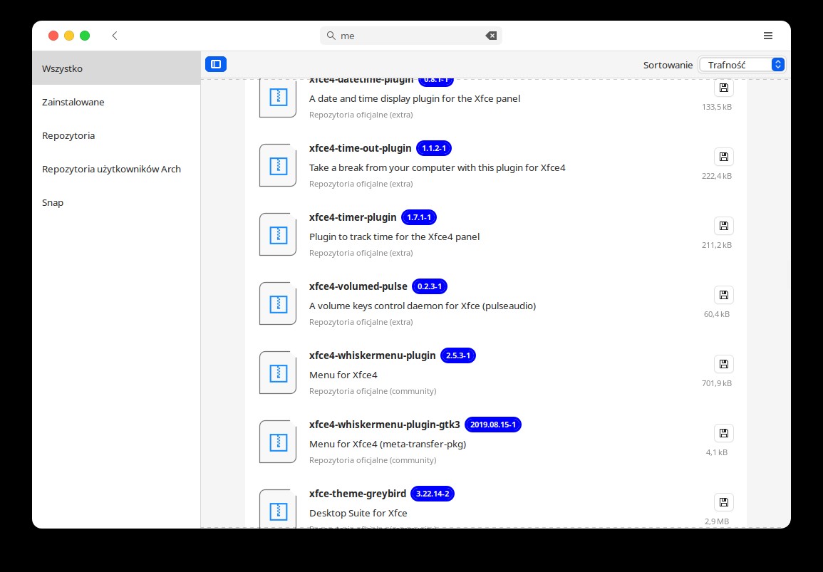
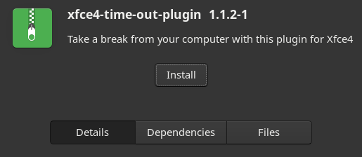
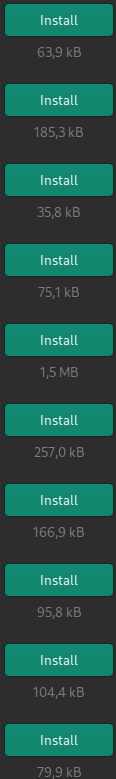
See this package page. Do you really thing that Install button should be so small and un-colored?
From most standing out positive changes:
- better menu structures and lack of confusing, multi-leveld drop down menus
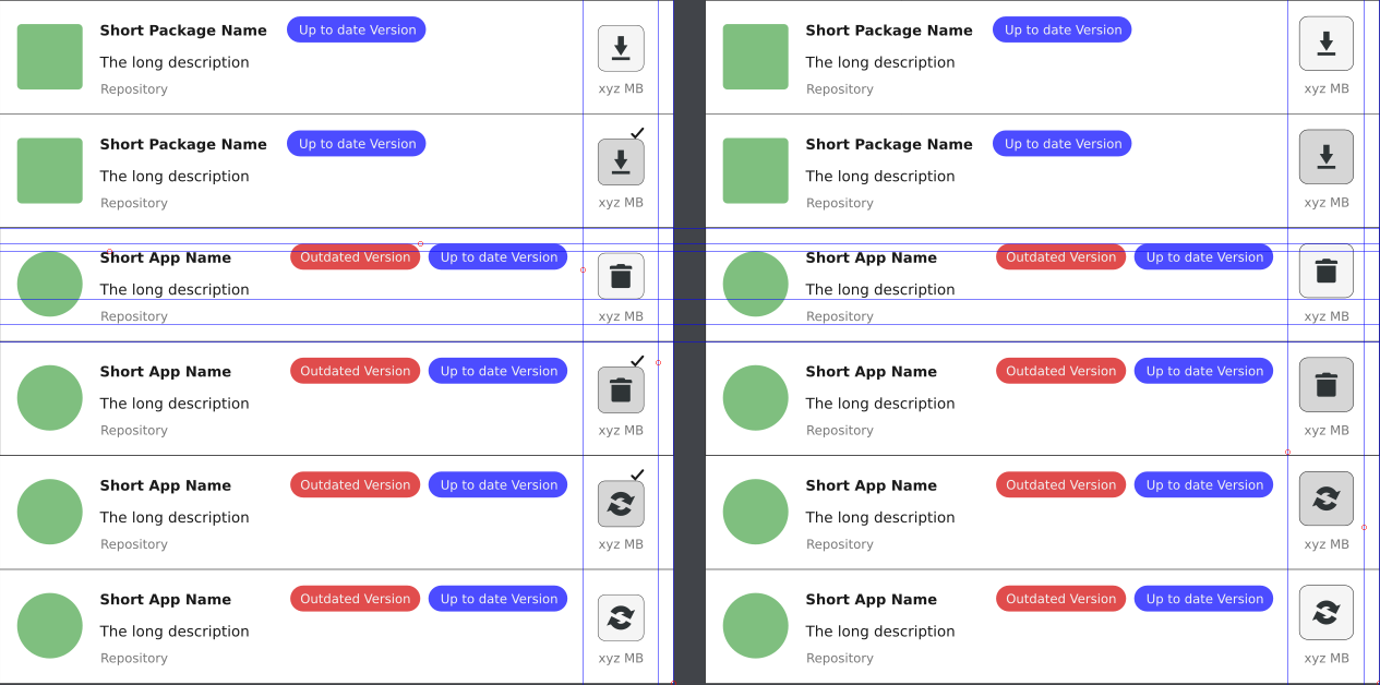
- snappy UI
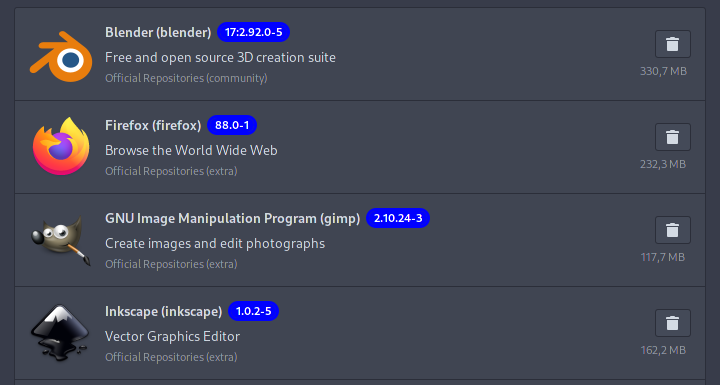


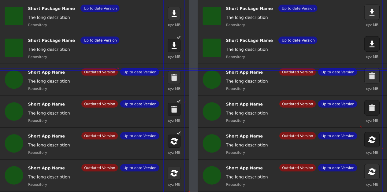
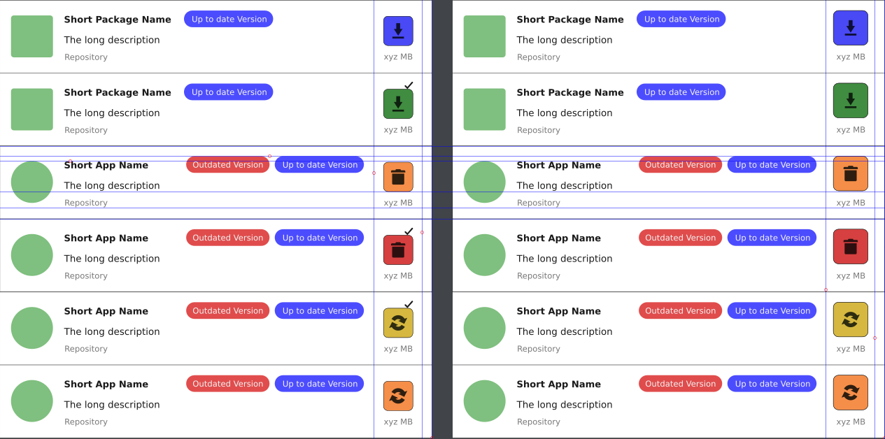
 Available install
 Pending install
 Uninstall option
 Pending uninstall/remove
 Available and pending update
 Update excluded from trnasaction
 As i see it so far, people will complain about everything.