Emblems with green background looks nice and work with colored background as well. I assume first one will don’t look pleasant on mobile. I’m trying to remind if I saw something similar somewhere, but unsuccessfully
Edit:
I’ll check what Alessandro had done with Thunderbird on developer streams. Maybe we can steal, I mean borrow something
Why not a red cross “x” (or else) instead of a green “v” for pending removal?
For me, the information I’m missing at first sight is not between what is (installed or not) and what is pending (to be installed or removed) but between what is currently installed or not (the icons are not well distinguishable, even in the theme you were showing), and within what is pending (to be installed/built or to be removed). The “v” doesn’t really help distinguishing.
If I look at those mockups (of very good quality), my first impression regarding pending operations is I will only install things. But there are actually some that will be removed among them.
Might be the case with Gnome Software > updates available to a particular application ? They have it on top, just blue. Not quite my cup of tea, but … is not that bad either to start me on a war path with them
Will check those too. Thanks for sharing!
Well, it can be probably, but that means 2 signs.
x is usually a sign of error, missing connection, close and sometimes remove (aka remove from bookmarks) for instance …
There has to be a clear distinction between pending install/removals and what is already installed and not installed, for sure, but there also has to be clear that is confirmed pending action. I see the x more usable for disabled updates, for example.
Yeah, those would be best either to be shown ALL on top of the Browse list, and separate in Install (when removed), and in Updates when disabled from update, but we still didn’t establish (apparently) what convention we chose.
Text
Colors
Icons
Emblems (different ones for each action?)
All of them at once ?
I’ve been following this topic for, some reason unknown even to me. And hhonesly, this,
well, that just sounds like PURE RC factor right there. Oh sure, there will be things to iron out along the way. That’s why it’s called software development. Because it develops.
Don’t get me wrong, constructive criticism is good, neccesary even. But that was nothing of the sort.
Eventually it turned into that, but that’s not the way it started.
Also,
I don’t know how long it was like that, or if the change was even active before you saw it, there’s no way to tell from your wording, but it doesn’t sound like it was that bad, if you hate it that much if you didn’t notice it immediately.
To the whole Manjaro team that has anything to do with it, it looks absolutely stunning to me, thank you!
Awesome! Would you think, from what was presented so far (even tho not quite in a compact mode) to showcase some “solutions” there too? Or nothing from wat was proposed here so far (not only pointing the faults) is not worth any attention?
Thanks!
Probably the dumbest idea ever. If I remember correctly I’ve seen something similar in Pop_OS software boutique or however they name it.
There is a similar thing made on GitLab in Help dropdown menu for notifications.
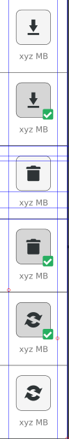
I’ve also noticed today (while updating) that it’s possible to add an icon above other icon (transaction authentication in XFCE), don’t know how I’ve missed this
I’ll play with it more tomorrow, maybe explore “dot” idea further. If it will be not useful now, maybe in the future, or for something else
I had a dream guys… and I am a moron. There is no sense to add more stuff around or above transaction icons. The main feature is already implemented (and its brilliant), only needs to be expanded.
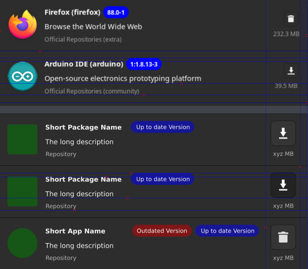
Pamac 11 have package version number colored and at the moment when a package is installed, the background is blue. When an update is available, there are two tags current version: red and new version: blue.
At the moment pending transactions have extra icon and how about removing it and just change package number tag background? This will be consistent with the general idea and require less work from guinux than adding extra stuff all around
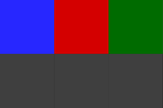
Yellow is pretty bad idea for background, maybe green will be better. It was pretty random choice.
I’d rather formulate it another way: what do you think about current version being not colored at all and with a blue accent for a new version if available and when no action has been taken yet (remove, update or install), then if it is update- or install-pending, it changes to green accent (respectfully for a new or current version label), in case of pending uninstall - to red.
Still no instantaneous visual distinction between what’s installed and what’s not (compared to 10.0), beside the icons that quickly get lost when looking at normal screen distance (contrary to the focused selected areas presented here), and the contrast between the thrash and download icons are highly dependent on themes.
I have reverted back to 10.0 for now, and I can’t even begin to understand how these download and thrash icons can be a visual cue improvement on desktop compared to that version.
I understand the change is driven by the mobile UI (problematic with 10.0) and it’s alright if there is a need for a change, but the absolute basics is being able to distinguish between installed and not installed, even before with and within pending operations.
For me, n°1 use case is still not fulfilled with mr_glitch proposition.
This are great points.
A reason why, if you look at the lines that break down the current vs second proposal from me, i made the install/unistall/update buttons larger, on the same useful space. Currently they also scale with the theme. With my proposal there should be no need to scale with the theme, nor lose functionality and look on mobile UI.
Adding green for confirmation of install and red for removal, makes perfect sense, but that will have to resonate somehow with the updates excluded from update…
See how the size of package is lined up with repository in current version, vs proposed one, and how the buttons are lined up too …
Addition:
Please avoid this blue/red/green on the same combination, as will get all the same “grey” for those that have visual impediments regarding color perception.
Regarding icons and button sizes:
app/package icon can be safely 60x60 pixels
install/remove/update button can be 50x50 pixels and the corresponding icons inside can be 22x22 pixels, but not higher than 22pixels.
I gather that @mr_glitch went around same thing, more or slightly different.
Looks much better now, although the blue versions look like actionable elements and ironically, are bigger than the real actionable icons (install/remove), however, it’s an improvement in overall.
My only complaint with the redesign is how big the rows are now. It would be better if there was a more compact view. There’s some issues in the settings with dark themes but I’m sure those will get sorted.
fully agree, the new UI is a disaster on many levels. We need to get back to the previous design and try to build improvements in a clever way. Please developers, revert course !


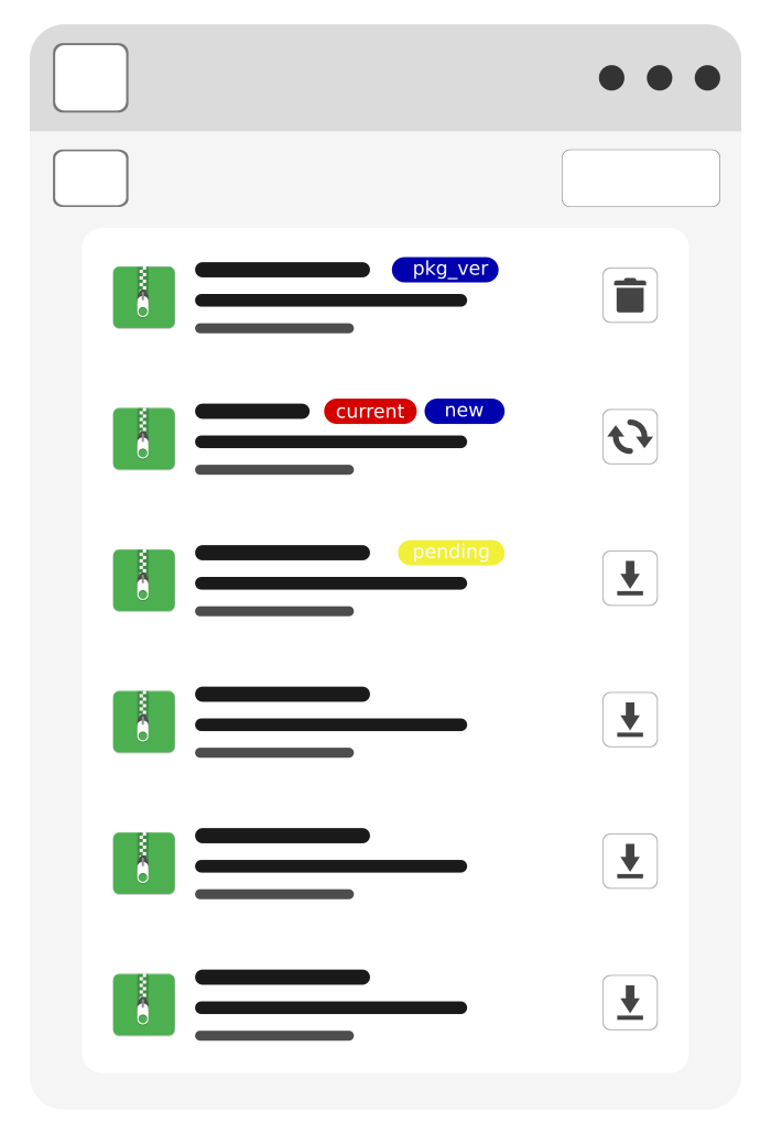
 if I understand correctly there will be only one tag then, which will reduce “skittles effect”. It should look much cleaner as well