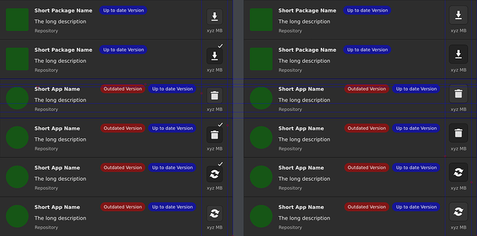
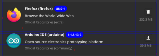
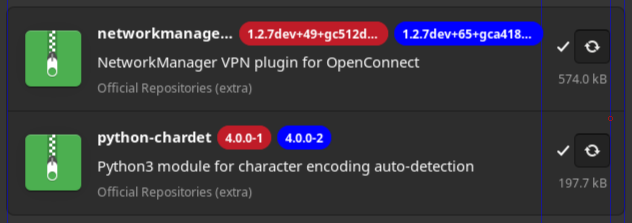
This is what Pamac UI offers at this point, in regard with install/remove/update icons/buttons:
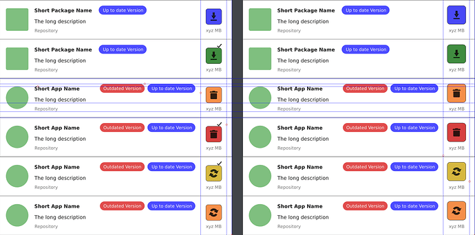
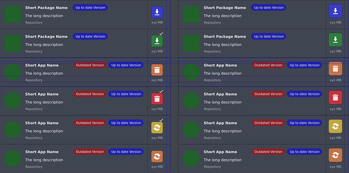
What could be improved, and i’m not talking about themes yet, as we should start with Color Codes signification (that we can use in this context) if that is the most important:
- RED - danger, stop, emergency, highly important, severe
- ORANGE - warning - medium important, can lead to broken functionality, ignorance
- YELLOW - caution - about to proceed, ready to perform an action
- GREEN - safety, clean, ready, recommended
- BLUE - information, guidance, additional, low importance
- MAGENTA (purple) - probably the favorite color of Prince, royalty, magic
States and Pending Operations (as i see them):
- Available for install > Install = Pending for Install
- Installed > Remove/Uninstall = Pending Removal
- Available Update = Pending Update
- Available Update > Removed from Pending Updates
- Available Update > Remove/Uninstall = Pending Removal
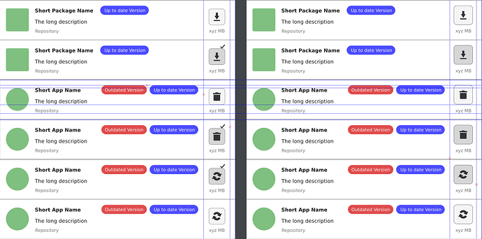
Here some alternatives, without color codes:
-
default Adwaita dark theme:
-
default Adwaita theme:
There will be needed at least two of each red and blue for versions to not fall into an visual issue between dark and light themes, and when comes to nuances of a color, good luck to please everyone …
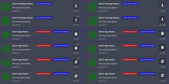
- this is how should look like on Arc Dark theme, just as a side note:
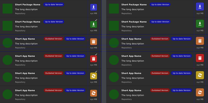
Now colors for the buttons to match the install/remove/update and pending + the usual colors significations…
-
Adwaita dark:
-
Adwaita and probably most light themes:
-
Arc Dark as side example:
To me it looks way too colorful, and i excluded applications and packages icons on purpose. Once they are also there, the entire UI will look crowded like a Christmas tree …
Based on all this, the state buttons and pending operations should have this nomenclature:
-
 Available install
 -
 Pending install
 -
 Uninstall option
 -
 Pending uninstall/remove
 -
 Available and pending update
 -
 Update excluded from trnasaction
And of course, you can picture the dark icons variant …
Hope this helps, and makes it more clear for everyone, or give you the start to make your own coherent proposal draft, directly to the point, without personal snarky remarks to devs and other forum members.
If my estimations are correct, this would not have a negative impact on the mobile functionality of Pamac, and visually should work too, regardless the monochromatic or colored version adopted (or not).
Cheers!
