I’m very new to Linux. I got problem when I clean install Manjaro install in UEFI mode. After installation, Manjaro cannot boot. I have check and Manjaro did install in my hard disk just cannot boot. I try install Windows 10 in UEFI mode got no problem. I also try install Manjaro in Legacy mode got no problem. Any tutorial how to fix this issue?
If you already have Microsoft Windows installed on that drive, then there will be an EFI System Partition (ESP) of approximately 512 MiB, formatted as FAT32 ─ or vfat, as it is called in UNIX speak.
During the partitioning phase, did you mark this ESP with the boot and esp flags? This is important with regard to the installation of the boot loader. Also, your partition table must be of the GPT type, not the MS-DOS/MBR type.
In addition to that, you must also make sure that Secure Boot and Windows Fast Boot are disabled in the UEFI firmware setup, and that the UEFI is set to boot in UEFI mode only, with CSM (legacy BIOS mode) disabled.
I’m sorry but I don’t understand what you mean. The EFI System Partition needs to be 512 MiB for use with GNU/Linux if you format it as FAT32. With FAT16, it may be smaller.
I know it’s a lot of wasted space, but the specifications demand it. When I first installed Manjaro, I had created my ESP at only 280 MiB, and it just wouldn’t work.
Delete that partition and create a new one in its place, 512 MiB in size, formatted as FAT32, marked with the boot flag, and set the mountpoint to /boot/efi.
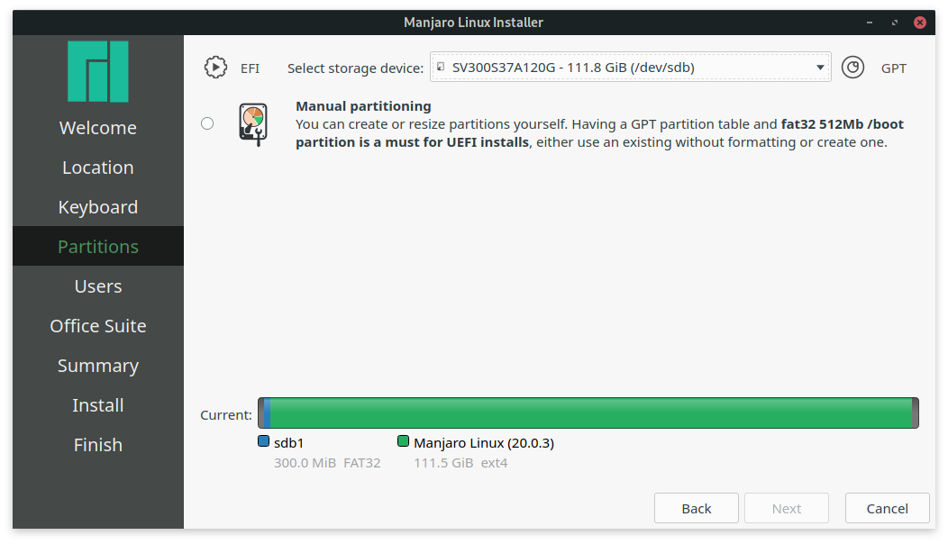
You are right! it is strange that in the manual partition part, the installer says you need 512. But when doing automatic install it creates 300 MiB EFI.
Screenshot of the installer (manual partition) Manjaro (20.0.3). Even the need of /boot partition is not correct. It should be EFI partition. A boot partition cannot be vFat and it is not a must.
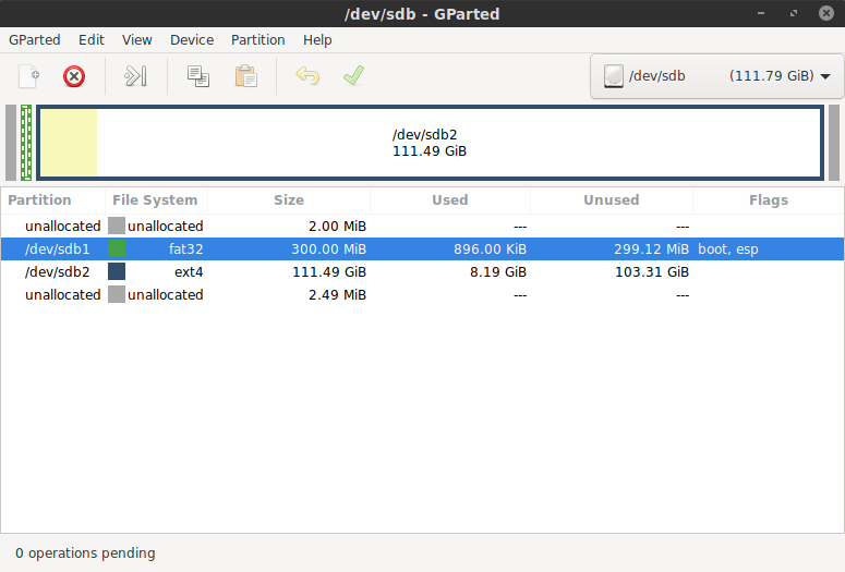
Is the partitioning tool in the .isoGParted? If so, then the bug might be in GParted, rather than in Calamares.
When I installed my system here in April 2019, the installer used the KDE Partition Manager. But then again, as I said earlier, I always opt for manual partitioning.
If you choose “Manual partitioning” (without using Gparted to partition the disk before), it says you need a 512 MiB FAT32 /boot partition. Assuming the /boot part is a “typo”, then it still creates a 300 Mib FAT32. But correctly as EFI using the automatic install.
So I don’t see how this is related to Gparted.
edit: by the way doesn’t Calamares use kpmcore to manage the partitioning?
it seems you have 2 ESPs: one on /dev/sda and one on /dev/sdb so you need to:
go into your UEFI firmware and tell it to boot from the second disk OR
mount the existing ESP during the install and have Manjaro write its system settings on the first ESP (and why we have GRUB: that’ll boot both Windows and Manjaro)
Guys, you mix up the requirements for a /boot and for a /boot/efi partition. For /boot you need indeed
for an /boot/efi partition 100 MiB is more than enough, even for a dual boot.
Any advice about using 512MB for $esp is for the case you decide to mount $esp at /boot , in which case all installed kernels will reside on this and kernels are fairly large (about 50MBs each, or similar). If not mounting at /boot you don’t need that space.
To provide adequate space for storing boot loaders and other files required for booting, and to prevent interoperability issues with other operating systems the partition should be at least 260 MiB. For early and/or buggy UEFI implementations the size of at least 512 MiB might be needed.
That’s for the EFI System Partition (/boot/efi), not /boot.