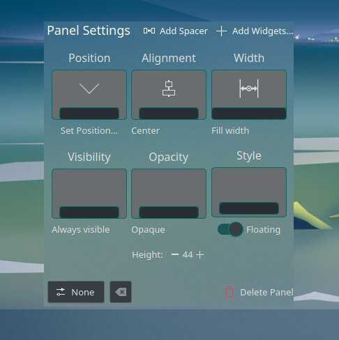
There are a lot of problems I am facing in the UI, but one that hurts my eyes is the following. The texts are not well aligned and also its translucent. Earlier it was opaque
Even though I am trying to set it opaque, it is not working

There are a lot of problems I am facing in the UI, but one that hurts my eyes is the following. The texts are not well aligned and also its translucent. Earlier it was opaque
Even though I am trying to set it opaque, it is not working

I honestly do not see any issue on your screenshot, where exactly ?
Regarding opacity, it’s related to your plasma theme mainly or to Blur effect on System settings → Windows Management → Desktop Effects → Blur
Make sure to clear things and use compatible additions.
https://wiki.archlinux.org/title/KDE#Configuration_related
If you are on wayland. This may be a certain bug. I have a workaround in my /etc/environment:
# qt wayland font bug https://bugs.kde.org/show_bug.cgi?id=479891
QT_SCALE_FACTOR_ROUNDING_POLICY="RoundPreferFloor"
This is how the menu looked before upgrade
Clean, opaque, text is perfectly aligned with on-hover highlights and all
This looks like you are using a theme that is not updated for plasma 6, or is otherwise incomplete.
Especially since you like opaque/flat .. you might try mine;
Oh there is a thread here:
I have just upgraded libplasma to 6.0.4-1.1 and it is working fine. Who so ever pushed the release, a big ![]() from my side.
from my side.
Its from here.
I guess referencing it in the Stable Announcement thread spurred action.
This topic was automatically closed 36 hours after the last reply. New replies are no longer allowed.