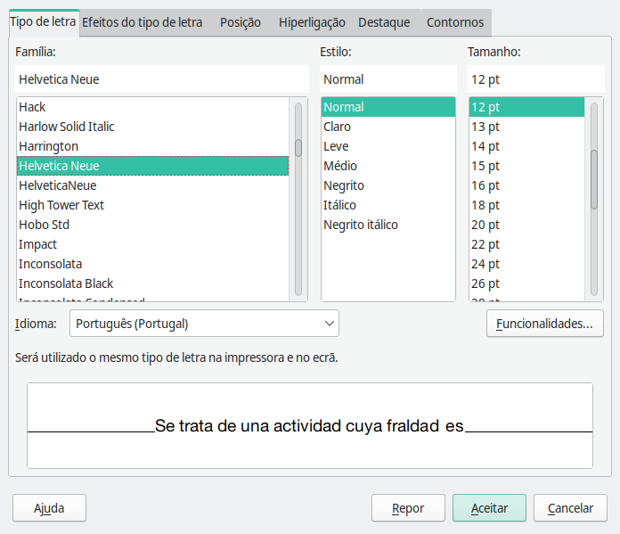
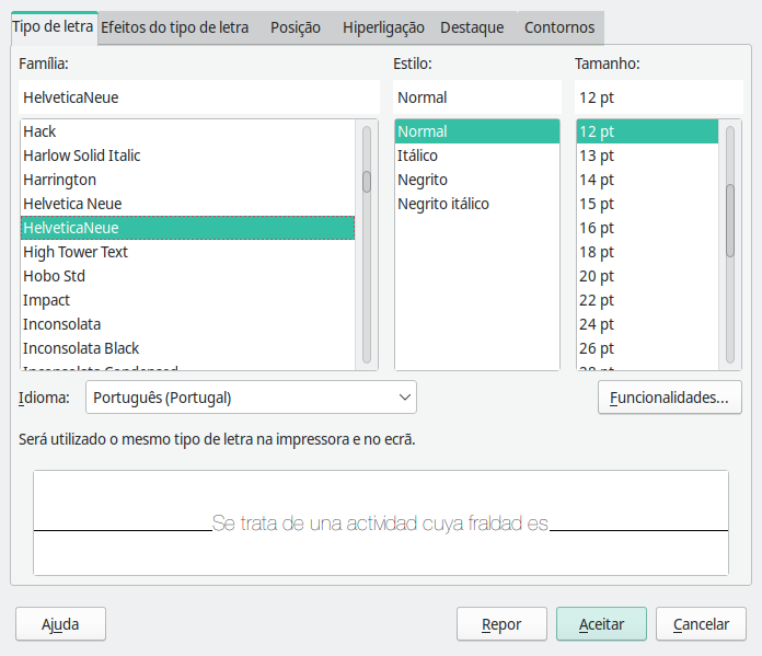
Here’s a screenshot:
Bold, italic, thin and bold-italic look good, but regular looks terrible, and IDK why.
I’m using Manjaro 21.3.7 Ruah, with Plasma 5.24.6, the screenshot is LibreOffice 7.3.5.2 30(Build:2). Font was downloaded from here I think.
EDIT: I think I “found” one error, which is: regular/normal and light/fine/clara are mixed up. In the screenshot, it is supposed to be showing the regular version but it’s showing a fine/light one instead and viceversa.
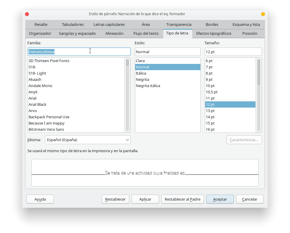
I also followed the post “Improve Font Rendering - Manjaro”, but I’m still having the rendering issue for the lighter version.