The New manjaro.org

The last few weeks I have been working on a new public face for the Manjaro project - a new manjaro.org.

Before the official domain will change to the new page you can already now take a look at it at:

The new website is a complete rewrite with a new tech stack (Nuxt). The main goals of this rewrite were:

  • Redesign the website to focus on important topics, reduce clutter and in general give it a more professional look and feel.
  • Introduce an Enterprise section, since professional services is a topic we as a company are expanding on and also already providing that to customers.
  • Simplify the tech stack. The new page is statically hosted and automatically deployed.

It would be awesome if you can give me feedback on design and functionality of the page, especially in case you encounter some bugs.

And if you know some webdesign or want to learn it, you can also contribute code to it at GitHub - manjaro/website: Next manjaro.org

Let us know what you think and thanks in advance.
13 Likes

I can be brief about that. I think it looks fantastic. :slight_smile: :+1: :clap:

However, on account of the description for the Plasma edition in the download section… :point_down:

… I would recommend the following — changed words in bold —… :point_down:

“The Plasma desktop is the most advanced GUI and offers the greatest flexibility.”

I would also omit the comparison with Microsoft Windows because…

  • GNU/Linux is not a Windows-like system and should not be compared to it. It’s an age-old but still ever-fallible advertising argument, aimed at attracting the wrong kinds of users — people looking for a free Windows clone. I would even say that comparing GNU/Linux — or even just the Plasma desktop environment — to Microsoft Windows is unprofessional, and painfully reminiscent of the “marketing strategy” of a certain other distribution I’ve used in the past, which, in my humble opinion, made them look amateurish, because if you’re promoting a GNU/Linux distribution and you’re comparing it to Microsoft Windows, then you’re actually making a statement that you’re insecure about the qualities of the system you’re promoting.

  • Following up on the above, GNU/Linux is a Free & Open Source UNIX/POSIX implementation and has nothing in common with Microsoft Windows. It has by now also already gathered a sufficiently impressive reputation among professionals to not require profiling itself as an alternative for anything else in the market.

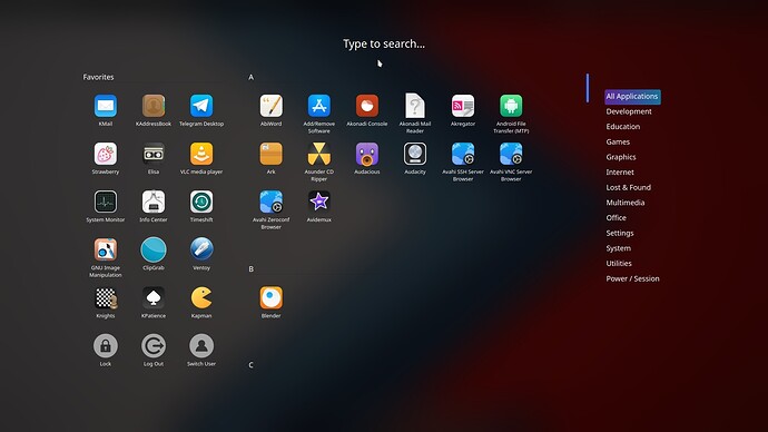
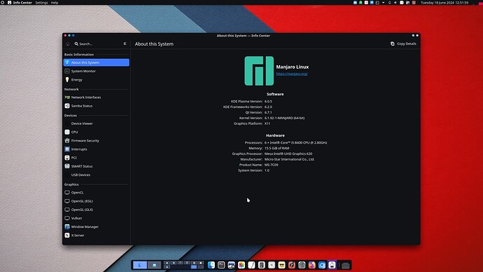
  • KDE Plasma comes from its developers with a default layout that more or less resembles Microsoft Windows — albeit to a lesser degree than LXQt, Xfce or Cinnamon — and can easily be made to look very different, as my screenshot below will show… :point_down:

8 Likes

It looks good, and doesn’t break and look ugly when you have Dark Reader extension installed which is a big + to me. I like it better than current website.

3 Likes

the link for arm-images at the download section are looking very hidden/small in comparision to the other ones.

1 Like

There is a big link at Products – manjaro.org. The Download link on the main page goes directly to x86 download options because I assume that’s >90% of people at the moment.

From the x86 page I only want to do a small link to ARM though. But maybe it’s too small indeed. I tried different other designs but wasn’t quite happy with it.

I copied all the desktop description texts from the old website’s Wagtail admin interface, but now that I look at it these texts aren’t shown on the current site. So maybe these were outdated quite a bit and suboptimal.

We can definitely adjust these texts. Only they should not be too long and able to be understood by a layman.

3 Likes

I have not read the text, but as a design it is nice, and the old version had indeed some useless clutter.
I miss however 2 links - for the packages and the mirror status. I guess the Help section would be the place for those. And the hardware section is under construction and it is important.

2 Likes

A link to packages is in the footer at the bottom. Is it too hidden?

There is also a link in the footer to the “Server Status”. Actually that might not be important at all and could be replaced with the Mirror Status

2 Likes

Link to github, gitlab and source archive would be nice

1 Like

Mirror status is way more important indeed.

2 Likes

i’ve got no complaints that the page is just in english but shouldn’t be a language selector avaiable, especially as company ?

2 Likes

Zet vud be dangerus, becoz zen ze Germans vud be sinking zet ze hole vebsite und ze forum ar in German, und zey ar ollreddy posting in German in ze Inglisher kategories rite now.

I suppose vee cud olveys take zem outside und shoot zem at dawn if zey do zis uggain, but zet vud be inkonvenient ven it rains. :stuck_out_tongue:

:face_with_hand_over_mouth: :smiling_imp:

4 Likes

:rofl:

where are the emojis if you need them ?

5 Likes

We knows, Preciousss, we knows. We misses them too. :sob:

Irregardless of @Aragorn’s overly cute threats of genocide it is planned to translate the website to German at least, maybe other languags too: I18n Support · Issue #8 · manjaro/website · GitHub :wink:

I have read the article linked in above issue ticket already, and it’s pretty good. If somebody is interested in contributing to the page by writing an i18 system for it, then I can assign the issue ticket to him.

1 Like

Couldn’t agree more. This whole “if you’re a Windows user, you will feel at home” just because there is a start menu bugs me no end. I was a Windows user for over 25 years, dipping my toes into Linux on several occasions, but what finally made me switch was when I realized I shouldn’t try to shoe-horn Linux into behaving like Windows.

3 Likes

Actually, I don’t have one. In my screenshot above, you will see a white circle in the upper left corner, and either clicking it or simply shoving the mouse into the top left corner will bring up the application dashboard (:point_down:), which I find both more aesthetically pleasing and more usable. :slight_smile:

1 Like

I was referring to the “you should try (insert whatever DE has a start menu)”-people.

1 Like

@Aragorn @Teo I created QA feedback by romangg ¡ Pull Request #13 ¡ manjaro/website ¡ GitHub with changes to desktop descriptions and the footer links.

1 Like

My comment is not personal to Aragorn.

I think, when we present Manjaro to website visitors, they are either people who look to distro-hop to Manjaro, or Windows / Mac users trying to find an alternative to their existing OS.

For the later type, they are trying to get out of their comfort zone, and they are mostly feeling insecure to jump to a new OS.
By mentioning that:

The UI resembles Windows layout.

It provides a “bridge” to these “comfort settlers” to step out from their comfort zone, and try something new.

Hey, it is not so different in UI, try it!

So, in this respect, I feel that the wording is perfectly alright.

However, if I’m newbie to Manjaro, I’d be confused by this homepage.

It showed “Products” and “Enterprise”, which immediately give the impression that the “company” is selling products and solutions.
There is no “User” (or Enterprise equivalent for User) section, and there is also no mention of “Open Source” nor “Free” wording.
And if you’re targeting enterprise, pls include an section on “About Us”, and “News” should be grouped underneath this tab as well.

“Professional support” is offered to biz, so I suppose it make more sense to group it under “Enterprise”, while Forum should be standalone.

That’s my initial thought.

I do like the clean structure aka the used site template with top right menus, big banner space below and the neat link section at the bottom but I think the graphics are random and colour coordination is messy.

I’d get rid of the Fischer Ski graphic (avoid the term ‘unstable’ on the front page, too many negative connotations) and the sky scraper stock photo.

For the banner graphic I’d use a single simple flat (plasma, if you must) desktop screenshot where some green matches the manjaro logo (check with color picker, this should be exact) on the top left. After I picked the screenshot I’d match the banner background colour to the screenshot.