1. When the listing’s width has changed, the scrolling position is incorrectly set.
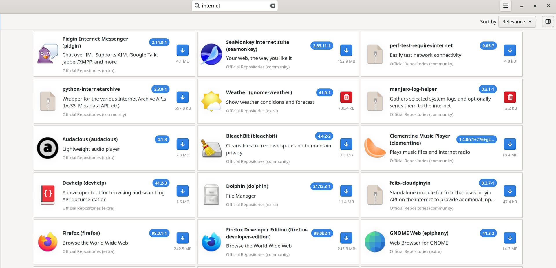
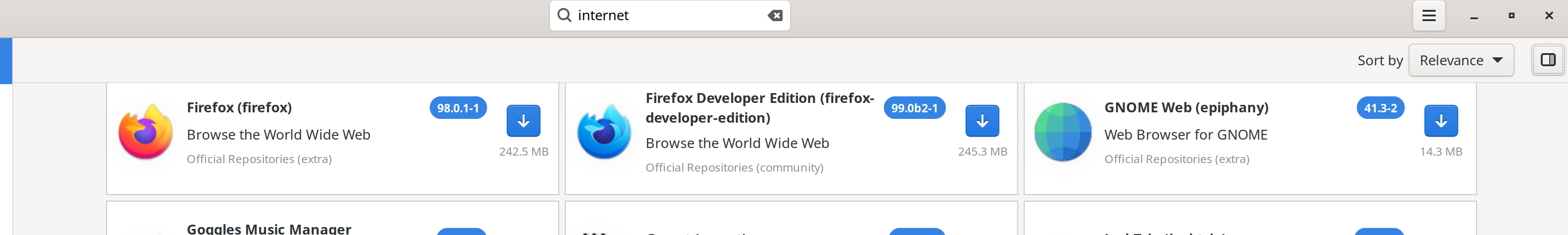
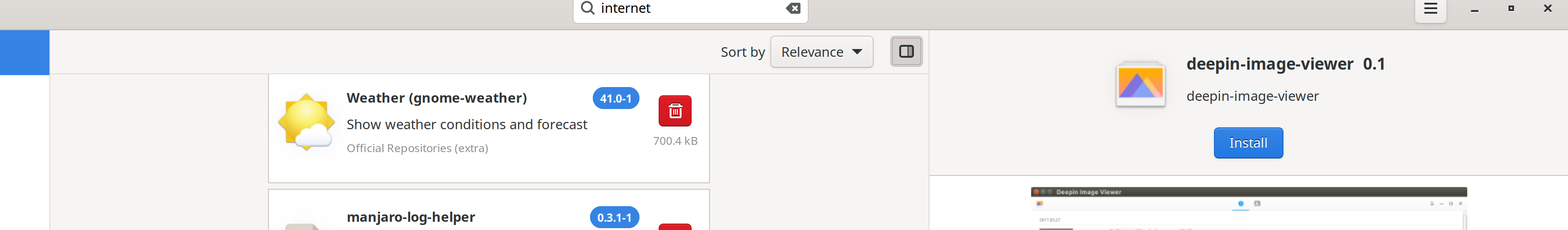
For example, maximise the window of “Add/Remove Software”, and then search for “Internet”. With all third-party sources disabled, in my case, “FireFox” is the 13th item. Since 3 items are displayed per row, it is placed at the 5th row. Now, scroll down the list so that “FireFox” is placed at the first visible row. Click the details panel button. The list is showing the 5th row, but since the width is now 1 item per row, the top visible item is “Weather”, and I have to scroll a lot down to locate “FireFox”.
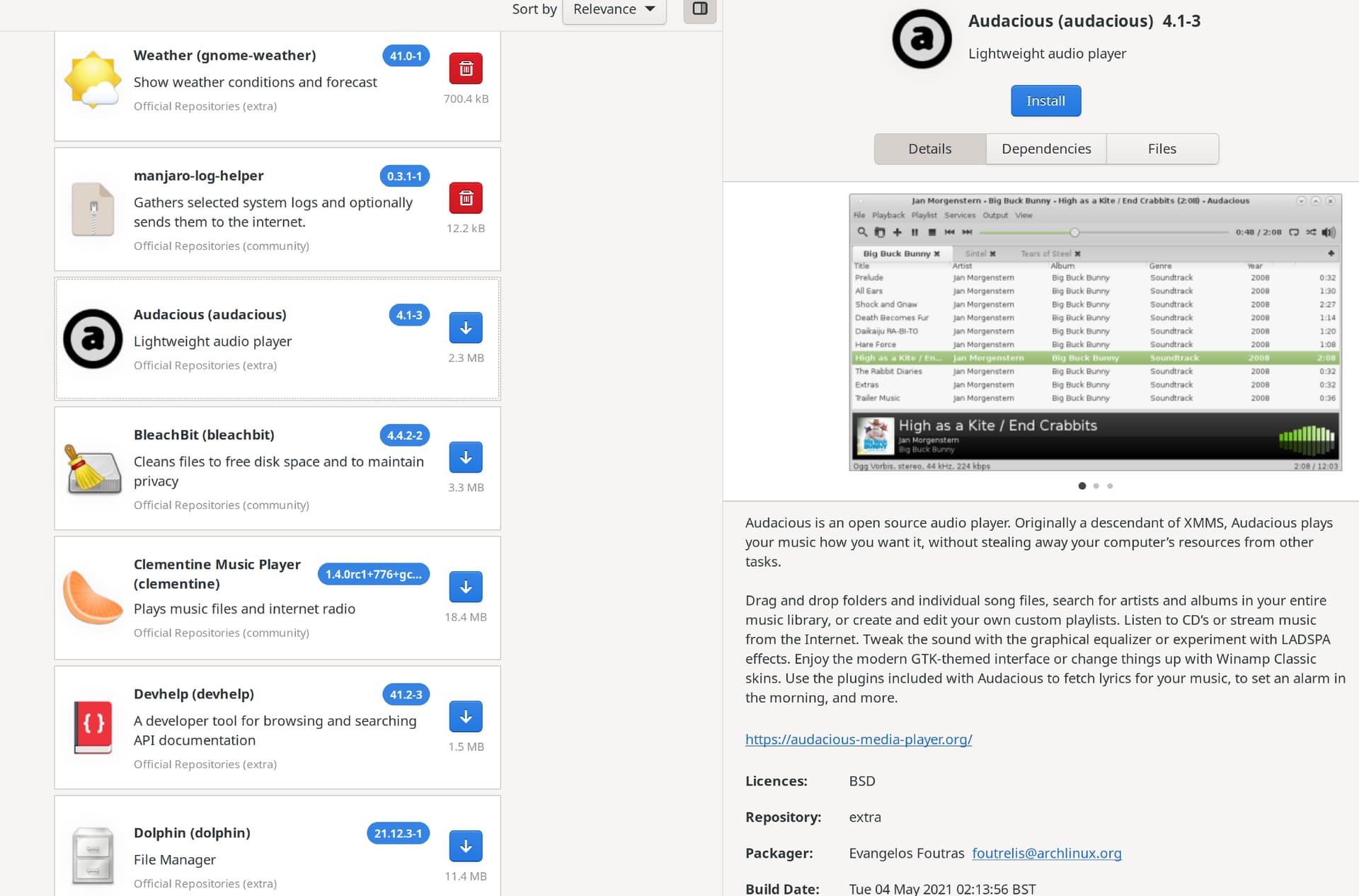
2. The selected item indicator is so subtle that it is hardly noticeable
In any themes that came with Gnome Manjaro by default, the selection indicator is just some thin light grey dots near the edges, which is very difficult to notice. In the screenshot below “Audacious” has been selected on the list.
3. No way to see what the “pending operations” are.
Imagine that I have clicked the download button of 10 apps in the list. It shows “10 pending operations” at the bottom panel, and then I click “Apply” and the installation of 1 of them fails. I want to remove that one and continue to install other 9 apps, but as far as I have tried, I could not find anyway to see the list of the pending operations and selectively cancel one of them. All I could do was cancel the whole thing and select the 9 apps from scratch.
4. The search box’s input hangs with auto-completion.
On my laptop, when typing something and it shows autocompletion list, the input hangs, as if it is blocked by the auto-completion. It does not, however on my desktop. Laptop is minimal install/Wi-Fi/older CPU and desktop is normal install/Ethernet. The CPU maybe low-end by today’s standards, but I don’t think it is THAT slow to be unable to type plain text in a text box in real-time.
5. Changing “Official Repositories” is not remembered if I do not press “Refresh Mirrors”.
I am not sure if this is a bug or an intended behaviour, but at least for me, it was not intuitive. I changed the mirror, but I did not want to click “Refresh Mirrors” because it will take a while, and I had already updated the system. I thought it would refresh when I launch it next time, but when I restarted “Add/Remove Software”, the change to the mirror selection was not kept. I had to click “Refresh Mirrors” before closing “Add/Remove Software”.
6. No order by “downloads” or “popularity”.
The default order is “Relevance”, and I am not sure what that is. In my experience, a lot of times the items at the top were not the best results.
7. No icons for AUR results
I am not sure if this is because the items in AUR are created by users and none of them added icons, or the “Add/Remove Software” has a problem displaying their icons, but all of the items in AUR have a default icon.
8. No size information in the detail view.
The app size is displayed in the list, but in the detailed view it has no size information. Also, I wish each dependency entry also showed its size.
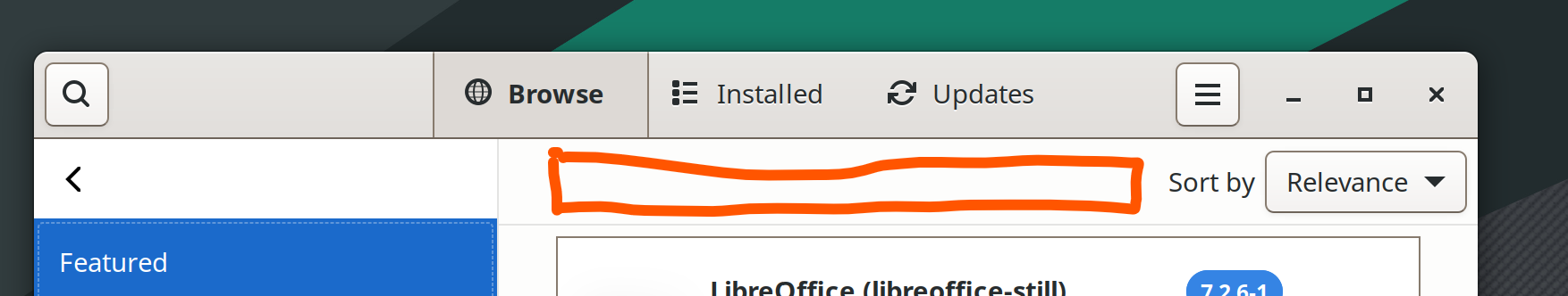
9. Why not just always show the search box?
Most of the time, I click the search icon at the top-left corner, and probably other people do so, too. Why not just show it all the time? There is unused wasted space at the top panel where “Sort by” is.