This are great points.
A reason why, if you look at the lines that break down the current vs second proposal from me, i made the install/unistall/update buttons larger, on the same useful space. Currently they also scale with the theme. With my proposal there should be no need to scale with the theme, nor lose functionality and look on mobile UI.
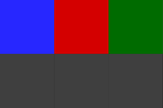
Adding green for confirmation of install and red for removal, makes perfect sense, but that will have to resonate somehow with the updates excluded from update…
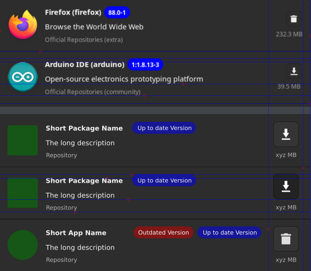
See how the size of package is lined up with repository in current version, vs proposed one, and how the buttons are lined up too …
Addition:
Please avoid this blue/red/green on the same combination, as will get all the same “grey” for those that have visual impediments regarding color perception.
Regarding icons and button sizes:
app/package icon can be safely 60x60 pixels
install/remove/update button can be 50x50 pixels and the corresponding icons inside can be 22x22 pixels, but not higher than 22pixels.
I gather that @mr_glitch went around same thing, more or slightly different. ![]()