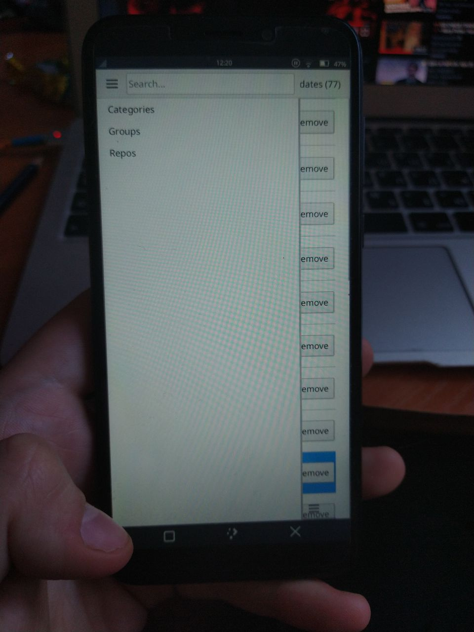
I’ve adapted pamac-qt to mobile view a bit some time ago but it is not in repositories nor in git atm
4 Likes
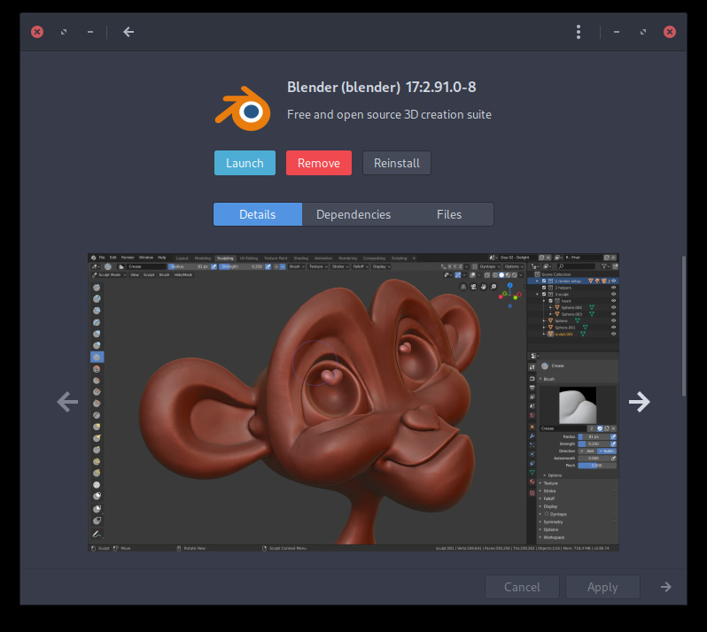
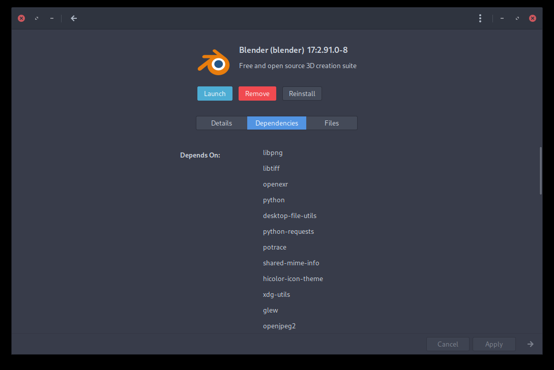
@anon89812132 Sure, your screenshots looks good, but click on Blender for example, then all become align=center, buttons change place, left margin changes, etc.
And if you click further on Details, Dependancies, Files, you’ll see the left margin changing each time.
Inconsistent.
Every screen by itself looks quite alright, that’s the difference between screens in alignment and placement that is confusing.
2 Likes
Yeah… no.
Between the apparition of mobiles devices and the invention of responsive design, we had to create separate layouts for mobiles (vertical layout) and desktops (horizontal layout). As @anon89812132 mentioned, this is twice the work to create, then to maintain.
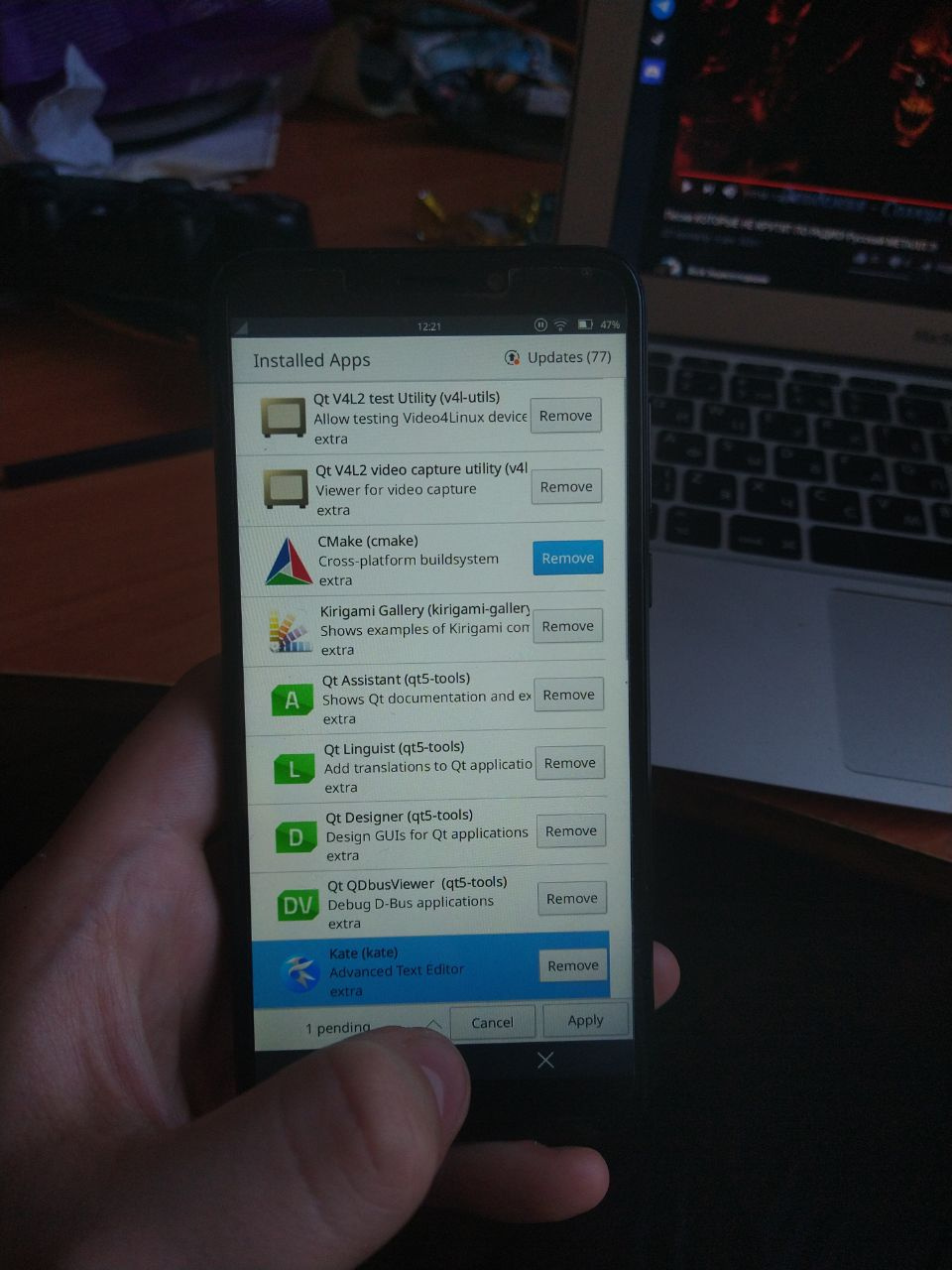
Only when i click on Files the window changed size. That is an inconsistency i think due to the fixed size in the text output box. The list of dependencies is just a list, so this would be the actual minimal size of the Pamac window after clicking trough all those options.
Definitely not ideal neither for Desktop, nor for Mobile.
My defensive stance is not with pointing out this issues, but the way some arguments have been used and put forward.
Think about something to not create friction with the developers, but for them to be a pleasure to read all this feedback comments. I know 100% that they are very diligent in what they do, and they want to provide a flawless experience for everyone. It takes a bit of time and patience from both sides and proper/respectful communication.
So far we all managed to do that to an extent, not perfect, but yeah … ![]()
2 Likes
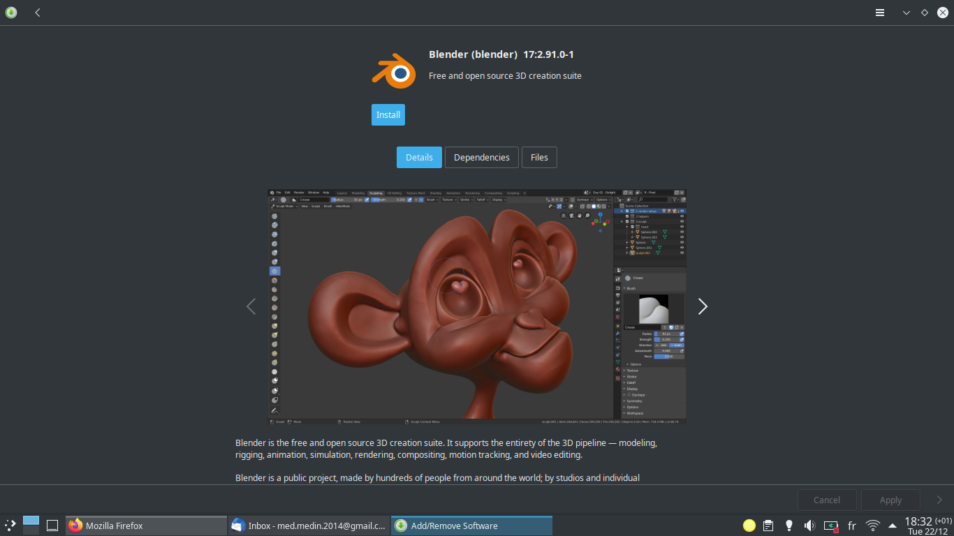
You are using the app not maximized, that’s why you show less wasted space, and no one (laptop users) actually open an app not maximized unless you have really big external screen.
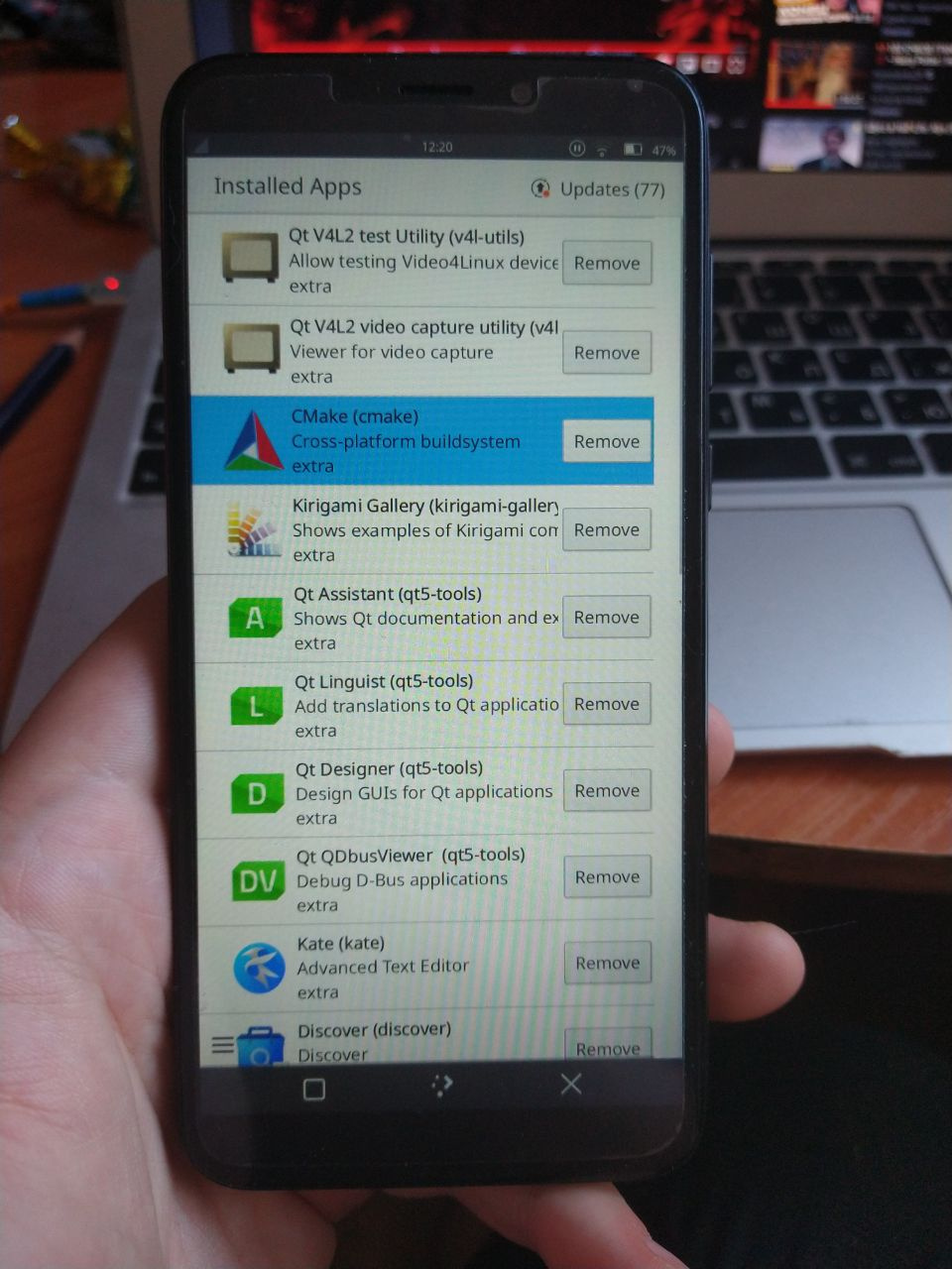
On Plasma Details and Install/Launch buttons are not left aligned at all, it looks like a mess for me.
When I click on Details the text is packed in the center, but when I click on Files it takes all horizontal space, in Dependencies the texts (headers and first items in lists) are not at all aligned to baseline.

While with an AUR package :
This is a false statement. I actually don’t maximize Pamac window. Do you have any data or poll which shows that every laptop user maximize the window? Maybe you’are actually in minority?
1 Like
On laptops with 15.6" screen you can’t use any app without maximizing it. Not maximized apps look too small for my eyes and cause problems of visibility, for example try to use LibreOffice or Inkscape not maximized on 15.6" laptop and you will see that half of buttons on toolbar become not visible.
In previous post you’ve said that this is an issue of every laptop user. Now you’re saying that it’s from your experience. There is a difference between “Me” and “Everybody”. There is nothing wrong if the new layout is uncomfortable for you, but don’t say that it’s the case of literally everybody.
1 Like
Most bought laptops in market have 15.6" or less that’s why so many users are forced to use apps maximized. I never known any student from my college or friend that uses laptop with screen bigger than that.
Most of my machines are 13" or 14" devices. I use window tiling and typically have 1-3 applications open in each workspace. Browsers and Office apps benefit from maximized state, but most apps don’t really benefit from it.
Maximizing all apps is a bit of a edge use case. That doesn’t mean that this use should not be taken into account, but it cannot be the only case that is taken into account.
The new layout is much friendlier to my use case. Pamac used to be uncomfortable to use with half screen window width, and now that is no longer an issue. It is still a bit rough around the edges, and there is still room for improvement, but I still consider this a good step forward. Even though it is not yet as polished as it was, it somehow feels much nicer.
Personally, I would have preferred a solution where the previous sidebar would have been preserved, but there would be a button in the top left corner that would allow sliding the sidebar in and out of the view. The default state would be determined by the window width. This would allow for even more narrow window width, but also use horizontal space more efficiently. But this approach can also work with some more polish.
I didn’t want to mention this but how do you find this much better ?
I’m sorry, but isn’t very risky to shift the whole UI of the one of important software in Manjaro ecosystem toward mobile direction without knowing the popularity or the credibility of Manjaro on mobile devices ? I think for now Manjaro desktop users are much larger than mobiles ones.
I think an alternative or fork version for mobile would be much better.
I use autotiling, so pamac launches almost always in half screen width. With the sidebar that was crowded. Now it’s not crowded anymore. It is better for more window widths, at the cost of not being as good for maximized window. I think this is a step in the right direction, now the maximized state just needs some more work to become as good as it was before. Then all window sizes will feel comfortable.
2 Likes
Looks like bug. Congratulations, you’ve found a bug and waited to use it as evidence that maximized windows are better? ![]() My hero
My hero ![]()
1 Like
How about instead of pointing out faults from tests that anybody can do, but actually do not match any real workflow, to come up with a some design mockups that work?
Is quite easy to trash the design of a pininfarina car by taking it on a stone quarry road, you know.
1 Like
Unfortunately seems to be happening far too much theses days. People don’t realise the team are doing this in thier spare time and giving them a fully fledged operating system for free. Yet instead of trying to contribute they just complain
I’m just an average Manjaro user and stated sincerely my true point of view, because I believe different opinions are always the way to come with something good and correct some decisions, and I always believed Manjaro are the most comfortable community to discuss and argue, you even accept and pay attention to feedback from newbies like myself.
I don’t hate Manjaro and I don’t have any bad intentions, in fact I was using Ubuntu for 6years, and after trying Manjaro KDE I’m happy with its release model and stability.
There is still the fork from Artix Linux: AUR (en) - pamac-classic
1 Like
The team decided to take up the task to provide something useful and functional. Contributing is not easy because each has a set of mind, a background and more or less experience in programming + a different taste in visuals.
The decisions need to be taken in steps and start with those situations where things are important, not stretched to examples that go to an extreme usage, but a real workflow. This also influences the decisions taken.
You are no longer a newbie ![]()
The feedback here is most welcome, and is fine to agree to disagree in some cases.
Is also true that once i established how i want all the applications to be, where to open, what size, on what activity and display, more or less in an arrangement that fits my particular taste, i find difficult to justify why someone would use a software like Pamac in full screen mode, or even tiled (i use tiling but not for Pamac nor Telegram for example).
Is almost the same situation as with desktop layout, themes, icons and color-schemes. Probably we could never agree to use the same and we all could make a good case for why “that one” and not the other.
Pamac will reach a point soon, when all will be in the right place, i’m sure about that.
1 Like
So, would it be usefull to provide visuals or is GTK+ version frozen as is?