You could say this is a continuation of this issue, yet now on the new Pamac 10.1.3: Pamac v10 has space wastes and bad alignments - #52 by Chhkuot

Caption: “Description text cuts off, not enough room, yet plenty of unused space on both sides”
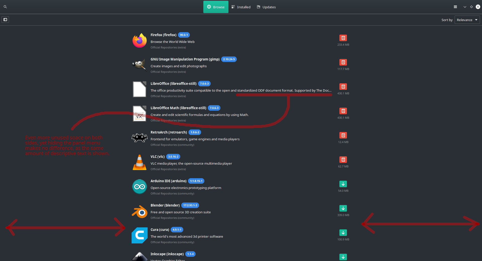
Caption: “Even more unused space on both sides, yet hiding the panel menu makes no difference, as the same amount of descriptive text is shown.”
Evidently, what is the purpose of “collapsing” the left panel menu, when it does nothing to benefit the extra space by doing so? Whether or not you hide the left panel, the same amount of text is still cut off. There’s a lot of extra space wasted on both sides that could be used for descriptions, actions, previews, package/file info, etc, that could be displayed when clicking on a package in the list.
Don’t just look at the dead space on the “right”. Add up the dead space on both the “left” and “right” and you’ll see you can fit a lot of useful information to the right side, while the list of packages can be aligned to the left side.