after an update there is no colors? only wine and and help have color?
Hi, I guess you have tried different themes? Not all of them are kept up to date by their maintainers. ![]()
2 Likes
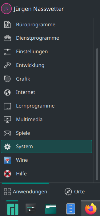
I don’t even know how to change the subject. I’m a Linux noob. here are colored icons
Mod edit:- Please avoid posting unnecessary screenshots.
Please don’t post multiple times in a row.
If you want to add something, please edit your previous post by clicking on the pencil icon.
This change was made in Plasma 6.2.0 to comply with KDE HIG: list of categories with 22px icons should be symbolic.
The fix for Wine category is already included KDE Frameworks 6.9.
Help Center is not a category but an app which should never be forced to use symbolic icon and will be added with other apps to a new category called Help in Plasma 6.3.
3 Likes
If you absolutely must have coloured icons, you could switch to using Application Menu instead of Application Launcher:
Right-click the Menu/Launcher icon in the panel, and then Show Alternatives… – from the resulting dialog you can choose from three options available. Application Dashboard is full screen; Application Menu is a little more compact than Application Launcher and still retains coloured icons.
This is accurate at least for Plasma 6.2.4 at the time of writing.
Regards.
1 Like
I use the Application Launcher, and I have colored icons (using the BeautyLine icon theme):

If the OP wants colored icons in their menu, they should follow @BG405’s earlier advice and change to a different icon theme.
Icon themes can be downloaded and selected via System Settings → Colors & Themes → Icons
A quick way to access the icon settings page via the command line is:
kcmshell6 kcm_icons
2 Likes
In Dolphin, you can get coloured icons in Places using something like Newaita-Reborn icons…
But not in the menus, and the panel icons with Newaita-Reborn (for network and Bluetooth) are just nasty…
Time to move on…
sorry but it doesn’t look pretty. I’m not allowed to say what I think of this skin otherwise I might get kicked out of the forum… ![]()
1 Like
Your comment is already on the borderline of what is generally acceptable in a public forum. Be warned.
The icon set was given as an example only. If its general appearance somehow threatens your manhood, I’m sure there are many others available that will not.
Now is a fine time to begin to change that.
Already mentioned earlier is that you can switch to using the Application Menu which still retains coloured icons when using the default Breeze theme, so there’s that.
Otherwise, look for a new icon theme.
This link might get you started:
Good luck.
2 Likes
Haha I agree - I think @soundofthunder was overreacting interpreting the ![]() as a
as a ![]() political statement… for sure we must appreciate that some forum members are Australian and we must tread carefully when bringing to light their appauling lack of good taste
political statement… for sure we must appreciate that some forum members are Australian and we must tread carefully when bringing to light their appauling lack of good taste ![]()
I tend to prefer slightly more subtle colours to those - but categories are symbolic only, so you can choose different sets but they will always be ‘same colour’ symbols (even if that’s a garish gradient).
Where ‘Beauty’ icons do excel, however, is in creating a consistent look - so variations on that theme with perhaps more palatable colour schemes would prove more interesting…
2 Likes