Hi all,
As you can see in:
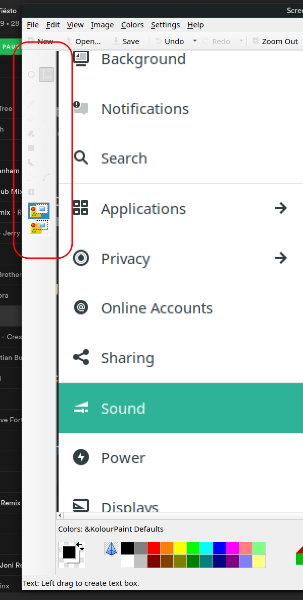
the controls on the side panel on the left are barely visible. How can I make it look more like a native GTK app?
Thanks.
Hi all,
As you can see in:
the controls on the side panel on the left are barely visible. How can I make it look more like a native GTK app?
Thanks.
Hello,
Use Kvantum Manager to set the proper theme for Qt5 applications.
The issue exists with gnome edition defaults, I’ll investigate this further.
To me it looks like the mix of theme as is Matcha-sea and Dark Icons because otherwise will not match the Shell theme, so Kwantum with Matchama or Matchama-light also will render some elements the wrong way plus the white icons, but with a light theme and icons for light themes, the result seems decently fine … We really have to avoid the mix of dark and light elements, because icons will fail to render.
Okay, the darkness of gtk and kvantum themes are not in sync. When any dark gtk theme is used and kvantum theme is matchama, it results in unreadable text like this. Solution is to use matahama-dark when you have dark gtk theme enabled.
Thanks all. I switched to a light theme for both Gnome and Kvantum (I hadn’t heard about Kvantum before). Using dark themes didn’t seem to work.