And in case someone decides to use the appimage version, i have to say, it is a bit hard to find a working one. Those from the official NG variant site do not load the article/translation in the middle of the window for some reason, at least on manjaro xfce.
Tested, virusfree according to Virustotal and working is this version GoldenDict-661dd4d-x86_64.AppImage
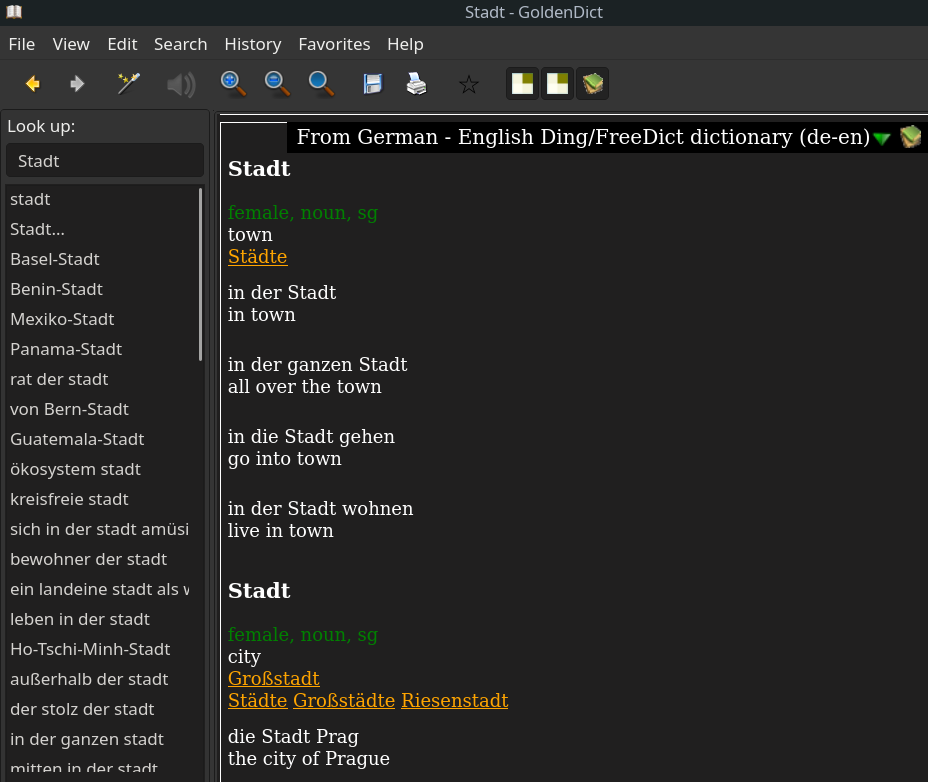
The working directory is in this case ~/.goldendict , which contains the style subfolder. The dark theme i posted above for the flatpak does not work entirely (themes the article view but not the toolbar). What works is this although i had to make small corrections to show some button icons - here is my fixed version of qt-style.css for the Dark-deep:
Dark-Deep qt-style.css fix only
/* ================= This file is encoded UTF-8 without BOM ================= */
/* GD WINDOWS DARK THEME */
/* ========================================================================== */
/* ========================================================================== */
/* ============= ATTENTION ============= */
/* All icon files used should be placed in the GoldenDict program folder, */
/* for example: c:\Program Files\GoldenDict\icons\dark-tb-handle.png */
/* */
/* =========== COLOR PALETTE =========== */
/* #2B3339 - main background */
/* #232B30 - darker background in tables and some input fields */
/* #4E5B65 - frame lines; unfocused elements highlighting */
/* #C7CBD3 - text */
/* #8E9CA8 - dimmed text */
/* #0080FF - (brigth blue) accents & hovers */
/* #FFFFFF - text on brigth blue background */
/* #006AD5 - (dimmed blue) list selections */
/* #A40000 - (rubin) */
/* highlighting in the search field in case of a negative result; */
/* accent on close buttons */
/* #D3D6DC - articles background */
/* #000000 - pressed elements; some borders */
/* #353F46 - tables headers */
/* #3D464E - accents in dictionaries buttons */
/* ========================================================================== */
/* ============= DICTIONARY SCANNING WINDOW ============= */
#Initializing
{
background: #2B3339;
}
#Initializing QLabel
{
font-family: "Segoe UI", "Noto Sans", sans-serif;
color: #C7CBD3;
}
#Initializing #progressBar
{
background: #2B3339;
border: 1px solid #0080FF;
}
#Initializing #progressBar::chunk
{
background: #0080FF;
margin: 1px;
}
/* ====================================================== */
/* ==================== GLOBAL SCOPE ==================== */
/* ====================================================== */
QDialog,
QSplitter,
QWidget
{
background: #2B3339;
}
QCheckBox,
QComboBox,
QGroupBox::title,
QInputDialog,
QLabel,
QLineEdit,
QMessageBox,
QPlainTextEdit,
QPushButton,
QRadioButton,
QToolButton
{
font-family: "Segoe UI", "Noto Sans", sans-serif;
color: #C7CBD3;
background: #2B3339;
}
QComboBox,
QGroupBox,
QLineEdit,
QPlainTextEdit,
QPushButton
{
border: 1px solid #4E5B65;
}
QLineEdit:focus,
QPlainTextEdit:focus,
QPushButton:focus
{
background: #2B3339;
border: 1px solid #0080FF;
}
QLineEdit
{
padding: 1px;
}
/* spinboxes */
QSpinBox
{
font-family: "Segoe UI", "Noto Sans", sans-serif;
color: #C7CBD3;
background: #232B30;
border: 1px solid #4E5B65;
height: 17px;
padding-top: 2px;
padding-bottom: 2px;
padding-left: 2px;
selection-background-color: #4E5B65;
}
QSpinBox:focus
{
background: #232B30;
border: 1px solid #0080FF;
}
QSpinBox:disabled
{
background: #2B3339;
}
QSpinBox::up-button
{
subcontrol-position: top right;
border: 1px solid #4E5B65;
width: 16px;
margin-top: 1px;
margin-right: 1px;
}
QSpinBox::up-arrow
{
padding-top: 1px;
image: url('./icons/dark-arrow-up.svg');
}
QSpinBox::up-arrow:hover
{
padding-top: 1px;
image: url('./icons/dark-arrow-up-h.svg');
}
QSpinBox::down-button
{
subcontrol-position: bottom right;
border: 1px solid #4E5B65;
width: 16px;
margin-bottom: 1px;
margin-right: 1px;
}
QSpinBox::down-arrow
{
image: url('./icons/dark-arrow-down.svg');
}
QSpinBox::down-arrow:hover
{
image: url('./icons/dark-arrow-down-h.svg');
}
QSpinBox::up-button:hover,
QSpinBox::down-button:hover
{
border: 1px solid #0080FF;
}
QSpinBox::up-button:pressed,
QSpinBox::down-button:pressed
{
border: 1px solid #000000;
background: #000000;
}
/* buttons */
QPushButton:hover
{
color: #FFFFFF;
background: #0080FF;
border: 1px solid #0080FF;
}
QPushButton:pressed
{
background: #000000;
border: 1px solid #000000;
}
QPushButton:disabled
{
background: #4E5B65;
border: 1px solid #4E5B65;
}
/* dialogs */
QMessageBox QPushButton
{
min-width: 90px;
height: 24px;
}
QInputDialog > QLabel
{
margin-top: 10px;
}
QInputDialog > QLineEdit
{
background: #232B30;
min-width: 300px;
margin-bottom: 20px;
}
QInputDialog > QPushButton
{
height: 20px;
}
/* switches */
QCheckBox::indicator:unchecked,
QGroupBox::indicator:unchecked,
QRadioButton::indicator:unchecked
{
background: #232B30;
border: 1px solid #4E5B65;
}
QCheckBox::indicator:unchecked:hover,
QGroupBox::indicator:unchecked:hover,
QRadioButton::indicator:unchecked:hover
{
background: #232B30;
border: 1px solid #0080FF;
}
QCheckBox::indicator:checked,
QCheckBox::indicator:checked:hover,
QGroupBox::indicator:checked,
QGroupBox::indicator:checked:hover,
QRadioButton::indicator:checked,
QRadioButton::indicator:checked:hover
{
image: url('./icons/dark-checkmark.svg');
background: #232B30;
border: 1px solid #0080FF;
/*margin: 2px;*/
}
QCheckBox::indicator:checked:pressed,
QCheckBox::indicator:unchecked:pressed,
QGroupBox::indicator:checked:pressed,
QGroupBox::indicator:unchecked:pressed,
QRadioButton::indicator:checked:pressed,
QRadioButton::indicator:unchecked:pressed
{
background: #000000;
border: 1px solid #000000;
/*margin: 0px;*/
}
QCheckBox::indicator:checked:disabled,
QCheckBox::indicator:checked:disabled:hover,
QRadioButton::indicator:checked:disabled,
QRadioButton::indicator:checked:disabled:hover
{
image: url('./icons/dark-checkmark-disabled.svg');
background: #2B3339;
border: 1px solid #4E5B65;
/*margin: 0px;*/
}
QCheckBox::indicator:unchecked:disabled,
QRadioButton::indicator:unchecked:disabled,
QCheckBox::indicator:unchecked:disabled:hover,
QRadioButton::indicator:unchecked:disabled:hover
{
background: #2B3339;
border: 1px solid #4E5B65;
}
/* list views */
QListView
{
font-family: "Segoe UI", "Noto Sans", sans-serif;
color: #C7CBD3;
background: #232B30;
border: 1px solid #4E5B65;
}
QListView::item
{
color: #C7CBD3;
background: #232B30;
}
QListView::item:hover
{
color: #C7CBD3;
background: #2B3339;
padding-left: 1px;
}
QListView::item:selected,
QListView::item:selected:active
{
color: #FFFFFF;
background: #0062C4;
border: 1px solid #0062C4;
}
QListView::item:selected:!active
{
color: #C7CBD3;
background: #4E5B65;
border: 1px solid #4E5B65;
}
QListView::item:selected:!active:hover
{
padding-left: 1px;
}
/* treeview lists */
QTreeView
{
font-family: "Segoe UI", "Noto Sans", sans-serif;
color: #C7CBD3;
background: #232B30;
border: 1px solid #4E5B65;
}
QTreeView::item
{
color: #C7CBD3;
background: #232B30;
}
QTreeView::item:hover
{
color: #C7CBD3;
background: #2B3339;
padding-left: 1px;
}
QTreeView::item:selected,
QTreeView::item:selected:active
{
color: #FFFFFF;
background: #0062C4;
border: 1px solid #0062C4;
}
QTreeView::item:selected:!active
{
color: #C7CBD3;
background: #4E5B65;
border: 1px solid #4E5B65;
}
QTreeView::item:selected:!active:hover
{
padding-left: 1px;
}
QTreeView::branch:has-children:!has-siblings:closed,
QTreeView::branch:closed:has-children:has-siblings
{
image: url(:/icons/expand_article.png);
}
QTreeView::branch:has-children:!has-siblings:closed:hover,
QTreeView::branch:closed:has-children:has-siblings:hover
{
image: url(:/icons/expand_article_hovered.png);
}
QTreeView::branch:open:has-children:!has-siblings,
QTreeView::branch:open:has-children:has-siblings
{
image: url(:/icons/collapse_article.png);
}
QTreeView::branch:open:has-children:!has-siblings:hover,
QTreeView::branch:open:has-children:has-siblings:hover
{
image: url(:/icons/collapse_article_hovered.png);
}
/* drop-down lists */
QComboBox
{
padding-left: 4px;
padding-bottom: 1px;
}
QComboBox:on
{
background: #232B30;
padding-top: 2px;
padding-left: 6px;
}
QComboBox:hover
{
background: #232B30;
}
QComboBox::drop-down
{
background: transparent;
border: none;
width: 20px;
}
QComboBox::drop-down:on
{
background: #232B30;
}
QComboBox::down-arrow
{
/*
width: 0;
height: 0;
border-left: 5px solid #2B3339;
border-right: 5px solid #2B3339;
border-top: 5px solid #4E5B65;
*/
image: url('./icons/dark-drop-down.svg');
width: 16px;
height: 16px;
}
QComboBox::down-arrow:on
{
top: 2px;
left: 2px;
}
QComboBox::down-arrow:hover
{
/*border-top: 5px solid #0080FF;*/
image: url('./icons/dark-drop-down-h.svg');
}
QComboBox QComboBoxListView
{
color: #C7CBD3;
background: #232B30;
selection-color: #FFFFFF;
selection-background-color: #006AD5;
}
QComboBox QComboBoxListView:focus
{
border: 1px solid #4E5B65;
}
/* tab bars */
QTabWidget::pane
{
border: 1px solid #4E5B65;
background: #2B3339;
top: -1px;
}
QTabBar::tab
{
color: #C7CBD3;
background: #2B3339;
border: 1px solid #4E5B65;
padding: 4px 12px;
}
QTabBar::tab:!selected
{
margin-top: 2px;
color: #8E9CA8;
}
QTabBar::tab:!selected:hover
{
color: #8E9CA8;
background: #232B30;
}
QTabBar::tab:selected
{
border-top: 2px solid #0080FF;
border-bottom: 1px solid #2B3339;
margin-left: -1px;
margin-right: -1px;
border-top-left-radius: 4px;
border-top-right-radius: 4px;
}
QTabBar::tab:first:selected
{
margin-left: 0px;
}
QTabBar::tab:last:selected
{
margin-right: 0px;
}
QTabBar::tab:pressed
{
background: #232B30;
margin-top: 3px;
border-top-left-radius: 0px;
border-top-right-radius: 0px;
}
QTabBar::tab:only-one
{
border-top: 1px solid #4E5B65;
margin-top: 2px;
margin-left: 0px;
margin-right: 0px;
border-top-left-radius: 2px;
border-top-right-radius: 2px;
}
/* groupings */
QGroupBox
{
margin-top: 6px;
padding-top: 8px;
padding-bottom: 6px;
}
QGroupBox::title
{
subcontrol-origin: margin;
subcontrol-position: top left;
left: 10px;
padding-left: 2px;
}
/* menu lists */
QMenu
{
font-family: "Segoe UI", "Noto Sans", sans-serif;
color: #C7CBD3;
background: #2B3339;
border: 1px solid #2B3339;
}
/* menu item hovered */
QMenu::item:selected
{
color: #FFFFFF;
background: #0080FF;
}
/* tooltips */
QToolTip
{
font-family: "Segoe UI", "Noto Sans", sans-serif;
color: #C7CBD3;
background: #2B3339;
border: 1px solid #4E5B65;
padding: 3px;
}
/* edit fields */
QLineEdit:active,
QPlainTextEdit:active
{
selection-color: #FFFFFF;
selection-background-color: #0062C4;
}
QLineEdit:!active,
QPlainTextEdit:!active
{
selection-color: #C7CBD3;
selection-background-color: #4E5B65;
}
/* scroll bars */
QScrollBar:horizontal,
QScrollBar:vertical
{
background: #2B3339;
}
QScrollBar:horizontal
{
border-top: 1px solid #000000;
border-bottom: 1px solid #000000;
height: 18px;
margin: 0 21px;
}
QScrollBar:vertical
{
border-right: 1px solid #000000;
border-left: 1px solid #000000;
width: 18px;
margin: 21px 0;
}
QScrollBar::handle:horizontal,
QScrollBar::handle:vertical
{
background: #4E5B65;
border: none;
}
QScrollBar::handle:horizontal
{
min-width: 40px;
}
QScrollBar::handle:vertical
{
min-height: 40px;
}
QScrollBar::handle:vertical:hover,
QScrollBar::handle:horizontal:hover
{
background: #0080FF;
}
QScrollBar::sub-line:horizontal,
QScrollBar::sub-line:vertical
{
border: 1px solid #000000;
background: #2B3339;
subcontrol-origin: margin;
}
QScrollBar::sub-line:horizontal
{
border-right: none;
width: 20px;
subcontrol-position: left;
}
QScrollBar::sub-line:vertical
{
border-bottom: none;
height: 20px;
subcontrol-position: top;
}
QScrollBar::add-line:horizontal,
QScrollBar::add-line:vertical
{
border: 1px solid #000000;
background: #2B3339;
subcontrol-origin: margin;
}
QScrollBar::add-line:horizontal
{
border-left: none;
width: 20px;
subcontrol-position: right;
}
QScrollBar::add-line:vertical
{
border-top: none;
height: 20px;
subcontrol-position: bottom;
}
QScrollBar::up-arrow:vertical,
QScrollBar::down-arrow:vertical
{
width: 0px;
height: 0px;
border-left: 5px solid #2B3339;
border-right: 5px solid #2B3339;
}
QScrollBar::up-arrow:vertical
{
border-bottom: 5px solid #4E5B65;
}
QScrollBar::down-arrow:vertical
{
border-top: 5px solid #4E5B65;
}
QScrollBar::up-arrow:vertical:hover
{
border-bottom: 5px solid #0080FF;
}
QScrollBar::down-arrow:vertical:hover
{
border-top: 5px solid #0080FF;
}
QScrollBar::left-arrow:horizontal,
QScrollBar::right-arrow:horizontal
{
width: 4px;
height: 4px;
background: #4E5B65;
}
QScrollBar::left-arrow:horizontal,
QScrollBar::right-arrow:horizontal
{
width: 0px;
height: 0px;
border-top: 5px solid #2B3339;
border-bottom: 5px solid #2B3339;
}
QScrollBar::left-arrow:horizontal
{
border-right: 5px solid #4E5B65;
}
QScrollBar::right-arrow:horizontal
{
border-left: 5px solid #4E5B65;
}
QScrollBar::left-arrow:horizontal:hover
{
border-right: 5px solid #0080FF;
}
QScrollBar::right-arrow:horizontal:hover
{
border-left: 5px solid #0080FF;
}
QScrollBar::add-page:vertical,
QScrollBar::sub-page:vertical,
QScrollBar::add-page:horizontal,
QScrollBar::sub-page:horizontal
{
background: none;
}
QScrollBar::sub-line:pressed,
QScrollBar::add-line:pressed
{
background: #000000;
}
QScrollBar::up-arrow:vertical:pressed,
QScrollBar::down-arrow:vertical:pressed
{
width: 0px;
height: 0px;
border-left: 5px solid #000000;
border-right: 5px solid #000000;
}
QScrollBar::left-arrow:horizontal:pressed,
QScrollBar::right-arrow:horizontal:pressed
{
width: 0px;
height: 0px;
border-top: 5px solid #000000;
border-bottom: 5px solid #000000;
}
/* ================== POP-UP STATUS BAR ================= */
MainStatusBar #text,
MainStatusBar #icon
{
font-family: "Segoe UI", "Noto Sans", sans-serif;
color: #C7CBD3;
background: #2B3339;
}
MainStatusBar #text
{
padding: 5px;
border-top: 1px solid #4E5B65;
border-right: 1px solid #4E5B65;
border-bottom: 1px solid #4E5B65;
}
MainStatusBar[hasImage="false"] #text
{
border-left: 1px solid #4E5B65;
}
MainStatusBar[hasImage="true"] #text
{
padding-left: 0px;
}
MainStatusBar #icon
{
border-left: 1px solid #4E5B65;
border-bottom: 1px solid #4E5B65;
border-top: 1px solid #4E5B65;
}
/* ================= POP-UP SEARCH BAR ================== */
/* ============= centralWidget & ScanPopup ============== */
#searchFrame
{
border: none;
border-top: 5px solid #4E5B65;
margin-top: 3px;
}
#searchFrame #searchPrevious
{
qproperty-icon: url('./icons/dark-arrow-back.svg');
}
#searchFrame #searchNext
{
qproperty-icon: url('./icons/dark-arrow-next.svg');
}
#searchFrame #highlightAllButton
{
qproperty-icon: url('./icons/dark-marker.svg');
margin-right: 5px;
}
#searchFrame #searchPrevious,
#searchFrame #searchNext,
#searchFrame #highlightAllButton
{
color: #C7CBD3;
background: #2B3339;
border: 1px solid #2B3339;
height: 18px;
padding-left: 2px;
}
#searchFrame #searchPrevious:hover,
#searchFrame #searchNext:hover
{
color: #FFFFFF;
background: #0080FF;
border: 1px solid #0080FF;
}
#searchFrame #highlightAllButton:hover,
#searchFrame #highlightAllButton:checked
{
color: #FFFFFF;
background: #0062C4;
border: 1px solid #0080FF;
}
#searchFrame #searchPrevious:pressed,
#searchFrame #searchNext:pressed,
#searchFrame #highlightAllButton:pressed
{
background: #000000;
border: 1px solid #000000;
}
/* "Look up in" field */
#searchFrame #searchText
{
font-size: 9pt;
}
#searchFrame #searchText:focus
{
background: #232B30;
}
#searchFrame #searchText[noResults="true"]
{
background: #A40000;
border: 1px solid #000000;
}
/* "Close Panel" icon
remove 3 following rules to return original icon */
#searchFrame #searchCloseButton
{
qproperty-icon: url('./icons/dark-close-button.svg');
}
#searchFrame #searchCloseButton:hover
{
background: #A40000;
border: 1px solid #A40000;
}
#searchFrame #searchCloseButton:pressed
{
background: #000000;
border: 1px solid #000000;
}
/* ====================================================== */
/* ==================== LOCAL SCOPE ===================== */
/* ====================================================== */
/* ==================== Main Window ===================== */
MainWindow
{
/* affects color of the thin frame around some elements of panels */
background: #2B3339;
}
/* panels separator */
MainWindow::separator
{
background: #2B3339;
width: 0.5em;
height: 0.5em;
}
MainWindow::separator:hover
{
background: #2B3339 url('./icons/dark-tb-handle.png');
}
/* ======================== Menu ======================== */
/* menu line */
MainWindow #menubar
{
font-family: "Segoe UI", "Noto Sans", sans-serif;
color: #C7CBD3;
background: #2B3339;
}
/* menu item */
MainWindow #menubar::item
{
background: #2B3339;
border: 1px solid #2B3339;
padding: 0.2em 0.3em;
}
/* menu item hovered/pressed */
MainWindow #menubar::item:selected,
MainWindow #menubar::item:pressed
{
color: #FFFFFF;
background: #0080FF;
border: 1px solid #0080FF;
}
/* ================ Dictionaries Toolbar ================ */
MainWindow #dictionaryBar
{
background: #2B3339;
border: 1px solid #000000;
padding: 0.2em;
}
/* capture area of Dictionary Toolbar */
MainWindow #dictionaryBar::handle:horizontal
{
background: #2B3339 url('./icons/dark-tb-handle.png');
background-position: top left;
width: 7px;
margin-right: 2px;
}
MainWindow #dictionaryBar::handle:vertical
{
background: #2B3339 url('./icons/dark-tb-handle.png');
background-position: top left;
height: 7px;
margin: 0px 1px 3px 1px;
}
/* inactive dictionary button */
MainWindow #dictionaryBar QToolButton
{
color: #C7CBD3;
background: #2B3339;
border: 1px solid #2B3339;
padding: 2px 1px 2px 2px;
margin: 1px 2px;
}
/* active dictionary button */
MainWindow #dictionaryBar QToolButton:checked
{
color: #C7CBD3;
background: #3D464E;
border: 1px solid #000000;
padding: 2px 1px 2px 2px;
margin: 1px 2px;
}
/* inactive dictionary button hovered */
MainWindow #dictionaryBar QToolButton:hover
{
border: 1px solid #4E5B65;
}
/* active dictionary button hovered */
MainWindow #dictionaryBar QToolButton:checked:hover
{
border: 1px solid #0080FF;
}
/* dictionary button pressed */
MainWindow #dictionaryBar QToolButton:pressed,
MainWindow #dictionaryBar QToolButton:checked:pressed
{
color: #C7CBD3;
background: #000000;
border: 1px solid #000000;
}
/* toolbar show-more button */
MainWindow #dictionaryBar #qt_toolbar_ext_button
{
margin: 0px;
}
MainWindow #dictionaryBar[orientation="1"] #qt_toolbar_ext_button
{
padding: 0px 2px 0px 1px;
background: #4E5B65;
border-color: #2B3339;
border-width: 2px 0px;
}
MainWindow #dictionaryBar[orientation="1"] #qt_toolbar_ext_button:checked,
MainWindow #dictionaryBar[orientation="1"] #qt_toolbar_ext_button:hover
{
background: #0080FF;
border-color: #2B3339;
border-width: 2px 0px;
}
MainWindow #dictionaryBar[orientation="1"] #qt_toolbar_ext_button:pressed,
MainWindow #dictionaryBar[orientation="1"] #qt_toolbar_ext_button:checked:pressed
{
background: #000000;
border-color: #2B3339;
border-width: 2px 0px;
}
MainWindow #dictionaryBar[orientation="2"] #qt_toolbar_ext_button
{
padding: 1px 0px 2px 0px;
background: #4E5B65;
border-color: #2B3339;
border-width: 0px 2px;
}
MainWindow #dictionaryBar[orientation="2"] #qt_toolbar_ext_button:checked,
MainWindow #dictionaryBar[orientation="2"] #qt_toolbar_ext_button:hover
{
background: #0080FF;
border-color: #2B3339;
border-width: 0px 2px;
}
MainWindow #dictionaryBar[orientation="2"] #qt_toolbar_ext_button:pressed,
MainWindow #dictionaryBar[orientation="2"] #qt_toolbar_ext_button:checked:pressed
{
background: #000000;
border-color: #2B3339;
border-width: 0px 2px;
}
/* ======================= PANES ======================== */
/* ====== Search, History, Dictionaries, Favorites ====== */
/* ================= "Look up in" line ================== */
/* Dictionaries Groups list */
MainWindow #searchPane GroupComboBox
{
/* font in Groups list & line */
font-family: Consolas, "Noto Sans Mono", monospace;
font-size: 9.1pt;
padding-left: 5px;
}
MainWindow #searchPane GroupComboBox:on
{
padding-top: 2px;
padding-left: 7px;
}
MainWindow #searchPane GroupComboBox::down-arrow
{
image: url(:/icons/collapse_article.png);
width: 9px;
height: 9px;
right: 1px;
}
MainWindow #searchPane GroupComboBox::down-arrow:on
{
top: 1px;
left: 1px;
}
MainWindow #searchPane GroupComboBox::down-arrow:hover
{
image: url(:/icons/collapse_article_hovered.png);
}
MainWindow #searchPane GroupComboBox QComboBoxListView
{
/* drop-down list indents */
padding-top: 10px;
padding-left: 10px;
/* drop-down list size */
min-width: 230px;
min-height: 500px;
}
MainWindow #searchPane QLabel
{
/* font in panes headers */
font-size: 9.1pt;
margin-top: 4px;
margin-bottom: 4px;
}
MainWindow #historyPane #historyPaneTitleBar #historyLabel,
MainWindow #historyPane #historyPaneTitleBar #historyCountLabel,
MainWindow #favoritesPane #favoritesPaneTitleBar #favoritesLabel,
MainWindow #dictsPane #dictsPaneTitleBar QLabel
{
/* font in panes */
font-size: 9.1pt;
}
MainWindow #searchPane #translateLine
{
/* font in "Look up in" line */
font-size: 9.1pt;
padding-left: 2px;
}
MainWindow #searchPane #translateLine,
MainWindow #searchPane #wordList,
MainWindow #dictsPane #dictsList,
MainWindow #historyPane #historyList,
MainWindow #favoritesPane #favoritesTree
{
font-family: "Segoe UI", "Noto Sans", sans-serif;
color: #C7CBD3;
background: #2B3339;
border: 1px solid #4E5B65;
}
MainWindow #searchPane #translateLine:focus
{
background: #232B30;
border: 1px solid #0080FF;
}
MainWindow #searchPane #wordList:focus,
MainWindow #dictsPane #dictsList:focus,
MainWindow #historyPane #historyList:focus,
MainWindow #favoritesPane #favoritesTree:focus
{
border: 1px solid #0080FF;
}
MainWindow #searchPane #wordList::item,
MainWindow #dictsPane #dictsList::item,
MainWindow #historyPane #historyList::item,
MainWindow #favoritesPane #favoritesTree::item
{
color: #C7CBD3;
background: #2B3339;
border: 1px solid #2B3339;
}
MainWindow #searchPane #wordList::item:hover,
MainWindow #dictsPane #dictsList::item:hover,
MainWindow #historyPane #historyList::item:hover,
MainWindow #favoritesPane #favoritesTree::item:hover
{
color: #C7CBD3;
background: #232B30;
border: 1px solid #232B30;
padding-left: 1px;
}
MainWindow #searchPane #wordList::item:selected,
MainWindow #dictsPane #dictsList::item:selected,
MainWindow #historyPane #historyList::item:selected,
MainWindow #favoritesPane #favoritesTree::item:selected
{
color: #C7CBD3;
background: #4E5B65;
border: 1px solid #4E5B65;
}
MainWindow #searchPane #wordList::item:focus,
MainWindow #dictsPane #dictsList::item:focus,
MainWindow #historyPane #historyList::item:focus,
MainWindow #favoritesPane #favoritesTree::item:focus
{
color: #FFFFFF;
background: #0062C4;
border: 1px solid #0062C4;
}
MainWindow #searchPane #translateLine[noResults="true"]
{
background: #A40000;
border: 1px solid #000000;
}
/* identify borders when the panels are floating */
MainWindow #searchPane,
MainWindow #historyPane,
MainWindow #favoritesPane,
MainWindow #dictsPane
{
background: #1F272C;
}
/* ===================== Panes Tabs ===================== */
MainWindow > QTabBar
{
qproperty-drawBase: 0;
}
MainWindow > QTabBar::tab
{
padding: 4px 16px;
margin-bottom: 2px;
margin-top: -1px;
}
MainWindow > QTabBar::tab:selected
{
border-bottom: 1px solid #0080FF;
border-top: 1px solid #2B3339;
color: #0080FF;
margin-left: 0px;
margin-right: 0px;
}
MainWindow > QTabBar::tab:!selected
{
margin-top: 0px;
color: #8E9CA8;
}
MainWindow > QTabBar::tab:first:selected
{
margin-left: 2px;
}
MainWindow > QTabBar::tab:last:selected
{
margin-right: 2px;
}
MainWindow > QTabBar::tab:first:!selected
{
margin-left: 2px;
}
MainWindow > QTabBar::tab:last:!selected
{
margin-right: 2px;
}
/* ================= Navigation Toolbar ================= */
MainWindow #navToolbar
{
background: #2B3339;
border: 1px solid #000000;
padding: 0.2em;
}
MainWindow #navToolbar::handle
{
background: #2B3339 url('./icons/dark-tb-handle.png');
}
MainWindow #navToolbar QToolBarSeparator
{
background: #4E5B65;
}
MainWindow #navToolbar QToolButton
{
color: #C7CBD3;
background: #2B3339;
border: 1px solid #2B3339;
padding: 2px;
margin: 1px 2px;
}
MainWindow #navToolbar QToolButton:checked,
MainWindow #navToolbar QToolButton:hover
{
background: #0062C4;
border: 1px solid #0080FF;
}
MainWindow #navToolbar QToolButton:pressed,
MainWindow #navToolbar QToolButton:checked:pressed
{
background: #000000;
border: 1px solid #000000;
}
/* Search Pane inactive:
Dictionaries Groups list and "Look up in" field */
MainWindow #navToolbar GroupComboBox
{
/* font in Groups list & field */
font-family: Consolas, "Noto Sans Mono", monospace;
font-size: 9.1pt;
color: #C7CBD3;
background: #2B3339;
border: 1px solid #4E5B65;
border-radius: 0px;
padding-left: 5px;
}
MainWindow #navToolbar GroupComboBox:on
{
background: #232B30;
padding-top: 3px;
padding-left: 7px;
}
MainWindow #navToolbar GroupComboBox:hover
{
background: #232B30;
}
MainWindow #navToolbar GroupComboBox::drop-down
{
background: transparent;
border: none;
width: 20px;
}
MainWindow #navToolbar GroupComboBox::drop-down:on
{
background: #232B30;
}
MainWindow #navToolbar GroupComboBox::down-arrow
{
/*
width: 0;
height: 0;
border-left: 5px solid #2B3339;
border-right: 5px solid #2B3339;
border-top: 5px solid #4E5B65;
*/
image: url(:/icons/collapse_article.png);
width: 10px;
height: 10px;
top: 1px;
right: 2px;
}
MainWindow #navToolbar GroupComboBox::down-arrow:on
{
top: 2px;
}
MainWindow #navToolbar GroupComboBox::down-arrow:hover
{
/*border-top: 5px solid #0080FF;*/
image: url(:/icons/collapse_article_hovered.png);
}
MainWindow #navToolbar GroupComboBox QComboBoxListView
{
color: #C7CBD3;
background: #232B30;
selection-color: #FFFFFF;
selection-background-color: #006AD5;
/* drop-down list indents */
padding-top: .5em;
padding-left: .5em;
/* drop-down list size */
min-width: 18em;
min-height: 40em;
}
MainWindow #navToolbar GroupComboBox QComboBoxListView:focus
{
border: 1px solid #4E5B65;
}
/* "Look up in" field */
MainWindow #navToolbar #translateLine
{
font-size: 9.1pt;
color: #C7CBD3;
background: #2B3339;
border: 1px solid #4E5B65;
border-radius: 0px;
padding: 1px;
}
MainWindow #navToolbar #translateLine:hover
{
background: #232B30;
}
MainWindow #navToolbar #translateLine:focus
{
background: #232B30;
border: 1px solid #0080FF;
}
MainWindow #navToolbar #translateLine IconButton[toolTip]
{
qproperty-pixmap: url('./icons/dark-tline-ddown.svg');
}
MainWindow #navToolbar #translateLine IconButton
{
qproperty-pixmap: url('./icons/dark-search.svg');
}
MainWindow #navToolbar #translateLine[noResults="true"]
{
background: #A40000;
border: 1px solid #A40000;
}
MainWindow #navToolbar #translateLine[noResults="true"]:hover
{
border: 1px solid #4E5B65;
}
/* drop-down list of "Look up in" field */
MainWindow #navToolbar CompletionList
{
font-family: "Segoe UI", "Noto Sans", sans-serif;
font-size: 9.1pt;
color: #C7CBD3;
background: #232B30;
border: 1px solid #4E5B65;
}
MainWindow #navToolbar CompletionList::item
{
color: #C7CBD3;
background: #232B30;
border: 1px solid #232B30;
}
MainWindow #navToolbar CompletionList::item:hover
{
color: #C7CBD3;
background: #4E5B65;
border: 1px solid #4E5B65;
padding-left: 1px;
}
MainWindow #navToolbar CompletionList::item:selected:!active
{
color: #C7CBD3;
background: #006AD5;
border: 1px solid #006AD5;
}
MainWindow #navToolbar CompletionList::item:selected:hover
{
color: #FFFFFF;
background: #006AD5;
border: 1px solid #0080FF;
}
/* =================== Articles Panel =================== */
MainWindow #centralWidget QToolButton:hover
{
background: #0080FF;
border: 1px solid #0080FF;
}
MainWindow #centralWidget QToolButton:pressed
{
background: #000000;
border: 1px solid #000000;
}
/* cards tabs */
MainWindow #centralWidget #qt_tabwidget_tabbar::tab
{
padding-left: 18px;
padding-right: 8px;
}
/* "Close Tab" icon
remove 3 following rules to return original icons */
MainWindow #centralWidget QTabBar::close-button
{
image: url('./icons/dark-close-button-tab.svg');
margin-top: 2px;
margin-right: 2px;
}
MainWindow #centralWidget QTabBar::close-button:hover
{
image: url('./icons/dark-close-button-tab-hover.svg');
background: #A40000;
}
MainWindow #centralWidget QTabBar::close-button:pressed
{
image: url('./icons/dark-close-button-tab.svg');
background: #000000;
}
/* "New Tab" and "Open Tabs List" icons
remove 2 following rules to return original icons */
MainWindow #centralWidget QToolButton[popupMode="0"]
{
qproperty-icon: url('./icons/dark-addtab-button.svg');
}
MainWindow #centralWidget QToolButton[popupMode="2"]
{
qproperty-icon: url('./icons/dark-tabs-button.svg');
}
MainWindow #centralWidget QToolButton::menu-indicator
{
background: transparent;
}
/* =============== Pop-up Navigation Panel ============== */
/* ================ in Full-text Search ================= */
MainWindow #ftsSearchFrame #ftsSearchPrevious,
MainWindow #ftsSearchFrame #ftsSearchNext
{
qproperty-icon: none;
color: #C7CBD3;
background: #2B3339;
border: 1px solid #4E5B65;
height: 24px;
min-width: 70px;
}
MainWindow #ftsSearchFrame #ftsSearchPrevious:focus,
MainWindow #ftsSearchFrame #ftsSearchNext:focus
{
background: #2B3339;
border: 1px solid #0080FF;
}
MainWindow #ftsSearchFrame #ftsSearchPrevious:hover,
MainWindow #ftsSearchFrame #ftsSearchNext:hover
{
color: #FFFFFF;
background: #0080FF;
border: 1px solid #0080FF;
}
MainWindow #ftsSearchFrame #ftsSearchPrevious:pressed,
MainWindow #ftsSearchFrame #ftsSearchNext:pressed
{
background: #000000;
border: 1px solid #000000;
}
MainWindow #ftsSearchFrame #ftsSearchPrevious:disabled,
MainWindow #ftsSearchFrame #ftsSearchNext:disabled
{
background: #4E5B65;
border: 1px solid #4E5B65;
}
/* ==================== MODAL WINDOWS =================== */
/* ===================== SCAN_POPUP ===================== */
.ScanPopup #outerFrame
{
border: 1px solid #000000;
}
ScanPopup
{
background: #2B3339;
}
ScanPopup #groupList
{
/* font in Groups list & line */
font-family: Consolas, "Noto Sans Mono", monospace;
font-size: 8pt;
color: #C7CBD3;
background: #2B3339;
border: 1px solid #4E5B65;
border-radius: 0px;
padding-left: 4px;
}
ScanPopup #groupList:on
{
background: #232B30;
padding-top: 3px;
padding-left: 6px;
}
ScanPopup #groupList:hover
{
background: #232B30;
}
ScanPopup #groupList::drop-down
{
background: transparent;
border: none;
width: 20px;
}
ScanPopup #groupList::drop-down:on
{
background: #232B30;
}
ScanPopup #groupList::down-arrow
{
/*
width: 0;
height: 0;
border-left: 5px solid #2B3339;
border-right: 5px solid #2B3339;
border-top: 5px solid #4E5B65;
*/
image: url(:/icons/collapse_article.png);
width: 8px;
height: 8px;
right: 1px;
}
ScanPopup #groupList::down-arrow:on
{
top: 1px;
left: 1px;
}
ScanPopup #groupList::down-arrow:hover
{
/*border-top: 5px solid #0080FF;*/
image: url(:/icons/collapse_article_hovered.png);
}
ScanPopup #groupList QComboBoxListView
{
color: #C7CBD3;
background: #232B30;
selection-color: #FFFFFF;
selection-background-color: #006AD5;
/* drop-down list indents */
padding-top: .5em;
padding-left: .5em;
/* drop-down list size */
min-width: 16em;
min-height: 35em;
}
ScanPopup #groupList QComboBoxListView:focus
{
border: 1px solid #4E5B65;
}
/* "Look up in" field */
ScanPopup #translateLine
{
/*font-size: 9pt;*/
color: #C7CBD3;
background: #2B3339;
border: 1px solid #4E5B65;
border-radius: 0px;
width: 12em;
padding: 0px 1px 2px 1px;
}
ScanPopup #translateLine:hover
{
background: #232B30;
}
ScanPopup #translateLine:focus
{
background: #232B30;
border: 1px solid #0080FF;
}
ScanPopup #translateLine IconButton[toolTip]
{
qproperty-pixmap: url('./icons/dark-tline-ddown.svg');
}
ScanPopup #translateLine IconButton
{
qproperty-pixmap: url('./icons/dark-search.svg');
}
ScanPopup #translateLine[noResults="true"]
{
background: #A40000;
border: 1px solid #A40000;
}
ScanPopup #translateLine[noResults="true"]:hover
{
border: 1px solid #4E5B65;
}
/* "Look up in" field's drop-down list */
ScanPopup CompletionList
{
/*font-size: 9pt;*/
font-family: "Segoe UI", "Noto Sans", sans-serif;
color: #C7CBD3;
background: #232B30;
border: 1px solid #4E5B65;
min-width: 17em;
}
ScanPopup CompletionList::item
{
color: #C7CBD3;
background: #232B30;
border: 1px solid #232B30;
}
ScanPopup CompletionList::item:hover
{
color: #C7CBD3;
background: #4E5B65;
border: 1px solid #4E5B65;
padding-left: 1px;
}
ScanPopup CompletionList::item:selected:!active
{
color: #C7CBD3;
background: #006AD5;
border: 1px solid #006AD5;
}
ScanPopup CompletionList::item:selected:hover
{
color: #FFFFFF;
background: #006AD5;
border: 1px solid #0080FF;
}
ScanPopup QToolButton
{
border: 1px solid #2B3339;
margin: 1px;
width: 20px;
height: 20px;
}
ScanPopup QToolButton:checked,
ScanPopup QToolButton:hover
{
background: #0062C4;
border: 1px solid #0080FF;
}
ScanPopup #dictionaryBar
{
background: #2B3339;
border: 1px solid #000000;
padding: 5px;
}
ScanPopup #dictionaryBar::handle:horizontal
{
background: #2B3339 url('./icons/dark-tb-handle.png');
background-position: top left;
width: 7px;
margin: 1px 4px 2px 0px;
}
ScanPopup #dictionaryBar::handle:vertical
{
background: #2B3339 url('./icons/dark-tb-handle.png');
background-position: top left;
height: 7px;
margin: 0px 2px 4px 1px;
}
/* inactive dictionary button */
ScanPopup #dictionaryBar QToolButton
{
color: #C7CBD3;
background: #2B3339;
border: 1px solid #2B3339;
padding: 2px 0px;
margin: 0px 0px 1px 1px;
}
/* active dictionary button */
ScanPopup #dictionaryBar QToolButton:checked
{
color: #C7CBD3;
background: #3D464E;
border: 1px solid #000000;
padding: 2px 0px;
margin: 0px 0px 1px 1px;
}
/* inactive dictionary button hovered */
ScanPopup #dictionaryBar QToolButton:hover
{
border: 1px solid #4E5B65;
}
/* active dictionary button hovered */
ScanPopup #dictionaryBar QToolButton:checked:hover
{
border: 1px solid #0080FF;
}
/* dictionary button pressed */
ScanPopup #dictionaryBar QToolButton:pressed,
ScanPopup #dictionaryBar QToolButton:checked:pressed,
ScanPopup QToolButton:pressed
{
background: #000000;
border: 1px solid #000000;
}
/* toolbar show-more button */
ScanPopup #dictionaryBar #qt_toolbar_ext_button
{
margin: 0px;
}
ScanPopup #dictionaryBar[orientation="1"] #qt_toolbar_ext_button
{
padding: 0px 2px 0px 1px;
background: #4E5B65;
border-color: #2B3339;
border-width: 1px 0px 2px 0px;
}
ScanPopup #dictionaryBar[orientation="1"] #qt_toolbar_ext_button:checked,
ScanPopup #dictionaryBar[orientation="1"] #qt_toolbar_ext_button:hover
{
background: #0080FF;
border-color: #2B3339;
border-width: 1px 0px 2px 0px;
}
ScanPopup #dictionaryBar[orientation="1"] #qt_toolbar_ext_button:pressed,
ScanPopup #dictionaryBar[orientation="1"] #qt_toolbar_ext_button:checked:pressed
{
background: #000000;
border-color: #2B3339;
border-width: 1px 0px 2px 0px;
}
ScanPopup #dictionaryBar[orientation="2"] #qt_toolbar_ext_button
{
padding: 1px 0px 2px 0px;
background: #4E5B65;
border-color: #2B3339;
border-width: 0px 1px 0px 2px;
}
ScanPopup #dictionaryBar[orientation="2"] #qt_toolbar_ext_button:checked,
ScanPopup #dictionaryBar[orientation="2"] #qt_toolbar_ext_button:hover
{
background: #0080FF;
border-color: #2B3339;
border-width: 0px 1px 0px 2px;
}
ScanPopup #dictionaryBar[orientation="2"] #qt_toolbar_ext_button:pressed,
ScanPopup #dictionaryBar[orientation="2"] #qt_toolbar_ext_button:checked:pressed
{
background: #000000;
border-color: #2B3339;
border-width: 0px 1px 0px 2px;
}
/* ============ DICTIONARY ANNOTATION WINDOW ============ */
DictInfo
{
background: #2B3339;
}
DictInfo QPushButton
{
min-width: 90px;
height: 24px;
}
DictInfo #infoLabel,
DictInfo #dictionaryFileList
{
background: #232B30;
}
DictInfo #infoLabel:focus,
DictInfo #dictionaryFileList:focus
{
border: 1px solid #4E5B65;
}
/* ============ DICTIONARY HEADWORDS WINDOW ============= */
DictHeadwords
{
background: #2B3339;
}
DictHeadwords #filterLine,
DictHeadwords #headersListView
{
font-family: "Segoe UI", "Noto Sans", sans-serif;
background: #232B30;
}
DictHeadwords #filterLine:focus,
DictHeadwords #headersListView:focus
{
border: 1px solid #0080FF;
}
DictHeadwords QGroupBox
{
margin-top: 6px;
padding-top: 8px;
padding-bottom: 0px;
}
DictHeadwords QGroupBox::title
{
subcontrol-origin: margin;
subcontrol-position: top center;
left: 0px;
padding: 1px 3px;
}
DictHeadwords #searchModeCombo
{
height: 20px;
}
DictHeadwords #searchModeCombo QComboBoxListView:focus
{
border: 1px solid #4E5B65;
}
DictHeadwords QPushButton
{
height: 24px;
}
/* ================== FULL-TEXT SEARCH ================== */
#FullTextSearchDialog
{
background: #2B3339;
}
#FullTextSearchDialog #searchLine,
#FullTextSearchDialog #headwordsView
{
font-family: "Segoe UI", "Noto Sans", sans-serif;
background: #232B30;
}
#FullTextSearchDialog #searchMode
{
height: 20px;
}
#FullTextSearchDialog #searchMode QComboBoxListView:focus
{
border: 1px solid #4E5B65;
}
#FullTextSearchDialog #distanceBetweenWords,
#FullTextSearchDialog #articlesPerDictionary
{
background: #232B30;
}
#FullTextSearchDialog #headwordsView:focus
{
border: 1px solid #0080FF;
}
#FullTextSearchDialog QPushButton
{
min-width: 70px;
height: 24px;
}
#FullTextSearchDialog #searchProgressBar
{
background: #2B3339;
border: 1px solid #0080FF;
}
#FullTextSearchDialog #searchProgressBar::chunk
{
background: #0080FF;
margin: 1px;
}
#FullTextSearchDialog #nowIndexingLabel
{
margin-bottom: 10px;
}
#FullTextSearchDialog #groupBox_2
{
margin-top: 10px;
}
#FullTextSearchDialog #groupBox_2::title
{
margin-top: 3px;
}
#FullTextSearchDialog #headwordsView
{
margin-bottom: 10px;
}
/* ==================== ABOUT WINDOW ==================== */
About
{
background: #2B3339;
}
About QPushButton
{
min-width: 90px;
height: 24px;
}
About #credits
{
border: 1px solid #4E5B65;
}
/* =============== PREFERENCES... WINDOW ================ */
Preferences
{
background: #2B3339;
}
Preferences QLineEdit
{
font-family: "Segoe UI", "Noto Sans", sans-serif;
color: #C7CBD3;
background: #232B30;
}
Preferences QLineEdit:focus
{
background: #232B30;
border: 1px solid #0080FF;
}
Preferences QComboBox
{
min-width: 90px;
min-height: 20px;
}
Preferences QPushButton
{
min-width: 90px;
height: 24px;
}
/* =============== DICTIONARIES... WINDOW =============== */
EditDictionaries
{
background: #2B3339;
}
EditDictionaries QTreeView::item
{
padding-top: 1px;
padding-bottom: 1px;
}
EditDictionaries QLineEdit
{
font-size: 9pt;
}
EditDictionaries QLineEdit,
EditDictionaries QPlainTextEdit
{
font-family: "Segoe UI", "Noto Sans", sans-serif;
color: #C7CBD3;
background: #232B30;
}
EditDictionaries DictListWidget
{
color: #C7CBD3;
background: #232B30;
border: 1px solid #4E5B65;
}
EditDictionaries QLineEdit:focus,
EditDictionaries #paths:focus,
EditDictionaries #soundDirs:focus,
EditDictionaries #hunspellDictionaries:focus,
EditDictionaries #mediaWikis:focus,
EditDictionaries #webSites:focus,
EditDictionaries #dictServers:focus,
EditDictionaries #programs:focus,
EditDictionaries #dictionaryOrder:focus,
EditDictionaries #inactiveDictionaries:focus,
EditDictionaries #dictionaryDescription:focus,
EditDictionaries #dictionaryFileList:focus,
EditDictionaries #dictionaries:focus
{
background: #232B30;
border: 1px solid #0080FF;
}
EditDictionaries #dictionaries:hover
{
border: 1px solid #0080FF;
}
EditDictionaries QComboBox
{
min-width: 90px;
min-height: 20px;
}
EditDictionaries QPushButton
{
min-width: 90px;
height: 24px;
}
EditDictionaries QHeaderView::section
{
color: #C7CBD3;
background: #353F46;
border: 1px solid #232B30;
padding-left: 6px;
}
EditDictionaries QTreeView::indicator:unchecked
{
background: #2B3339;
border: 1px solid #4E5B65;
}
EditDictionaries QTreeView::indicator:unchecked:hover
{
background: #2B3339;
border: 1px solid #0080FF;
}
EditDictionaries QTreeView::indicator:checked,
EditDictionaries QTreeView::indicator:checked:hover
{
image: url('./icons/dark-checkmark.svg');
background: #2B3339;
border: 1px solid #0080FF;
/*background: #0080FF;*/
/*border: 1px solid #000000;*/
}
EditDictionaries QSlider::groove
{
background: qlineargradient(x1:0, x2:1, stop:0 #000000, stop:0.4 #232B30, stop:0.6 #232B30, stop:1 #004488);
border: 1px solid #4E5B65;
height: 6px;
}
EditDictionaries QSlider::handle
{
background: #232B30;
border: 1px solid #4E5B65;
width: 8px;
margin: -8px 0;
}
EditDictionaries QSlider::handle:hover
{
border: 1px solid #0080FF;
}
EditDictionaries QSlider::handle:pressed
{
background: #0080FF;
border: 1px solid #0080FF;
}
EditDictionaries Groups #addDictsToGroup,
EditDictionaries Groups #removeDictsFromGroup
{
min-width: 30px;
}
EditDictionaries DictGroupsWidget QTabBar::tab
{
min-width: 60px;
}
EditDictionaries DictGroupsWidget QTabBar::scroller
{
width: 36px;
}
EditDictionaries DictGroupsWidget QToolButton[popupMode="0"]
{
background: #232B30;
border: 1px solid #4E5B65;
padding-top: 6px;
padding-bottom: 5px;
padding-left: 2px;
}
EditDictionaries DictGroupsWidget QToolButton:hover
{
background: #0080FF;
border: 1px solid #0080FF;
}
EditDictionaries DictGroupsWidget QToolButton:pressed
{
background: #000000;
border: 1px solid #000000;
}
EditDictionaries DictGroupsWidget QToolButton[popupMode="2"]
{
qproperty-icon: url('./icons/dark-tabs-button.svg');
}
EditDictionaries DictGroupsWidget QToolButton[popupMode="2"]::menu-indicator
{
background: transparent;
}
EditDictionaries DictGroupsWidget #groupIcon QComboBoxListView
{
min-height: 20em;
}
EditDictionaries DictGroupsWidget #groupIcon QComboBoxListView:focus
{
border: 1px solid #4E5B65;
height: 10em;
}
EditDictionaries DictGroupsWidget QLabel#label_3
{
qproperty-pixmap: none;
}
EditDictionaries #OrderAndProps #searchLine IconButton[width="30"],
EditDictionaries #Groups #searchLine IconButton[width="30"]
{
qproperty-pixmap: url('./icons/dark-search-quick.svg');
}
EditDictionaries #OrderAndProps #searchLine IconButton,
EditDictionaries #Groups #searchLine IconButton
{
qproperty-pixmap: url('./icons/dark-search-clear.svg');
}
/* ================ PRINT PREVIEW WINDOW ================ */
QPrintPreviewDialog QToolBar
{
background: #2B3339;
border: 1px solid #000000;
padding: 0.2em;
}
QPrintPreviewDialog QToolBar::handle
{
background: #2B3339 url('./icons/dark-tb-handle.png');
}
QPrintPreviewDialog QToolBar QToolButton
{
color: #C7CBD3;
background: #2B3339;
border: 1px solid #2B3339;
padding: 2px;
margin: 1px 2px;
}
QPrintPreviewDialog QToolBar QToolButton:checked,
QPrintPreviewDialog QToolBar QToolButton:hover
{
background: #0062C4;
border: 1px solid #0080FF;
}
QPrintPreviewDialog QToolBar QToolButton:pressed,
QPrintPreviewDialog QToolBar QToolButton:checked:pressed
{
background: #000000;
border: 1px solid #000000;
}
QPrintPreviewDialog QToolBar QToolBarSeparator
{
background: #4E5B65;
}
QPrintPreviewDialog QComboBox,
QPrintPreviewDialog QLineEdit
{
background: #232B30;
}
QPrintPreviewDialog QComboBox
{
selection-background-color: #4E5B65;
}
QPrintPreviewDialog QComboBox:on,
QPrintPreviewDialog QComboBox:focus,
QPrintPreviewDialog QLineEdit:focus
{
background: #232B30;
border: 1px solid #0080FF;
}
QPrintPreviewDialog QComboBox QComboBoxListView
{
color: #C7CBD3;
background: #232B30;
selection-color: #FFFFFF;
selection-background-color: #0062C4;
}
QPrintPreviewDialog QGraphicsView
{
border: 1px solid #2B3339;
}
/* =============================== HELP WINDOW ============================== */
/* I didn't want to color this window, but it inherits the styles of the */
/* other windows it was called from. Also, it has no objectName (ID) in the */
/* current version of GD, so I refer to window title. */
QDialog[windowTitle*="GoldenDict"] QTextBrowser
{
font-family: "Segoe UI", "Noto Sans", sans-serif;
border: 1px solid #4E5B65;
background: #232B30;
color: #C7CBD3;
padding-left: 20px;
}
QHelpContentWidget,
QHelpIndexWidget
{
font-family: "Segoe UI", "Noto Sans", sans-serif;
color: #C7CBD3;
background: #232B30;
border: 1px solid #232B30;
border-radius: 4px;
margin: 6px;
padding: 6px;
}
QDialog[windowTitle*="GoldenDict"] QToolButton:hover
{
background: #0062C4;
border: 1px solid #0080FF;
}
QDialog[windowTitle*="GoldenDict"] QToolButton:pressed
{
background: #000000;
border: 1px solid #000000;
}
QDialog[windowTitle*="GoldenDict"] QListView::item,
QDialog[windowTitle*="GoldenDict"] QTreeView::item
{
padding-top: 1px;
padding-bottom: 2px;
}
QDialog[windowTitle*="GoldenDict"] QListView:focus,
QDialog[windowTitle*="GoldenDict"] QTreeView:focus
{
border: 1px solid #232B30;
}
QDialog[windowTitle*="GoldenDict"] QTreeView::branch:has-siblings:!adjoins-item
{
border-image: url('./icons/dark-tv-vline.svg');
}
QDialog[windowTitle*="GoldenDict"] QTreeView::branch:has-siblings:adjoins-item
{
border-image: url('./icons/dark-tv-branch-more.svg');
}
QDialog[windowTitle*="GoldenDict"] QTreeView::branch:!has-children:!has-siblings:adjoins-item
{
border-image: url('./icons/dark-tv-branch-end.svg');
}