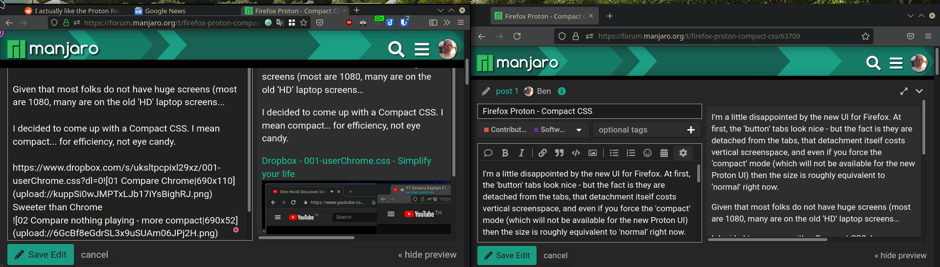
I think I’m done with this.
I had minor issues with colours mostly of text on containerised tabs between light and dark themes, but they’re easily adjusted if you load them up in VSCode with highlighting on…
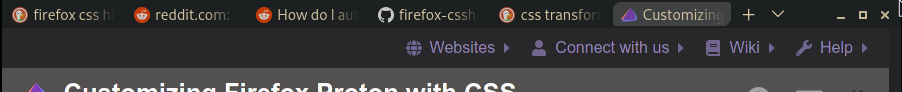
So here’s ‘Twilight’ theme (GTK set to Breeze) - a banking tab (blue text on personal tabs).
I brought back the top line - highlighting the current tab - which you’d see better on the SpaceX tab TBH.
So I revived a decent tab height - a few other tweaks… and I’m happy with it.
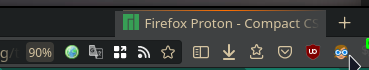
Menus are sanely sized - but won’t show in screenshots for some reason…
--tab-border-radius: 0px 0px !important; sets no radius
CSS - for /firefox/profile/chrome/chromeUser.css file
/*
Set Firefox toolkit.legacyUserProfileCustomizations.stylesheets --> TRUE
*/
:root{
--toolbarbutton-inner-padding: 3px !important; /* reduce spacing for toolbar buttons */
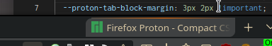
--proton-tab-block-margin: 3px 2px !important; /* space around tab (0 to merge with URL)*/
--tab-min-height: 26px !important;
--tabs-shadow-size: 0px !important;
--tab-border-radius: 8px 0px !important;
--arrowpanel-menuitem-padding: 2px !important;
--arrowpanel-dimmed: color-mix(in srgb, #c73530 40%, transparent) !important;
--arrowpanel-dimmed-further: color-mix(in srgb, #c73530 50%, transparent) !important;
--arrowpanel-dimmed-even-further: color-mix(in srgb, #c73530 60%, transparent) !important;
--urlbar-icon-padding: 4px !important;
--panel-font-size: inherit !important;
--arrowpanel-padding: 0.4em !important;
--panel-separator-zap-gradient: linear-gradient(90deg, #5f574c 0%, #ff6f00 50.90%, #444444 100%) !important; /* active tab highlight */
--lwt-accent-color: #0a0a0f !important; /* frame */
}
/* Reduce left spacer on tab bar */
.titlebar-spacer[type="pre-tabs"] {
display: none !important;
}
/* "Smaller Urlbar and Search-bar" */
#urlbar{min-height: 26px !important; margin-block: 0px 0px!important;font-size: 1.12em !important;text-shadow: none !important;}
#urlbar-background{margin-block: 1px 1px; !important;}
#urlbar-container{margin-block: 0px -4px;}
#urlbar-zoom-button {padding: 0px 2px !important;}
#searchbar {min-height: 26px !important;text-shadow: none !important; font-size: 1.12em !important; margin-block: -3px !important;}
/* Rainbow line in main menus */
.PanelUI-subView > toolbarseparator {border-image: var(--panel-separator-zap-gradient) 1 !important;}
/* Gradient Line */
.tab-background { position: relative !important;}
.tab-background::after { width: 96% !important;margin-block:-5px !important; background: var(--panel-separator-zap-gradient); position: absolute;
content: ''; height: 1px; left: 6; right: 0; top: 0; margin-top: -1px !important; margin-left: 2px !important; transform: scale(0, 1);
transform-origin: center center; opacity: 1 !important;}
.tab-background[selected="true"]::after { transform: scale(1, 1);}
/* Active Tab Brightness */
.tab-content[selected="true"] {background-color:color-mix(in srgb, #c5c5c5 0%, transparent) !important;
border-radius:0px !important; margin-top: 2px !important; margin-bottom: 3px !important;}
/* Show Tab Close buttons only when hovered */
.tab-close-button {
fill: rgba(255, 75, 75, 0.95) !important;
}
.tabbrowser-tab:not([pinned]) .tab-close-button {
max-width: 0px !important;
opacity: 0 !important;
transition: all 150ms ease-in-out 150ms !important;
/* no delay on exit*/
}
.tabbrowser-tab:not([pinned]):hover .tab-close-button {
display: -moz-box !important;
max-width: 20px !important;
opacity: 1 !important;
transition: all 550ms ease-in-out 550ms !important; /* delay on entry*/
}
/* LEGACY audio icon next to the tab icon - comment out the tab-secondary-label */
.tab-icon-stack:is([muted],[soundplaying],[activemedia-blocked]) {
grid-template-areas: "a s";
}
.tab-icon-overlay:is([muted],[soundplaying],[activemedia-blocked]){ grid-area: s; }
.tab-icon-overlay,.tab-icon-image{ opacity: 0.75 !important; }
/* secondary audio label can be removed if you use this style, but feel free to remove the next line if you want to show it. */
.tab-secondary-label{ display: none }
/* show the secondary label when video is in PiP */
.tab-secondary-label[pictureinpicture]{ display: -moz-box }
.tab-secondary-label:is([pictureinpicture]) {display: -moz-box !important; margin-top:-1px !important; color:#00dbfd !important;
font-size: 0.65em !important; font-weight: bold !important;text-shadow: 0px 0px 5px #272727 !important}
.tab-secondary-label:is([muted], [activemedia-blocked]) {display: none}
.tab-close-button{margin-inline-start: -2px !important;width: 15px !important;height: 15px !important;padding: 3px !important; margin-inline-end:-6px !important}
#tabbrowser-tabs{ --uc-tabs-scrollbutton-border: 2px }
#scrollbutton-up, #scrollbutton-down{ border-block-width: var(--uc-tabs-scrollbutton-border,0px) !important; }
.sharing-icon, #permissions-granted-icon, #tracking-protection-icon, .notification-anchor-icon, #blocked-permissions-container
>.blocked-permission-icon { height: 14px !important; width :14px !important;}
#identity-icon{color: #286828 !important; height: 14px !important; width :14px !important}
.urlbar-icon {padding: 4px !important}
.PanelUI-subView toolbarseparator.proton-zap {border-image: var(--panel-separator-zap-gradient) 1;}
.tab-context-line{max-width: 17px !important; max-height: 1px !important; margin-left: 8px !important;margin-bottom: -1px !important;}
.tab-context-line{-moz-box-ordinal-group: 2 !important; opacity: 1 !important;transition: none !important;}
.identity-color-blue {--identity-tab-color: #60a5d3 !important; --identity-icon-color: #2574A7 !important;--tab-line-color:#295170 !important;}
.identity-color-green {--identity-tab-color: #1E934F !important; --identity-icon-color: #1E934F !important;--tab-line-color:#20834b !important;}
.identity-color-orange {--identity-tab-color: #e67e22 !important; --identity-icon-color: #e67e22 !important;--tab-line-color:#a9642c !important;}
.identity-color-red {--identity-tab-color: #ff392b !important; --identity-icon-color: #ff392b !important; --tab-line-color:#cc372f !important;}
.identity-color-pink {--identity-tab-color: #ff33bb !important; --identity-icon-color: #ff33bb !important;--tab-line-color:#e22fa7 !important;}
.identity-color-purple {--identity-tab-color: #813E9D !important; --identity-icon-color: #813E9D !important;--tab-line-color:#703988 !important;}
/* text on tabs */
.identity-color-blue >.tab-stack > .tab-content:not([selected="true"]) .tab-label{color: #4079e2 !important;}
.identity-color-green >.tab-stack > .tab-content:not([selected="true"]) .tab-label{color: #50e18c !important; }
.identity-color-orange >.tab-stack > .tab-content:not([selected="true"]) .tab-label{color: #ebc247 !important; }
.identity-color-red >.tab-stack > .tab-content:not([selected="true"]) .tab-label{color: #ff6666 !important;}
.identity-color-pink >.tab-stack > .tab-content:not([selected="true"]) .tab-label{color: #ff99eb !important;}
.identity-color-purple >.tab-stack > .tab-content:not([selected="true"]) .tab-label{color: #caa4da !important;}
/* Adds tint to tabs selected according to the container */
.identity-color-blue> .tab-stack> .tab-content[selected="true"] {background-color:color-mix(in srgb, #255da7 80%, transparent) !important;
border-radius:0px !important; margin-top: 3px !important; margin-bottom: 3px !important;}
.identity-color-green .tab-stack> .tab-content[selected="true"] {background-color:color-mix(in srgb, #1E934F 80%, transparent) !important;
border-radius:0px !important; margin-top: 3px !important; margin-bottom: 3px !important;}
.identity-color-orange .tab-stack> .tab-content[selected="true"] {background-color:color-mix(in srgb, #e67e22 80%, transparent) !important;
border-radius:0px !important; margin-top: 3px !important; margin-bottom: 3px !important;}
.identity-color-red .tab-stack> .tab-content[selected="true"] {background-color:color-mix(in srgb, #a0392b 80%, transparent) !important;
border-radius:0px !important; margin-top: 3px !important; margin-bottom: 3px !important;}
.identity-color-pink .tab-stack> .tab-content[selected="true"] {background-color:color-mix(in srgb, #ff99eb 80%, transparent) !important;
border-radius:0px !important; margin-top: 3px !important; margin-bottom: 3px !important;}
.identity-color-purple .tab-stack> .tab-content[selected="true"] {background-color:color-mix(in srgb, #813E9D 80%, transparent) !important;
border-radius:0px !important; margin-top: 3px !important; margin-bottom: 3px !important;}
/* Replace the button background-colors with a glow effect */
/* Edit the color choices how you see fit */
/* Make backgrounds transparent */
.close-icon,
.urlbar-icon,
.urlbar-icon-wrapper,
toolbar .toolbarbutton-1,
#tabbrowser-tabs toolbarbutton,
toolbar toolbarbutton > .toolbarbutton-icon,
toolbar toolbarbutton > .toolbarbutton-badge-stack,
.titlebar-button,
#identity-box,
#identity-icon-box,
#tracking-protection-icon-container,
.findbar-textbox~toolbarbutton,
toolbarbutton.scrollbutton-up,
toolbarbutton.scrollbutton-down,
toolbarbutton#scrollbutton-up,
toolbarbutton#scrollbutton-down{
background-color: transparent !important;
border-color: transparent !important;
}
/* Glow effects on hover */
.close-icon:hover,
.urlbar-history-dropmarker:hover,
#page-action-buttons > .urlbar-icon:hover,
.urlbar-icon-wrapper:hover > .urlbar-icon,
toolbar .toolbarbutton-1:not([disabled]):hover .toolbarbutton-icon,
#TabsToolbar toolbarbutton:not([disabled]):hover .toolbarbutton-icon,
toolbar #downloads-button:hover #downloads-indicator-anchor,
#identity-box:not(.no-hover):hover,
#tracking-protection-icon:hover,
.findbar-textbox~toolbarbutton:not([disabled]):hover,
toolbarbutton.scrollbutton-up:not([disabled]):hover,
toolbarbutton.scrollbutton-down:not([disabled]):hover,
toolbarbutton#scrollbutton-up:not([disabled]):hover,
toolbarbutton#scrollbutton-down:not([disabled]):hover{
filter: brightness(2) drop-shadow(0 0 3px rgb(255, 0, 0)) drop-shadow(0 0 2px rgb(255, 0, 0))
}
/* Active states and close window button hover state */
#titlebar .titlebar-buttonbox > .titlebar-close:hover > .toolbarbutton-icon,
.close-icon:active,
.urlbar-history-dropmarker:active,
#page-action-buttons > .urlbar-icon:active,
#page-action-buttons > .urlbar-icon[open],
.urlbar-icon-wrapper:active > .urlbar-icon,
.urlbar-icon-wrapper[open] > .urlbar-icon,
toolbar toolbarbutton:not([disabled]):active .toolbarbutton-icon,
toolbar toolbarbutton:not([disabled])[open] .toolbarbutton-icon,
#TabsToolbar toolbarbutton:not([disabled]):active .toolbarbutton-icon,
toolbar #downloads-button:active #downloads-indicator-anchor,
toolbar #downloads-button[open] #downloads-indicator-anchor,
#identity-box:not([disabled]):active,
#tracking-protection-icon-container[open] #tracking-protection-icon,
.findbar-textbox~toolbarbutton:not([disabled]):active,
toolbarbutton.scrollbutton-up:active,
toolbarbutton.scrollbutton-down:active,
toolbarbutton#scrollbutton-up:active,
toolbarbutton#scrollbutton-down:active{
filter: brightness(2) drop-shadow(0 0 2px red) drop-shadow(0 0 1px yellow)
}
/* auto-hide nav-bar *
#navigator-toolbox{
--uc-bm-height: 28px; /* Might need to adjust if the toolbar has other buttons *
--uc-bm-padding: 2px; /* Vertical padding to be applied to bookmarks *
--uc-navbar-height: -40px; /* navbar is main toolbar. Use negative value *
--uc-autohide-toolbar-delay: 3000ms; /* The toolbar is hidden after 0.6s *
}
:root[uidensity="compact"] #navigator-toolbox{ --uc-bm-padding: 1px; --uc-navbar-height: -32px }
:root[uidensity="touch"] #navigator-toolbox{ --uc-bm-padding: 6px }
:root[sessionrestored] #nav-bar,
:root[sessionrestored] #PersonalToolbar{
transform: rotateX(90deg);
transform-origin: top;
transition: transform 235ms linear var(--uc-autohide-toolbar-delay) !important;
z-index: 2;
}
#nav-bar[customizing],#PersonalToolbar[customizing]{ transform: none !important }
#navigator-toolbox > #PersonalToolbar{
transform-origin: 0px var(--uc-navbar-height);
z-index: 1;
position: relative;
}
:root[sessionrestored]:not([customizing]) #navigator-toolbox{ margin-bottom: calc(2px - var(--uc-bm-height) - 2 * var(--uc-bm-padding) + var(--uc-navbar-height)); }
#PlacesToolbarItems > .bookmark-item,
#OtherBookmarks,
#PersonalToolbar > #import-button{
padding-block: var(--uc-bm-padding) !important;
}
/* Make sure the bookmarks toolbar is never collapsed even if it is disabled
#PersonalToolbar[collapsed="true"]{
min-height: initial !important;
max-height: initial !important;
visibility: hidden !important
}
/* The invisible toolbox will overlap sidebar so we'll work around that here
#navigator-toolbox{ pointer-events: none; border-bottom: none !important; }
#PersonalToolbar{ border-bottom: 1px solid var(--chrome-content-separator-color) }
#navigator-toolbox > *{ pointer-events: auto }
#sidebar-box{ position: relative }
/* SELECT TOOLBAR BEHAVIOR Comment out or delete one of these to disable that behavior */
/* Show when urlbar is focused
#nav-bar:focus-within + #PersonalToolbar,
#navigator-toolbox > #nav-bar:focus-within{
transition-delay: 100ms !important;
transform: rotateX(0);
}
/* Show when cursor is over the toolbar area
#navigator-toolbox:hover > .browser-toolbar{
transition-delay: 100ms !important;
transform: rotateX(0);
}

