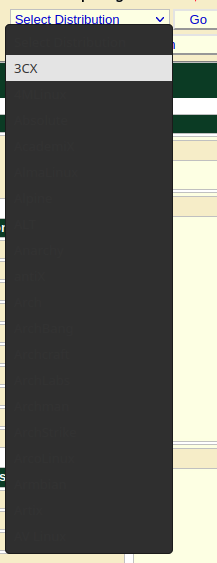
Here’s what a dropdown looks like for me in Firefox (only):
Is there a way to make it more managable?
I’ve checked that Chromium looks ok.
I have a dark GNOME 43 system theme enabled.
Here’s what a dropdown looks like for me in Firefox (only):
Is there a way to make it more managable?
I’ve checked that Chromium looks ok.
I have a dark GNOME 43 system theme enabled.
I don’t have this issue using a dark theme in KDE(Plasma) + firefox(developer edition) ![]()
Looks like the website might be defining a text color in the drop down, but not the background of the drop down it self. Does it happen on other websites?
Hi,
Thanks for the response.
Yes, it happens on some other websites, but not all. And only with Firefox. Everything works fine with Chromium.
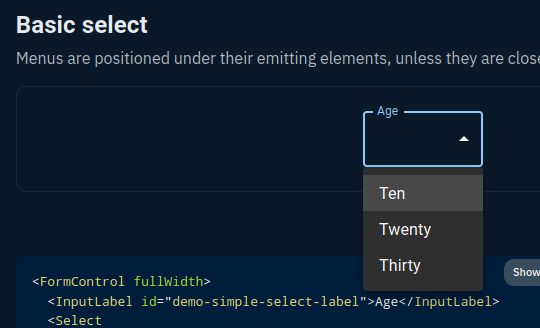
Also, some of the pages work just fine, here’s an example from MUI docs:
Thanks for confirming. Time to switch for me, I think ;).