")
2 Likes
The contrast is very nice! Great updated theme. Thank you. 
1 Like
Hi, @codesardine thanks for the dark theme again.
Qs:
- Can you make the footer with dark background as well ? and
- Could you please tone down Welcome to our community
<div class="search-banner">just a bit ?
Other than that its nice and fresh look.
Cheers… 
It was deliberately made larger and more conspicuous, because earlier, none of the n00bs could see that it was there, apparently. 
 Oh well than… its oki… I guess
1 Like
Thanks.
The numer of new/unread posts behind thread titles is barely readable, the pinkish color doesn’t seem to fit into manjaro color scheme,
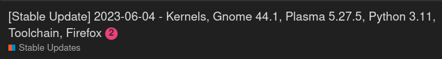
screenshot
Also (as already mentioned), the footer is far too bright (for a dark theme).
2 Likes
Thanks for dark mode!
Is it supposed to be persistent? Mine switched itself back to light mode when I opened the forum on a new tab … oops I had cookies blocked, should work better now.
Will you also have dark mode on code blocks and quote blocks? Wait, is it already done, or was I dreaming of a place that never was …
I hope this post doesn’t get negative karma points lol
I personally didn’t even notice the dark theme was gone 
Maybe it’s because i have this extension installed 
I just checked with the forum’s “Dark” version, and somehow the dark mode of the extension shows better dark mode as the Forum’s “Dark” theme especially the “CityScape” at bottom is way too light…
- Bottom using “Dark” theme of forum: (Extension auto disabled itself)
- Bottom using “Light” theme of forum: (Extension auto enabled itself)
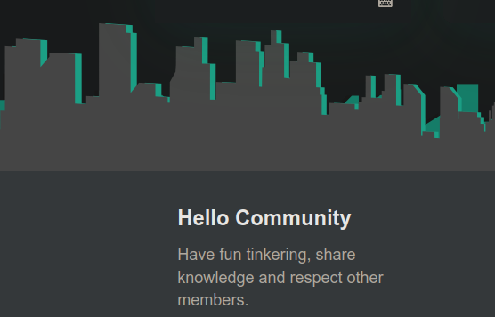

So bottom line is:
Yea ill keep my forum setting on “Light” until the “Dark” is really dark mode…
In the end I switched to the official Dark theme, and with the Dark Reader extension I modified the defaults a little bit to make it better to me. I can live with that. If anyone want to test, in Dark Reader go to the More tab, then click the Only for forum.manjaro.org button, and switch to the Static mode, and add the custom CSS by clicking the orange bulb above Static, click Apply, it should change top banner, the search banner, and fix the footer.
/* GENERAL */

html {
  background:  #2C2C2C !important;
}


/* HEADER */

.d-header {
  background-image: none !important;
  box-shadow: none !important;
  background-color: #14181c !important;
}
#main-outlet-wrapper .sidebar-wrapper {
  background-color: #14181c !important;
}
.search-banner {
  background: #999 !important;
}
.search-banner .custom-search-banner-wrap input#search-term {
  background-color: var(--primary-very-low) !important;
}
.custom-search-banner-wrap .results {
  background: var(--primary-low) !important;
}
.search-link:hover {
  background-color: var(--primary-very-low) !important;
}
.widget-link .badge-notification .unread-notifications {
  background-color: #2197ff !important;
}
.discourse-no-touch .d-header-icons .icon:hover, .discourse-no-touch .d-header-icons .icon:focus, .drop-down-mode .d-header-icons .active .icon {
  background-color: #14181c !important;
}


/* MENU */

.menu-panel {
  background-color: var(--primary-low) !important;
}
.user-menu.revamped .menu-tabs-container {
  background: var(--primary-low) !important;
}
.user-menu.revamped .tabs-list .btn.active {
  background-color: var(--primary-very-low) !important;
}
.user-menu.revamped .tabs-list .btn:hover {
  background-color: #14181c !important;
}
.user-menu .quick-access-panel li {
  background-color: var(--primary-low) !important;
}
.user-menu .quick-access-panel li:hover {
  background-color: var(--primary-very-low) !important;
}
.discourse-no-touch .btn:hover, .discourse-no-touch .btn.btn-hover {
  background: var(--primary-very-low) !important;
}
.user-menu.revamped .quick-access-panel li.unread, .user-menu.revamped .quick-access-panel li.pending {
  background-color: var(--tertiary-low) !important;
}


/* NOTIFICATION PAGE */

.user-stream .item, .user-stream .user-stream-item {
  background-color: transparent !important;
}


/* FOOTER */

.custom-footer {
  background:  #2C2C2C !important;
}
.custom-footer-content {
  height: 0px !important;
  visibility: hidden !important;
}
.custom-footer .flexbox {
  color: #999 !important;
}


/* POST */

pre code {
  background-color: var(--primary-low) !important;
}

aside.quote .title {
  border-left: 5px solid var(--primary-high) !important;
  border-right: 1px solid var(--primary-high) !important;
  background-color: var(--primary-low) !important;
}
blockquote {
  border-left: 5px solid var(--primary-high) !important;
  border-right: 1px solid var(--primary-high) !important;
  background-color: var(--primary-low) !important;
}
aside.onebox {
  background-color: var(--primary-low) !important;
  border: 5px solid var(--primary-high) !important;
}

.presence-users {
  background-color: var(--primary-low) !important;
}

.user-card .card-content, .group-card .card-content {
  background: var(--primary-low) !important;
}

.modal.history-modal .modal-inner-container {
  max-width: calc(var(--d-max-width) + 300px) !important;
}
.modal-inner-container {
  background-color: var(--primary-very-low) !important;
}

#reply-control .reply-area {
  background-color: var(--primary-very-low) !important;
}

.emoji-picker {
  background-color: var(--primary-low) !important;
  height: 420px !important;
  max-height: 70vh !important;
  max-width: 520px !important;
}
.emoji-picker .emoji-picker-emoji-area {
  background-color: var(--primary-low) !important;
}

.tap-tile-grid .tap-tile.active {
  background-color: var(--primary-low) !important;
}

.autocomplete {
  background-color: var(--primary-very-low) !important;
  border: 1px solid var(--primary-very-low) !important;
}
.autocomplete ul li a.selected {
  background-color: var(--primary-low) !important;
}
.discourse-no-touch .autocomplete ul li a:hover, .discourse-no-touch .autocomplete ul li a.btn-hover {
  background-color: var(--primary-low) !important;
}


/* OTHER */

.sticky-header .topic-list-header {
  background: #20282d !important;
}

.user-main .about .details {
  background: none !important;
}

ul {
  background-color: transparent !important;
}

.select-kit.is-expanded .select-kit-body {
  background-color: var(--primary-low) !important;
}

.select-kit .select-kit-row {
  background-color: var(--primary-low) !important;
}
.select-kit .select-kit-row:hover {
  background-color: var(--primary-very-low) !important;
}
.select-kit .select-kit-row.is-selected {
  background-color: var(--primary-100) !important;
}
.select-kit.multi-select .multi-select-header {
  background: none !important;
}
.select-kit.combo-box .select-kit-header {
  background: none !important;
}
.select-kit.multi-select {
  background: none !important;
}
input[type="text"], input[type="password"], input[type="datetime"], input[type="datetime-local"], input[type="date"], input[type="month"], input[type="time"], input[type="week"], input[type="number"], input[type="email"], input[type="url"], input[type="search"], input[type="tel"], input[type="color"] {
  background: none !important;
}

.d-editor-textarea-wrapper {
  background-color: var(--primary-low) !important;
}

.ignored-list {
  background-color: var(--primary-low) !important;
}
I’ll probably switch the highlights from green to blue but that may be done at a later time. At least it is a base to start from.
//EDIT: I edited the post, if a thread is opened to share our dark reader CSS I’ll post it there, for now I’ll keep updating it here.
1 Like
If you are comfortable using css (or javascript, etc)
And especially if you are only leveraging it for one or two sites.
Then there isnt really a need for dark reader.
You can use ‘overwrites’, ‘snippets’, or other developer tools, in chromium.
And similarly in firefox there is ‘style editor’.
I use Dark Reader since many years also for other sites, and I don’t recall edits made in browsers’ developer tools to be permanent 
You can make them persistent … it just depends how it is applied.
…Though FF may have deprecated one of the ways it had for doing so?
1 Like
Information to do with what you wish: dark themes are, for many of us, not a convenience but a necessity. An accessibility necessity, if you like–if accessibility is important to you.
I appreciate that the dark themes are re-enabled, but suggest that this be done at the time of upgrade rather than a few days later.
Can you fix the Home page so the categories do not overflow the main width? This is not a big thing, but this is annoying to me 

You can see everything respects the blue dotted lines, but the Home content with categories, they overflow 20 pixels on the right side of the main body where everything else is contained.
//EDIT: it is now corrected  :
:
Thank you for the Dark theme,and no toggle needed since it recognized my system preferences.
it did change my preference to light in this site profile,but i set it again to dark.
Can you make it so the badge badge-notification clicks does not look overwhelming, get it back to its defaults (gray background I guess). Best is to exclude .clicks from the forced notification badge color.

change
.badge-notification:not(.new-reviewables):not(.new-topic), .topic-list-body .unseen-topic .badge-notification.new-topic::before, .badge-notification.unread-posts, .badge-notification.new-pms, .d-header-icons .unread-notifications
to
.badge-notification:not(.new-reviewables):not(.clicks):not(.new-topic), .topic-list-body .unseen-topic .badge-notification.new-topic::before, .badge-notification.unread-posts, .badge-notification.new-pms, .d-header-icons .unread-notifications
Result back to normal:
2 Likes
This issue has been addressed in the future I would appreciate if you would open issues in the correct place → Issues · WEB / Discourse theme · GitLab
OK whatever I’ll do it myself as you didn’t understand what is wrong with your dark theme, and fix the issue you created by doing more wrong coloring. Fixes will be there.
//EDIT: And we can’t override it as you’re using !important; in your CSS. Please fix it properly
.badge-notification.clicks {
  background-color: var(--primary-low) !important;
  color: var(--primary-medium) !important;
}
.badge-notification:not(.new-reviewables):not(.new-topic):not(.clicks), .topic-list-body .unseen-topic .badge-notification.new-topic::before, .badge-notification.unread-posts, .badge-notification.new-pms, .d-header-icons .unread-notifications {
  background-color: var(--notification-color) !important;
  font-weight: bold;
  border: none !important;
}
I still miss the old (home page) layout, I know I can change to Latest etc., but having categories expanded + latest on the side made it one click away for most things. I guess people don’t like change:).