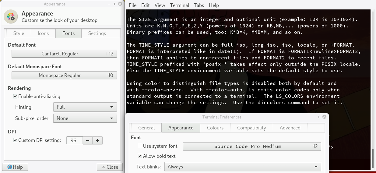
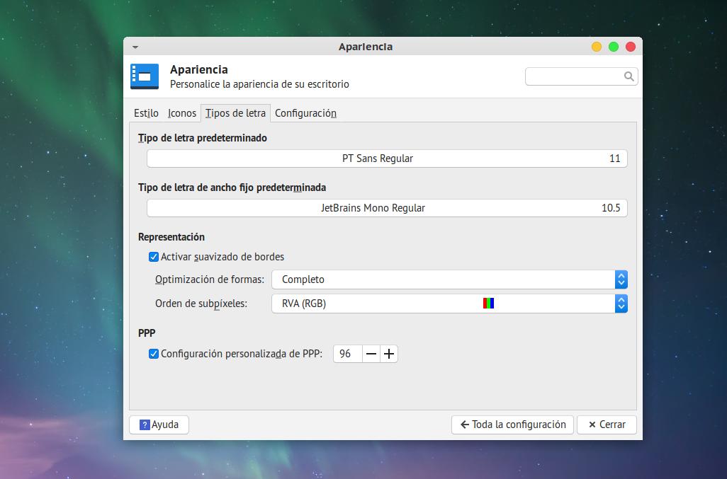
In my terminal settings I changed my font to source code pro but when I use the same font for the whole system it doesn’t look good. And I’m not sure but I feel that it looks different on desktop and terminal.
I tried some fonts but the spacing usually is to narrow or to wide. Even if I try only regular fonts.
Only font that looks pretty ok is Sans Regular but I would like to find something crispier.
p.s.
AA on
Hinting - slight
subpixel - RGB
dpi - 96
True. But in this case I didn’t want to know what font is the prettiest.
I started to check fonts and some of them look like this M a n j a r o
and some quite opposite. Almost no spacing.
And after quite a lot of checking I can say that there is something wrong with my fonts or settings.
For example when I change font to icomoon bold italic nothing is going on. Font is thin.
In firefox for example I changed settings to minimum font size 12 and after restart I did some tests and for sure fonts are smaller than 12.
I changed all sizes of firefox fonts and they are still the same.