I notice there’s some weird aliasing that happens with fonts on Manjaro here, for English text you get a lot of aliasing around the edges of text, but when you’re using another or just seeing another language text on screen, there’s little to no aliasing around that text. For example Japanese text, the text looks more sharper and lacks that aliasing effect around the text that English text has. I thought it might be a font issue but when compared to on another computer running another Linux distro like Linux Mint, both machines using the same fonts and such the aliasing doesn’t appear to have that issue around Japanese text, it just appears as it normally would around English text.
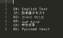
I did a test comparison between different languages to compare how the fonts are rendered, the ones that stand out the most is Japanese and Chinese text, they both lack aliasing unlike the others which have aliasing. Why doesn’t Japanese and Chinese text render the same way as the other text? Not even Korean text renders in the same way as Japanese and Chinese, in fact it looks like it has more aliasing than the other text. They even look weird when seen on websites too. Is there a way to fix this so all the text renders the same?