Maybe it’s worth it to make them upside-down?
You mean something like this ?
Not very convinced by it either …
Also it still bugs me that if i try to have nice rounded corners, or even try to have a bit of shadow under, in some circumstances is simply rendering an artifact, and looks really bad.
Maybe this ?
2 Likes
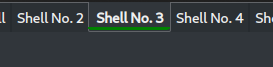
The last one is quite good-looking indeed.
1 Like
@bogdancovaciu Maybe you can take inspiration from this Yakuake theme. I find this very sleek looking.
For now i decided to keep it this way, so the light and dark remain consistent.

and be close to what happens here
Yet, as you can see there are some limitations and differences still, as i do not think the assets quite follow the same rules on yakuake as on kde plasma settings tabs.
3 Likes
This also makes sense and looks normal. Again the light is waaay better than the dark one but it’s okay for the time being given that you’re still trying to improve that. Thanks Bogdan! 
2 Likes
Don’t thank me yet, i’m not done bothering you! 
There might be a way to make things better
4 Likes
OK, now it’s kool 

1 Like
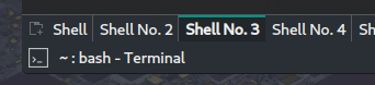
Somehow this looks a bit too much to me, or … ?
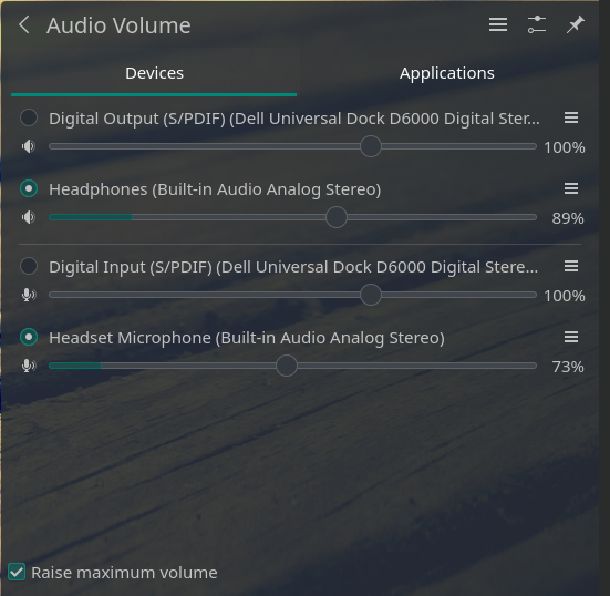
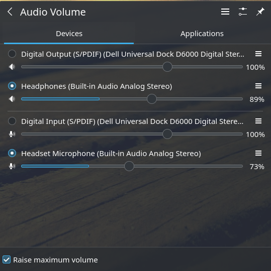
KDE Breath Dark theme, especially dark pine-green on sound bars are too dark. At least for me. Where can I change that to something lighter ?
Original breeze has nicer blue contrast, but this pine-green of Manjaro was really nice before update.
Only speak yakuake today 
Final:
@igorp - please post a screenshot so i know exactly what you are referring too, i have to many iterations of Breath to know now exactly what shade of green bothers you… Thanks!
1 Like
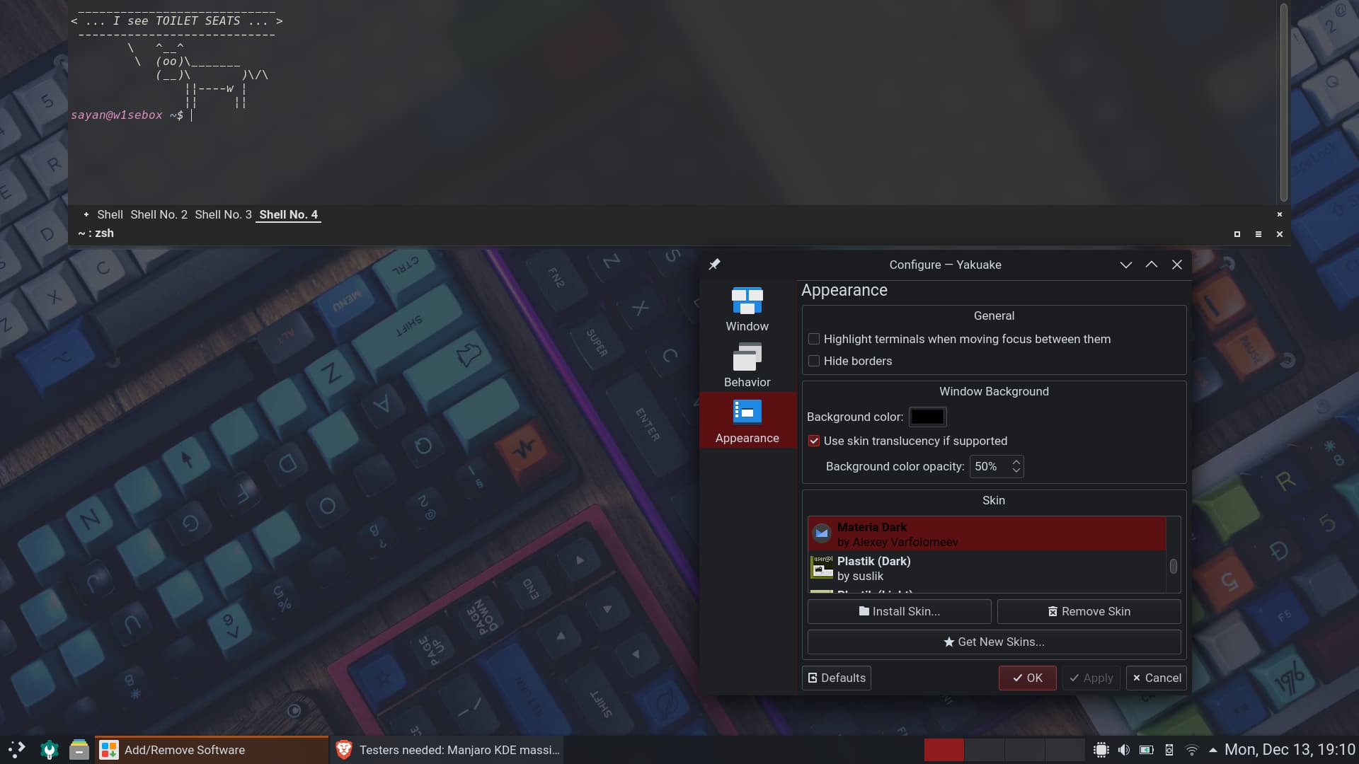
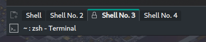
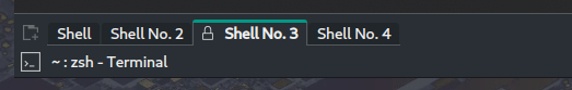
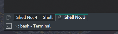
Light one looks nice, with the dark one I still need to look hard to separate between “Shell No.4” and “Shell” tab.
In my real (work)life situation they’re displaying a (oftentimes rather long) working directory where the textual distinction sometimes is hard and visual cues all the more important.
1 Like
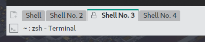
Then i guess we should go like this ?
used now the button background color from the color-scheme …
5 Likes
Super, thanks for pointing that out - let me check and see what can be done.
1 Like
Recent stable update using Pamac removed some important packages, which one should I install to keep Manjaro in good state ?
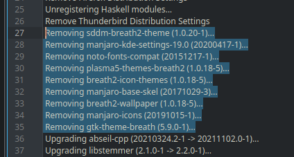
it’s manjaro-kde-settings (without version)
1 Like
In my experience contrast makes the panels looks pretty intuitive , try the small bar in the active tab on the dark theme more contrast to the theme. The look of the inactive tabs are amazing!!!
For visuals, please provide examples.
All the bars in town are closed, even the small ones …
If ou refer to the Panel and Titlebars with the buttons, yeah, they are all small on my end. A panel smaller than 32 pixels becomes something else, hence i never go bellow that; is always on top and does not fill the entire horizontal space of the screen.
The close, minimize, etc. buttons are on both sides of the titlebar. As color-scheme i use one based on Blender interface. There is a very small difference between the active window and inactive window on my end. I dislike jumpy visuals for interface.
This might not work for somebody else, neither the arrangement nor the color-scheme.

The best contrast is in Adwaita dark as application style (if someone installs adwaita-qt) and color-scheme, but many dislike it.
Remember, we try to provide a default that works for most people, but those color-schemes can be personalized by every user, to meed their particular taste and requirements …
Hey @igorp - you can try this and place it in /.local/share/color-schemes/ as whateverName.colors file and you can change the ColorScheme description and Name in the [General] line …
[ColorEffects:Disabled]
Color=56,56,56
ColorAmount=0
ColorEffect=0
ContrastAmount=0.65
ContrastEffect=1
IntensityAmount=0.1
IntensityEffect=2

[ColorEffects:Inactive]
ChangeSelectionColor=true
Color=112,111,110
ColorAmount=0.025
ColorEffect=2
ContrastAmount=0.1
ContrastEffect=2
Enable=false
IntensityAmount=0
IntensityEffect=0

[Colors:Button]
BackgroundAlternate=0,110,98
BackgroundNormal=51,57,63
DecorationFocus=0,110,98
DecorationHover=0,152,134
ForegroundActive=61,174,233
ForegroundInactive=194,194,194
ForegroundLink=29,153,243
ForegroundNegative=218,68,83
ForegroundNeutral=246,116,0
ForegroundNormal=194,194,194
ForegroundPositive=39,174,96
ForegroundVisited=155,89,182

[Colors:Complementary]
BackgroundAlternate=0,110,98
BackgroundNormal=42,46,50
DecorationFocus=0,152,134
DecorationHover=0,152,134
ForegroundActive=61,174,233
ForegroundInactive=161,169,177
ForegroundLink=29,153,243
ForegroundNegative=218,68,83
ForegroundNeutral=246,116,0
ForegroundNormal=252,252,252
ForegroundPositive=39,174,96
ForegroundVisited=155,89,182

[Colors:Header]
BackgroundAlternate=40,46,51
BackgroundNormal=51,57,63
DecorationFocus=0,152,134
DecorationHover=0,152,134
ForegroundActive=61,174,233
ForegroundInactive=161,169,177
ForegroundLink=29,153,243
ForegroundNegative=218,68,83
ForegroundNeutral=246,116,0
ForegroundNormal=252,252,252
ForegroundPositive=39,174,96
ForegroundVisited=155,89,182

[Colors:Header][Inactive]
BackgroundAlternate=49,54,59
BackgroundNormal=42,46,50
DecorationFocus=61,174,233
DecorationHover=61,174,233
ForegroundActive=61,174,233
ForegroundInactive=161,169,177
ForegroundLink=29,153,243
ForegroundNegative=218,68,83
ForegroundNeutral=246,116,0
ForegroundNormal=252,252,252
ForegroundPositive=39,174,96
ForegroundVisited=155,89,182

[Colors:Selection]
BackgroundAlternate=0,110,98
BackgroundNormal=0,137,123
DecorationFocus=0,110,98
DecorationHover=0,152,134
ForegroundActive=252,252,252
ForegroundInactive=252,252,252
ForegroundLink=253,188,75
ForegroundNegative=218,68,83
ForegroundNeutral=246,116,0
ForegroundNormal=252,252,252
ForegroundPositive=39,174,96
ForegroundVisited=155,89,182

[Colors:Tooltip]
BackgroundAlternate=40,46,51
BackgroundNormal=15,15,15
DecorationFocus=0,110,98
DecorationHover=0,152,134
ForegroundActive=61,174,233
ForegroundInactive=194,194,194
ForegroundLink=29,153,243
ForegroundNegative=218,68,83
ForegroundNeutral=246,116,0
ForegroundNormal=194,194,194
ForegroundPositive=39,174,96
ForegroundVisited=155,89,182

[Colors:View]
BackgroundAlternate=35,38,41
BackgroundNormal=24,25,29
DecorationFocus=0,110,98
DecorationHover=0,152,134
ForegroundActive=61,174,233
ForegroundInactive=194,194,194
ForegroundLink=29,153,243
ForegroundNegative=218,68,83
ForegroundNeutral=246,116,0
ForegroundNormal=194,194,194
ForegroundPositive=39,174,96
ForegroundVisited=155,89,182

[Colors:Window]
BackgroundAlternate=51,57,63
BackgroundNormal=40,46,51
DecorationFocus=0,110,98
DecorationHover=0,152,134
ForegroundActive=61,174,233
ForegroundInactive=194,194,194
ForegroundLink=29,153,243
ForegroundNegative=218,68,83
ForegroundNeutral=246,116,0
ForegroundNormal=194,194,194
ForegroundPositive=39,174,96
ForegroundVisited=155,89,182

[General]
ColorScheme=BreathDark
Name=Breath Dark BOGDAN rework
shadeSortColumn=true

[KDE]
contrast=4

[WM]
activeBackground=40,46,51
activeBlend=40,46,51
activeForeground=252,252,252
inactiveBackground=51,57,63
inactiveBlend=51,57,63
inactiveForeground=89,89,89
Has some slight differences than the current Breath Dark.