Hello!
I was just viewing some pdf and noticed how ugly the title is set (and also the author’s name):

Letter spacing is so off, that it decreases readbility.
Is there anything I can do against this?
Thank you!
Hello!
I was just viewing some pdf and noticed how ugly the title is set (and also the author’s name):
Letter spacing is so off, that it decreases readbility.
Is there anything I can do against this?
Thank you!
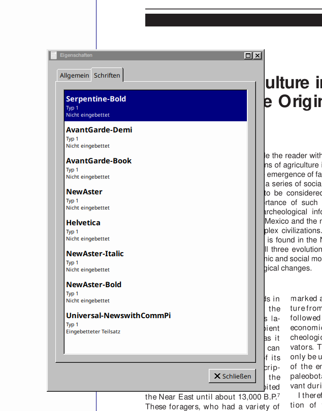
Can you reproduce the issue with the default viewer, Qpdfview?
I bet you the PDF is using a font you don’t have installed, and the creator of the PDF chose not to embed fonts. The terrible kerning is likely because your Atril is using a font with differently-sized letters but placing the letters at the correct location for the intended font.
It seems like you where right. QPDF didn’t show me this, but in Atril I found this "properties’ window:
There are many non-embedded fonts (I guess this least means they are all used in this document.)
I noticed that in my /etc/fonts there aren’t too many fonts:
10-sub-pixel-vrgb.conf
fonts.conf.pacsave.1
69-urw-z003.conf
30-win32-aliases.conf
46-noto-sans.conf
50-user.conf
69-urw-p052.conf
10-sub-pixel-rgb.conf
70-no-bitmaps.conf
75-ttf-inconsolata.conf
40-nonlatin.conf
10-hinting-slight.conf
90-synthetic.conf
65-droid-sans.conf
65-nonlatin.conf
45-latin.conf
11-lcdfilter-light.conf
fonts.conf.pacsave
11-lcdfilter-default.conf
70-noto-cjk.conf
46-noto-mono.conf
75-yes-terminus.conf
10-scale-bitmap-fonts.conf
10-hinting-none.conf
69-urw-standard-symbols-ps.conf
66-noto-mono.conf
65-droid-serif.conf
10-autohint.conf
10-hinting-medium.conf
fonts.conf.pacnew
30-metric-aliases.conf
69-urw-nimbus-sans.conf
10-no-sub-pixel.conf
69-urw-fallback-generics.conf
20-unhint-small-vera.conf
69-urw-c059.conf
65-khmer.conf
10-sub-pixel-bgr.conf
45-generic.conf
51-local.conf
60-generic.conf
25-unhint-nonlatin.conf
65-droid-kufi.conf
69-unifont.conf
69-urw-fallback-specifics.conf
66-noto-serif.conf
fonts.conf
66-noto-sans.conf
69-urw-nimbus-roman.conf
conf.d
69-urw-z003.conf
30-win32-aliases.conf
46-noto-sans.conf
50-user.conf
69-urw-p052.conf
70-no-bitmaps.conf
40-nonlatin.conf
10-hinting-slight.conf
90-synthetic.conf
65-droid-sans.conf
65-nonlatin.conf
45-latin.conf
70-noto-cjk.conf
46-noto-mono.conf
75-yes-terminus.conf
10-scale-bitmap-fonts.conf
69-urw-standard-symbols-ps.conf
66-noto-mono.conf
65-droid-serif.conf
30-metric-aliases.conf
69-urw-nimbus-sans.conf
69-urw-fallback-generics.conf
20-unhint-small-vera.conf
69-urw-c059.conf
45-generic.conf
51-local.conf
60-generic.conf
65-droid-kufi.conf
69-unifont.conf
69-urw-fallback-specifics.conf
66-noto-serif.conf
65-droid-sans-mono.conf
66-noto-sans.conf
69-urw-nimbus-roman.conf
49-sansserif.conf
README
65-fonts-persian.conf
69-urw-fallback-backwards.conf
60-latin.conf
69-urw-d050000l.conf
46-noto-serif.conf
69-urw-bookman.conf
69-urw-nimbus-mono-ps.conf
69-urw-gothic.conf
80-delicious.conf
49-sansserif.conf
70-yes-bitmaps.conf
65-fonts-persian.conf
10-unhinted.conf
69-urw-fallback-backwards.conf
60-latin.conf
69-urw-d050000l.conf
46-noto-serif.conf
69-urw-bookman.conf
69-urw-nimbus-mono-ps.conf
10-sub-pixel-vbgr.conf
69-urw-gothic.conf
fonts.conf.pacsave.2
80-delicious.conf
11-lcdfilter-legacy.conf
10-hinting-full.conf
60-droid-sans-mono.conf
I would have expected way more. Am I missing a font pack? Or should I just search for these fonts online and install them one by one? Or is there any reason to NOT install too many additional fonts? (I think I remember Windows getting really slow, with too many fonts installed, many years, ago, for example…)
Thank you both!