Could the ones configuring the web-site (forum) to make it use widescreen’s space better?
At moment the forum is displayed in the middle of my screen with black borders on left and right.
It would be much nicer if it stretched the whole wide automatically, eg. use more Responsive design layout without fixed widths.
I recommend reading this:
See the reply from Rafael, one of the discourse team members … 
1 Like
I guess you mean this part right? 
However, here you can customize your instance as you see fit. CSS will make it as wider as you want.
Hence why i said:

Yeah, YOU can do it with a CSS for your browser to fit your needs.
1 Like
Ugh ok i will try to make a greasemonkey plugin then, im trying now using the developer toolbar…
Not being dismissive here, but wanted you to see first hand an explanation from a UX designer/programmer how this “works” … We already know that reading long text on horizontal will make you quite frustrated and will be tiresome
Test it on your end for a while and let us know how that worked.
That is actually a fault of the editor that creates the text.
Yes no one likes to read a “Wall of text”, but that is not something a websites css should try to “fix”
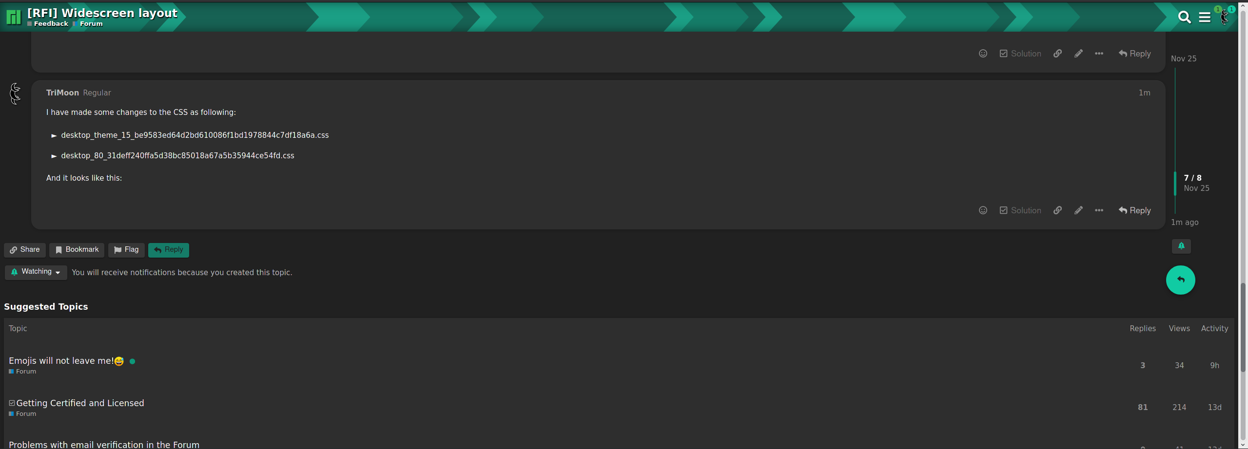
I have made some changes to the CSS as following:
desktop_theme_15_be9583ed64d2bd610086f1bd1978844c7df18a6a.css
--- desktop_theme_15_be9583ed64d2bd610086f1bd1978844c7df18a6a.css	2020-11-25 18:02:13.568717544 +0300
+++ desktop_theme_15_be9583ed64d2bd610086f1bd1978844c7df18a6a-new.css	2020-11-25 18:23:32.603521369 +0300
@@ -210,7 +210,7 @@
  box-shadow:0px 2px 1px -1px rgba(0,0,0,0.2),0px 1px 1px 0px rgba(0,0,0,0.14),0px 1px 3px 0px rgba(0,0,0,0.12)
 }
 .topic-post {
- padding-top:6px;
+ padding-top:6px
 }
 .topic-post .topic-body.clearfix:before,
 .topic-post .topic-body.clearfix:after {
@@ -440,8 +440,9 @@
  box-shadow:0 2px 5px 0 rgba(0,0,0,0.16),0 0 0 0 rgba(0,0,0,0.12);
  background-color:#2e2e2e;
  margin-top:10px;
- border-radius:4px;
- padding:15px 20px 0 20px
+ border-radius:2ch;
+ padding:15px 20px 0 20px;
+ width: calc(100% - 45px - 20ch);
 }
 .topic-avatar {
  border-top:0;
@@ -717,7 +718,7 @@
 #main-outlet {
  flex:1 0 auto;
  max-width:calc(100% - 16px);
- width: 1110px;
+ width: calc(100% - 16px);
 }
 .mobile-view #main-outlet {
  max-width:calc(100% - 20px)
desktop_80_31deff240ffa5d38bc85018a67a5b35944ce54fd.css
--- desktop_80_31deff240ffa5d38bc85018a67a5b35944ce54fd.css	2020-11-25 17:42:02.956068416 +0300
+++ desktop_80_31deff240ffa5d38bc85018a67a5b35944ce54fd-new.css	2020-11-25 18:12:34.061412009 +0300
@@ -3362,7 +3362,7 @@
 }
 .topic-list-item td:first-child,
 .topic-post {
- border-left:1px solid transparent;
+ border-left:1px solid transparent
 }
 .topic-list tr.selected td:first-child,
 .topic-list-item.selected td:first-child,
@@ -9982,7 +9982,7 @@
 .wrap {
  margin-right:auto;
  margin-left:auto;
- padding:0 8px;
+ padding:0 8px
 }
 .wrap .contents {
  position:relative
@@ -13748,7 +13748,7 @@
 }
 @media all and (min-width: 1250px) {
  .timeline-container {
-  margin-left:900px
+  margin-left:calc(100% - 20ch);
  }
 }
 .timeline-container.timeline-docked {
@@ -15084,7 +15084,7 @@
  margin-bottom:10px
 }
 .wrap {
- max-width:1110px;
+/*  max-width:1110px */
 }
 .full-width {
  margin-left:0
And it looks like this:
1 Like