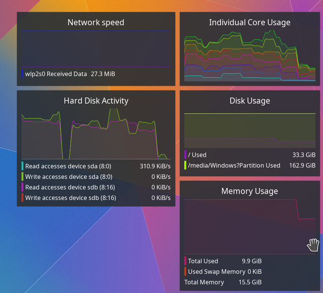
Hello there. I have recently updated my KDE Manjaro installation to the latest 20.1 version. Naturally, all the KDE Plasma widgets got updated too, and the CPU load widget (Don’t remember how it was formally called before) got split into 2: Total CPU Usage and Individual Core Usage. The thing that is bothering me is that on the Individual Core Usage widget, with the Line Chart display style all the lines are overlayed on each other, instead of being rendered on their own individual track like it was before. It really makes the whole widget look messy and meaningless for me, so I was wondering if there is a way to bring back the old appearance mentioned above? I’ve toggled every setting available for the widget and couldn’t find what I was looking for, which is similar to the current Text Only display style.
You could try to add these here.

But the new widgets are really bad. I can’t get the line chart to display text for example so I use an additional bar chart because the text only works on this one.
The Individual Core Usage widget alread has these core lines. The problem is the way they are rendered, so I agree that the new widgets are really bad. I can’t believe they went