Color deficiency is irrelevant here. A color deficient can differentiate colors. For green-red deficiency, some green on some blue, etc. may be problem but traditional color codes are ok.
That is just one deficiency and is called deuteranopia. There are types of deficiency for each base colors (red, yellow and blue combination) with different shades variations: protanopia, protanomaly, deuteranopia, deuteranomaly, tritanopia, tritanomaly.
What is relevant? Since color codes got back into Pamac, why getting argumentative again?
I’'m not saying this or that way must be chosen. However color deficiency did not seem to me as a relevant argument for saying not use colors in pamac.
Edit: sorry it is my bad, it was an old discussion, I misunderstood the issue I think 
No worries sometimes even tho we try to clarify things, is possible that we get different message from the “entire picture”. At that time, the focus was on functionality and because of the switch to gtk4 not all features got into that release and people got upset. Is understandable.
What do you think of the latest release, is more practical, does fulfill the goal to help user identify better the packages, does it look better, does integrate better with the rest of the UI ?
Thanks.
Yes I think it is pamac-gtk too so I am very confused when you say pamac-qt
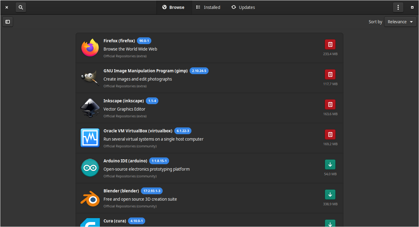
You could say this is a continuation of this issue, yet now on the new Pamac 10.1.3: Pamac v10 has space wastes and bad alignments - #52 by Chhkuot

Caption: “Description text cuts off, not enough room, yet plenty of unused space on both sides”
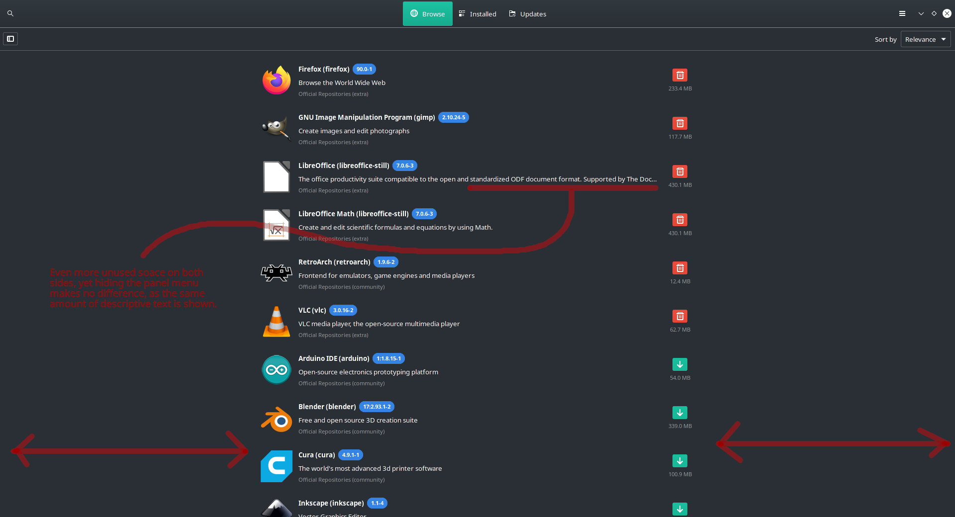
Caption: “Even more unused space on both sides, yet hiding the panel menu makes no difference, as the same amount of descriptive text is shown.”
Evidently, what is the purpose of “collapsing” the left panel menu, when it does nothing to benefit the extra space by doing so? Whether or not you hide the left panel, the same amount of text is still cut off. There’s a lot of extra space wasted on both sides that could be used for descriptions, actions, previews, package/file info, etc, that could be displayed when clicking on a package in the list.
Don’t just look at the dead space on the “right”. Add up the dead space on both the “left” and “right” and you’ll see you can fit a lot of useful information to the right side, while the list of packages can be aligned to the left side.
1 Like
Added your feedback in this topic, se we keep it tidy … Read along. While pointing out the “faults” let us know also if there are some solutions in mind. Note: Must be working on mobile as well.
While not specific solutions (as others can chime in on what that unused space can display when clicking on a package) they lead towards some possibilities.
I currently cannot comment on how it can work on a phone screen, as I do not have any such phones that can run a Linux distro.
Phones (naturally held as a vertical screen) versus computers (horizontal screens) have distinctive paradigms.
However, I can confirm the above display issues are the same on a 27” monitor and a small netbook 9” screen.
I didn’t notice before, but there is something which starts to bother me. My display have 1366x768 and padding in maximized Pamac window isn’t that big.
Does someone here have a display bigger than 1920x1080? I’m curious how it looks on wide screen.
Padding for high resolution displays could be smaller thought. I like GTK design, but this is too big even for me, plus length from corners (menu button, launcher etc.) to menu item can be uncomfortable.

My monitor is 1920 x 1080 (screenshots above). I’m running KDE, however.
I know that’s why I was asking for screenshot from a display higher than 1920x1080 
You think I’m made of money with 4K monitors side-by-side in some decked out RGB-LED gaming room with soundproof padding and a custom-made ergonomic desk with a holographic fish tank that lights up automatically on a sunset-sunrise schedule?
Psssshh. Probably the last time I take any comments seriously from someone who has a penguin as their avatar… 
What? xD Point me where I told you to buy bigger screen.
I asked for screenshot (if somebody with display higher than 1920x1080 is here) because if padding on 1920x1080 is that big, so how it looks on something bigger, which means how wide are items and how they are scaled.
For now, it looks like menu items width is static or something like that, which can be pretty bad for wide screens.
You didn’t. I was just being a goofball, my fellow penguin.
I think that’s most likely the case, and you can see this pattern between our three screenshots above: as the display resolution increases, the relative widths (of the listed items) shrinks.
I’ve created an issue and if you guys/gals like to add something I’ve forgotten or correct me if I misunderstood something from our discussion, don’t hesitate to jump in
changing the <property name="maximum_size">900</property> to <property name="maximum_size">1920</property> for example, indeed will solve the list of packages display issue, or rather better fill the empty space while Pamac is in full screen mode, or maximized, but will still not solve the preview of the package, especially of those that have 3 words description and no screenshot. There is simply no information to fill that space … The transition between the list of packages to package preview is rather more noticeable, making things even worse visually, so i kind of understand why Guillaume decided to keep it as it is.
What is the purpose of collapsing the left panel, regardless? The majority of computer users are very likely to have screens with a horizontal resolution wider than 1000 pixels. (In fact, what percentage of computer users currently own displays that are smaller than 1000 pixels horizontal resolution?) Even my netbook is 1366 pixels wide.
So the “collapsible panel” on the left comes off as odd. It serves no apparent function. It gives the vibe of a pre-release application to test the UI.
Which raises the question, why the 900 pixel limit? Why not dynamically grow horizontally based on the size of the window? Even in these very forums, the size (specifically the width) of my web browser dictates the horizontal size of the very forms I am typing this in.
Mobile device. Mentioned already
also explained in the video from this comment:
see that video please
Pamac is made to work on mobile and desktop.
I’ll repeat: will still not solve the preview of the package, especially of those that have 3 words description and no screenshot.
An example, look for qvkbd package, click on it to see the details and description, maximize Pamac and let us know what information should fill the empty space around those buttons and short description …
1 Like