I’m not an expert in creating GTK GUIs, but I know a bit and maybe this help you to chill a bit. The Window is filed with containers which are auto aligned to centre in this case and most cases in GNOME (check out GNOME 40), so this is why the window have “empty” spaces on the right and left side which is an effect of not enough content to fill the whole window (width is probably set to auto-scaling). It has pros and cons but at least there is guaranty that after scaling containers in the window will not move to weird positions and everything is in one place. Pamac will be improved and will change with time so chill out.
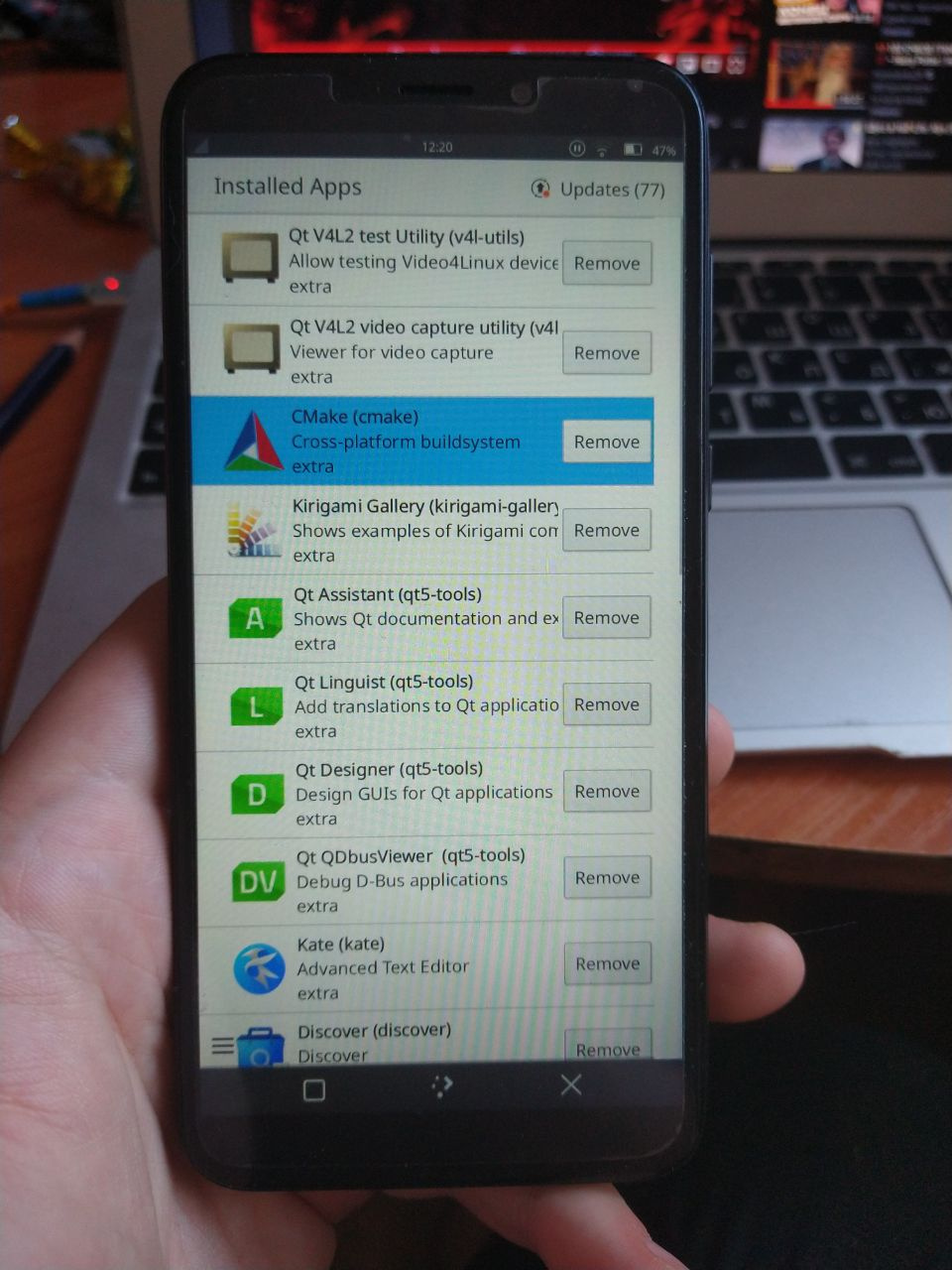
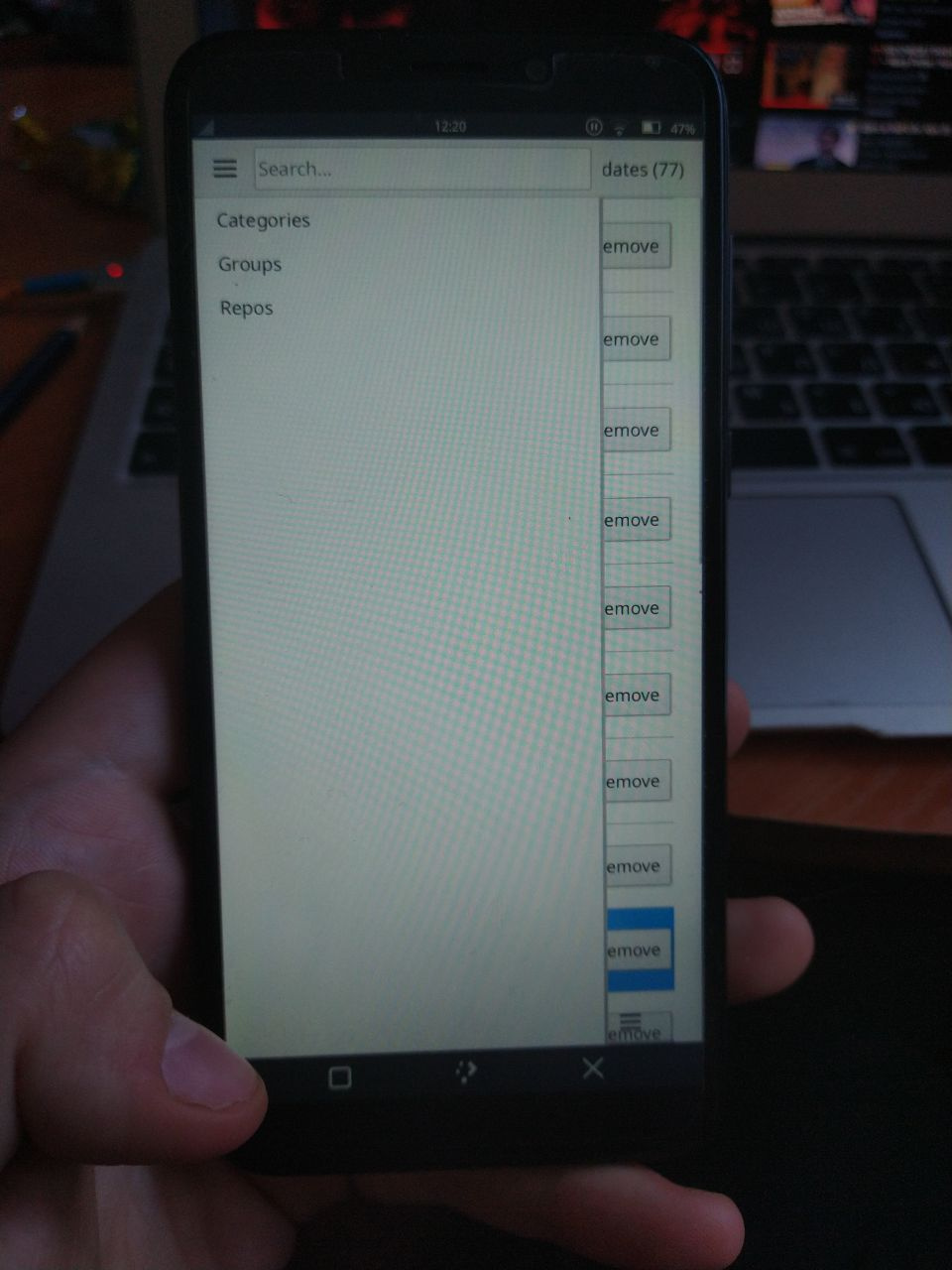
But previous layout with left sidebar containing categories was much better, and the content at right side. For now everything is shown in center and looks vertically crowded, because most laptops in market have 15.6" screen with small height compared to width, so forcing content vertically and let wasted space horizontally is not good.
1 Like
This is “ergonomy” stuff, keeping focus one place bla bla bla. Pamac GTK is GNOME app (at least it’s how I understand it), so it’s following their guides, so probably this is why v10 looks how it looks.
GNOME is not the only desktop in market, GTK framework can be used to build apps on any desktop and is not obligated to follow the crappy design of GNOME3.
1 Like
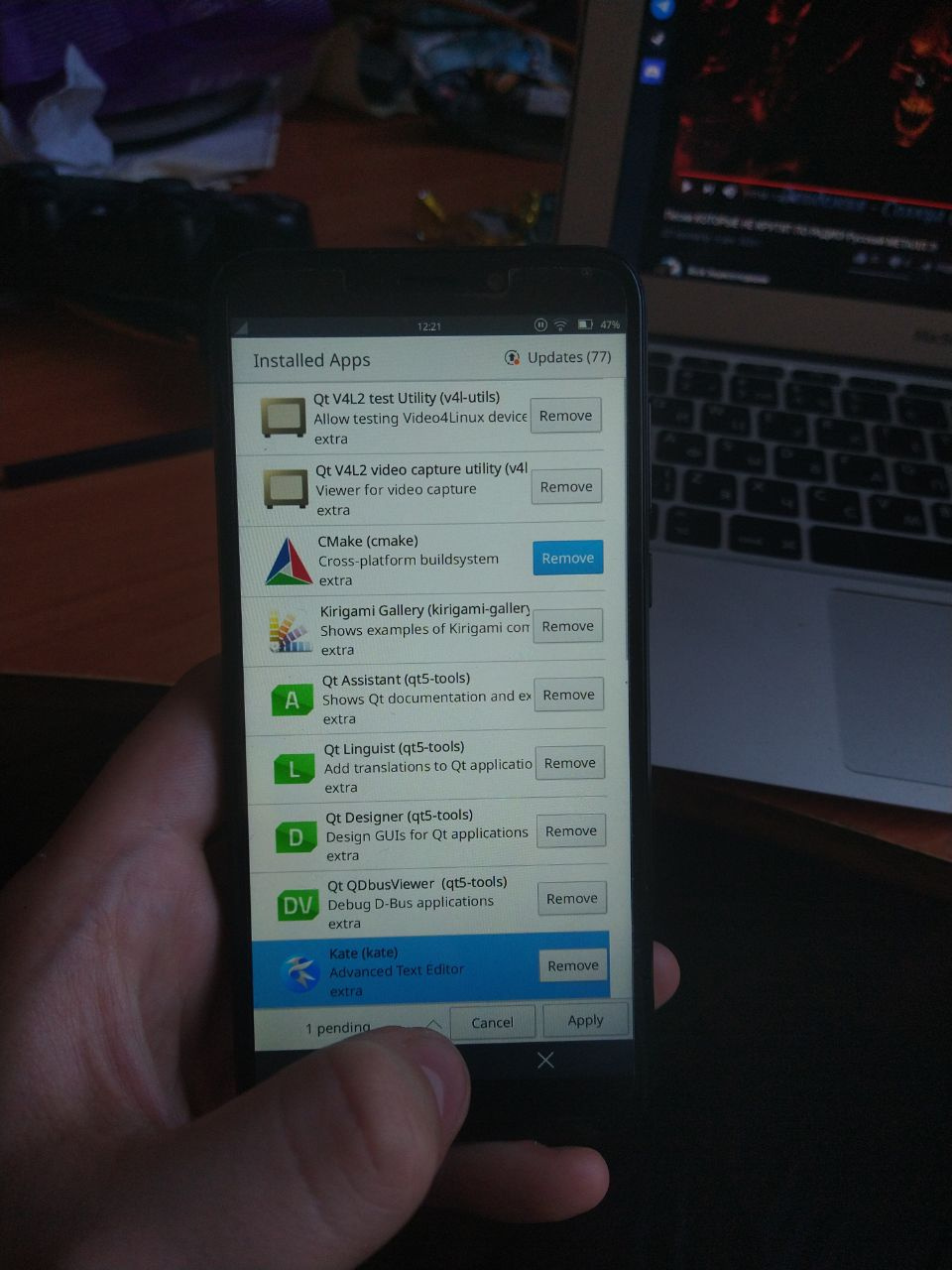
Issues with the v10 UI are inconsistencies:
- placements of buttons (sometimes on the right, sometimes in the middle)
- left margin/alignment (jumping here and there depending on the window)
- align=center, this one is a big no! (except maybe the title bar)
That’s what’s making it confusing. Usability could be greatly improved by keeping placements and alignments consistents so the eyes don’t need to jump around.
1 Like
Pamac v10 UI changes are mostly done to have it prepared for our mobile devices like the PinePhone. We will see on how we can have it better aligned on desktop and mobile screens. Issues with Pamac can be posted here.
2 Likes
Nah, let me make this a fair comparison.
This is what Discover looks like when viewing an app:

Sure, not perfect, but it tries to use the space the best it can. It still has a sidebar for fast acces to important things and puts not just everything in the center. Also the user can see multiple screenshots and the description of the app without scrolling.
Now compare this to pamac v10 in the same size:
Sidebar is gone, instead just wasted space (which becomes even more when changing the window size / aspect ratio) because everything is forced centered.
Bonus: look at what Discover does when resizing:
Sure, the design of Discover is not perfect, but it has much less wasted space compared to pamac.
Also it works on both: desktop and mobile.
Back to topic, so pamac itself:
I don’t think the new design is that bad. It is just made with mobile in mind. But sadly mobile only. For desktop users it got worse.
So let us collect ideas to improve it. As for now, those options come to my mind:
- Make a pamac desktop and separate pamac mobile version
- Adapt something like a dynamic layout depending on window size like Discover is doing it
- Add a toggle to pamac settings to switch between desktop / mobile layout
7 Likes
Yeah, but if Pamac developer chosen to follow GNOME principles there is reason for that but don’t ask me I don’t have skill to read in people mind.
Oh it look like it’s made to fit PinePhone 
I don’t consider that GNOME have crappy design. You can like it or not its personal preference, and they don’t build theirs’ stuff basing on personal preferences. They are basing on ergonomy from my knowlage.
Thanks, I already reported it there.
Now moving the goalpost as you did when the discussion started about Pamac in full screen more, now we move to what it does when resized.
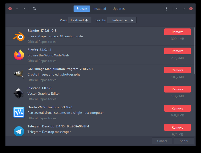
Look how beautiful Pamac looks like on my end, and i don’t have to move it nor resize it
KDE Plasma team to make Discover plus the time they had to work on it vs one person that deals with everything about Pamac and relies on a hand of people for constructive feedback … Sweet. 
Care to give a hand with the code for those tasks?
Pamac GTK+ will remain just that. There is another project for Pamac QT by @LordTermor
Desktop and Mobile variants is double the work. I don’t quite get from where Manjaro suddenly became Apple to provide Apple Store and iTunes like app, at their current usability and look. Seems like a lot of expectations.
Ideas are great, feedback is welcome, but so far it comes quite patronizing.
I’ve adapted pamac-qt to mobile view a bit some time ago but it is not in repositories nor in git atm
4 Likes
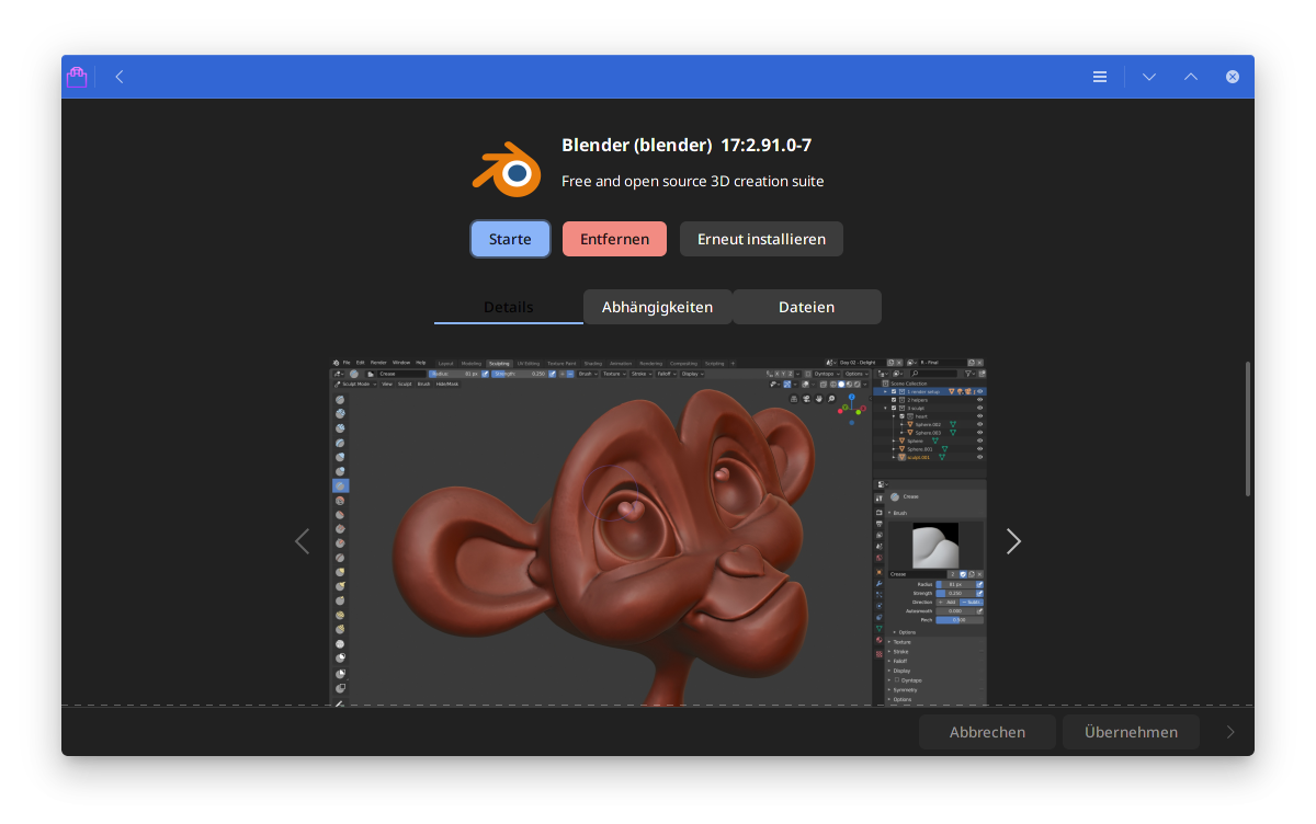
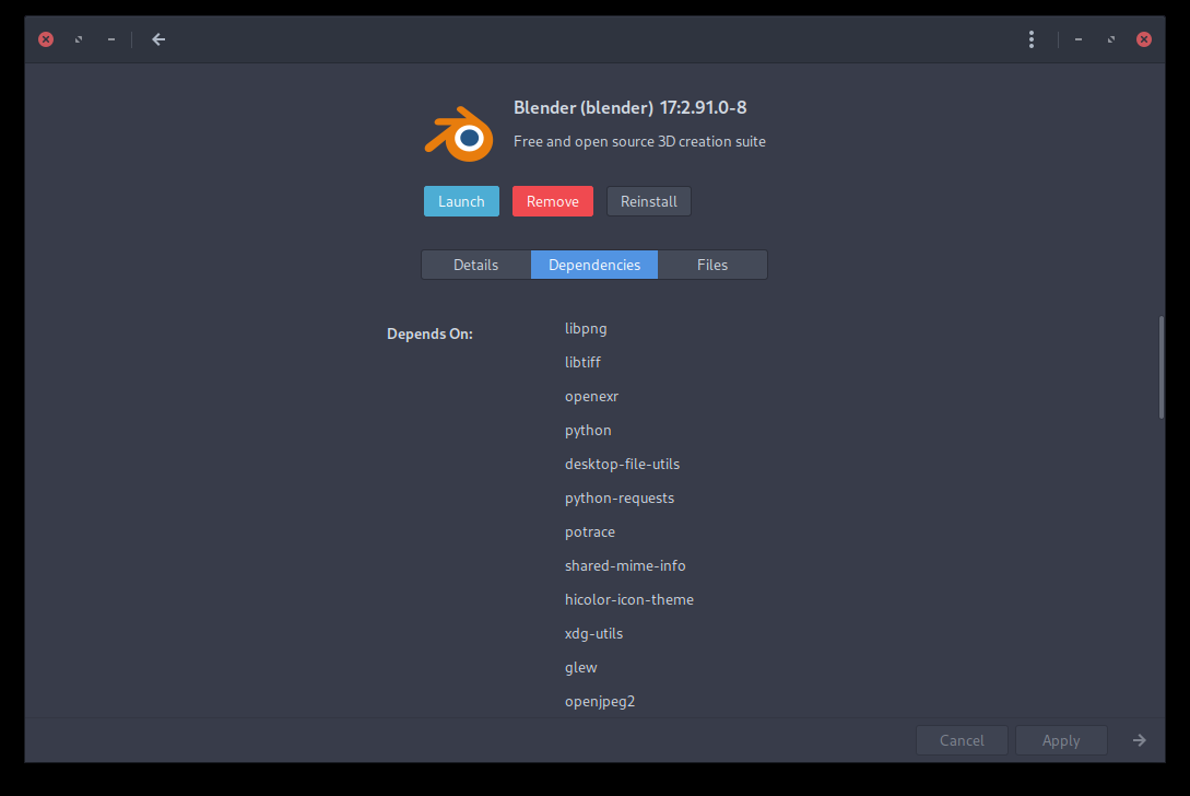
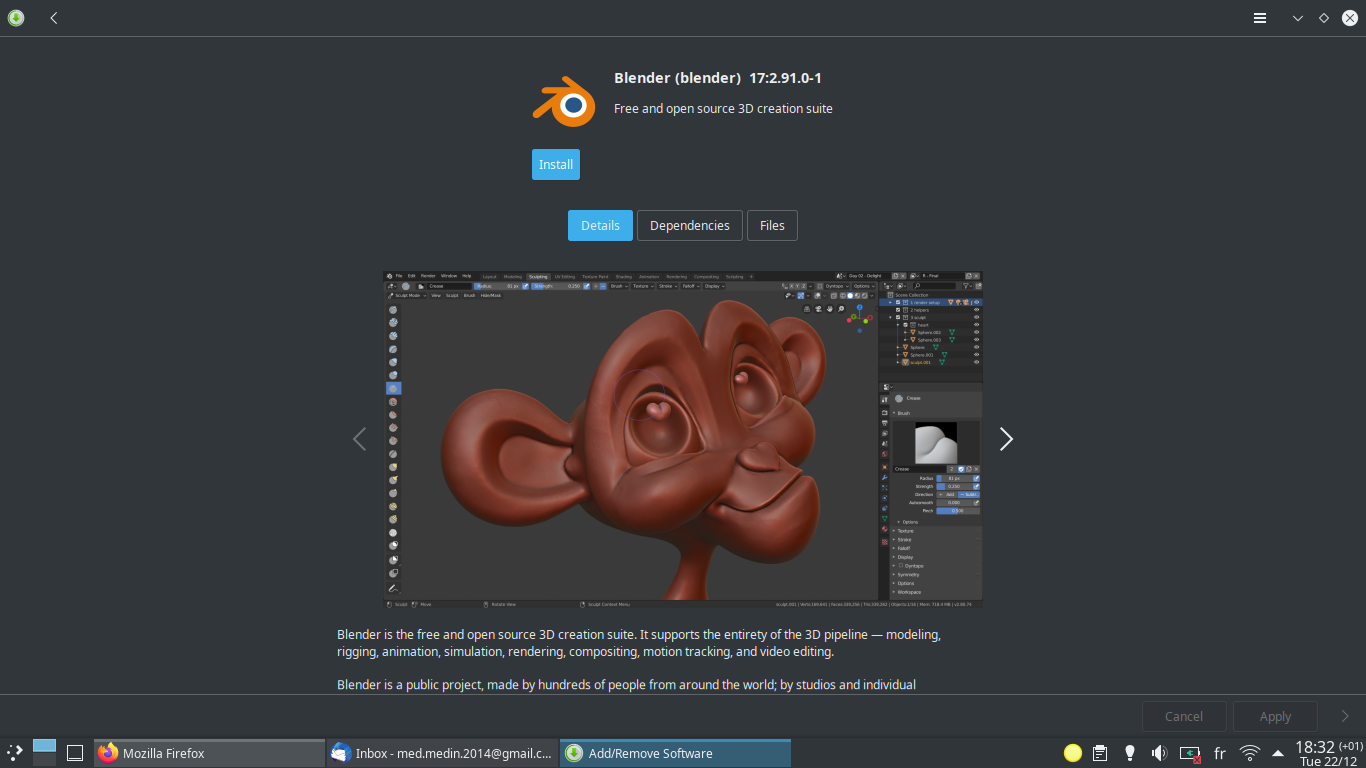
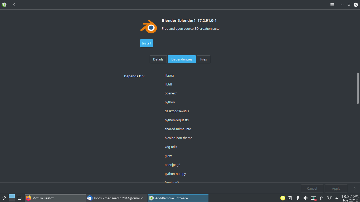
@bogdancovaciu Sure, your screenshots looks good, but click on Blender for example, then all become align=center, buttons change place, left margin changes, etc.
And if you click further on Details, Dependancies, Files, you’ll see the left margin changing each time.
Inconsistent.
Every screen by itself looks quite alright, that’s the difference between screens in alignment and placement that is confusing.
2 Likes
Yeah… no.
Between the apparition of mobiles devices and the invention of responsive design, we had to create separate layouts for mobiles (vertical layout) and desktops (horizontal layout). As @bogdancovaciu mentioned, this is twice the work to create, then to maintain.
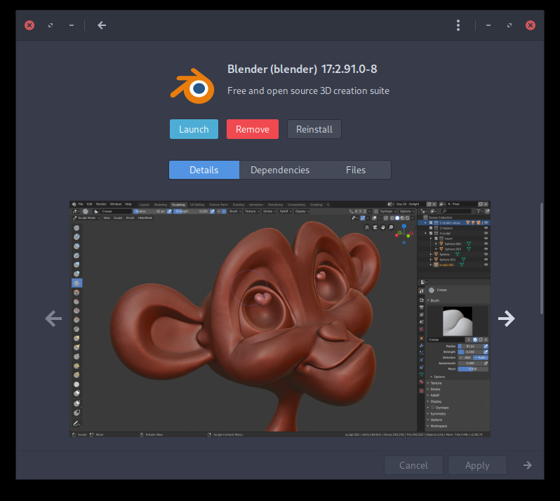
Only when i click on Files the window changed size. That is an inconsistency i think due to the fixed size in the text output box. The list of dependencies is just a list, so this would be the actual minimal size of the Pamac window after clicking trough all those options.
Definitely not ideal neither for Desktop, nor for Mobile.
My defensive stance is not with pointing out this issues, but the way some arguments have been used and put forward.
Think about something to not create friction with the developers, but for them to be a pleasure to read all this feedback comments. I know 100% that they are very diligent in what they do, and they want to provide a flawless experience for everyone. It takes a bit of time and patience from both sides and proper/respectful communication.
So far we all managed to do that to an extent, not perfect, but yeah …
2 Likes
You are using the app not maximized, that’s why you show less wasted space, and no one (laptop users) actually open an app not maximized unless you have really big external screen.
On Plasma Details and Install/Launch buttons are not left aligned at all, it looks like a mess for me.
When I click on Details the text is packed in the center, but when I click on Files it takes all horizontal space, in Dependencies the texts (headers and first items in lists) are not at all aligned to baseline.

While with an AUR package :
This is a false statement. I actually don’t maximize Pamac window. Do you have any data or poll which shows that every laptop user maximize the window? Maybe you’are actually in minority?
1 Like
On laptops with 15.6" screen you can’t use any app without maximizing it. Not maximized apps look too small for my eyes and cause problems of visibility, for example try to use LibreOffice or Inkscape not maximized on 15.6" laptop and you will see that half of buttons on toolbar become not visible.
In previous post you’ve said that this is an issue of every laptop user. Now you’re saying that it’s from your experience. There is a difference between “Me” and “Everybody”. There is nothing wrong if the new layout is uncomfortable for you, but don’t say that it’s the case of literally everybody.
1 Like
Most bought laptops in market have 15.6" or less that’s why so many users are forced to use apps maximized. I never known any student from my college or friend that uses laptop with screen bigger than that.
Most of my machines are 13" or 14" devices. I use window tiling and typically have 1-3 applications open in each workspace. Browsers and Office apps benefit from maximized state, but most apps don’t really benefit from it.
Maximizing all apps is a bit of a edge use case. That doesn’t mean that this use should not be taken into account, but it cannot be the only case that is taken into account.
The new layout is much friendlier to my use case. Pamac used to be uncomfortable to use with half screen window width, and now that is no longer an issue. It is still a bit rough around the edges, and there is still room for improvement, but I still consider this a good step forward. Even though it is not yet as polished as it was, it somehow feels much nicer.
Personally, I would have preferred a solution where the previous sidebar would have been preserved, but there would be a button in the top left corner that would allow sliding the sidebar in and out of the view. The default state would be determined by the window width. This would allow for even more narrow window width, but also use horizontal space more efficiently. But this approach can also work with some more polish.