
In FF it looks way better (than chromium based browsers):
![]()
@kerry_s No seriously, it is different 

btw. The archlinux one looks crystal clear, no matter what browser 
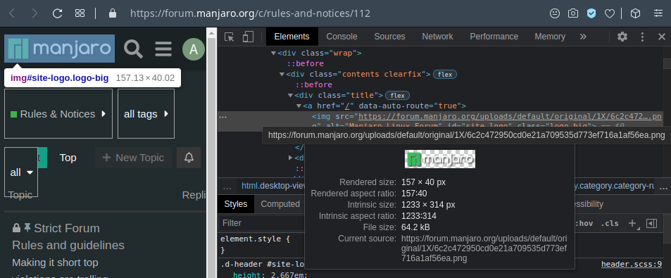
I have seen these kind of issues on chromium based browsers for a long time. Sometimes it gets fixed. But after sometime this issue comes back.
In the past, I have had issues with even texts getting blurred when the window gets resized.
As a developer, yes you can overcome these bugs by adding or removing css properties. But it is not at all elegant.
(for eg. you can add image-rendering: -webkit-optimize-contrast; to the blurred manjaro logo using devtools and see the difference)
And that’s my rant for today. 
I don’t see a difference though,

Bu yeah, webdevs have a hard time I guess. IE11 support on the Manjaro website please
Try adding it to the logo on the main page. I mean on the logo that you show on your first reply.
Oh… Dont get me started on that. he he 
Haha, indeed that looks way better.
![]()